a new brand identity for Glasgow sports club
Sectors
The Brief
The GWRC asked Design Hero to create a cohesive brand identity in Glasgow that could apply to all teams under the Glasgow Wheelchair Rugby Club as umbrella brands. The GWRC’s brand had grown organically and needed revisiting. The board were keen to impress on Design Hero how their members had overcome incredible difficulties and adversity in their daily lives, and it was clear how this translated into the combative and challenging nature of the sport. The new Glasgow brand design had to reflect the bravery, energy and spirit of every member of the Glasgow Wheelchair Rugby Club and Design Hero was excited to be responsible for reimagining the sports clubs brand in this way.
💎 branding design for GWRC
📕 brand guidelines for GWRC
We designed a new brand identity for sports club in Glasgow to reflect the bravery of their players
Following consultation with the board, Design Hero have identified the GWRC’s core brand values. The new brand values extend to multiple teams under the GWRC brand. On watching the team at work, we noticed with every match, these brave warriors roll out onto the field of battle, and the new brand aims to reflect the energy, daring, drama and boldness of the sport.
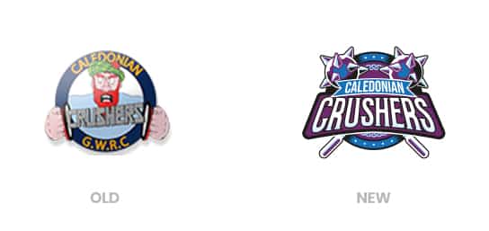
Old Logo vs new logo
The previous brand had emerged organically without a prior strategy and was based around a “see you Jimmy” character which the club felt didn’t represent the core brand and wasn’t an inclusive emblem.
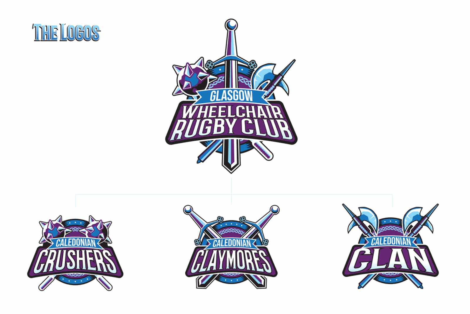
New branding for sports club
The new brand identity design for GWRC has been built around these core brand values. The new brand embraces the “warrior spirit” and builds a new design language around the iconography of weaponry. Each team name is derived from different types of weaponry, and each subbrand for GWRC assumes a weapon as its motif.
New logo Designs
As a Glasgow branding agency for Glasgow Wheelchair Rugby Club encompasses child logos for each team. This new design language is designed with future flexibility in mind to allow for the addition of more teams or sub brands at a later date.
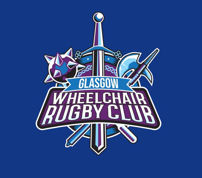
Branding for Glasgow Wheelchair Rugby Club
The club logo combines the weaponry and elements of the child logos into a heraldic logo for the club as a whole.
The crushers take the bloody form of spiked
mace to crush the competition with blunt
force. Ouch!
The claymores embody the famous Claymore
sword which embodies the warrior Scot.
The Clan favour a pair of deadly long handled axe to cleave their enemy on the pitch!
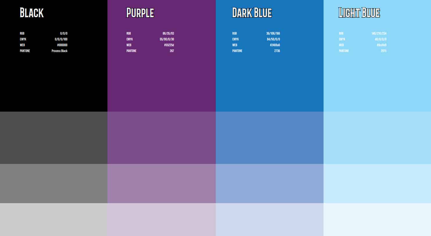
Brand colours
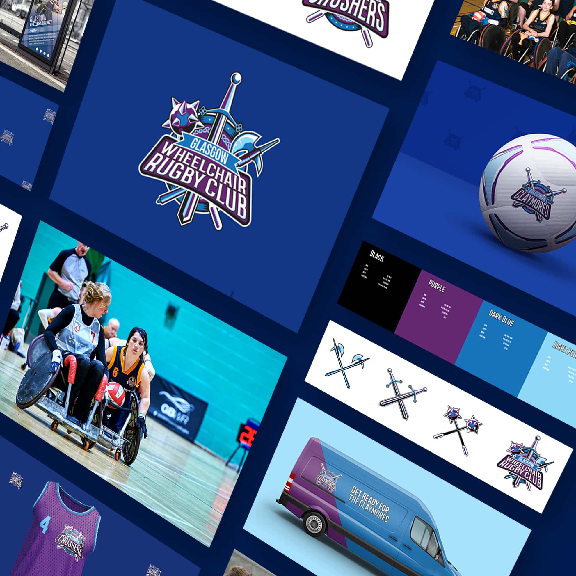
Design Hero has selected a more Scottish colour scheme in line with the brand brief, with purple highlights to add variety. The previous orange is gone.
Brand assets
We also designed a range of brand collateral such as brand patterns for social media, branded attire and van liveries so the GWRC have a clear idea of how to use their brand going forwards.
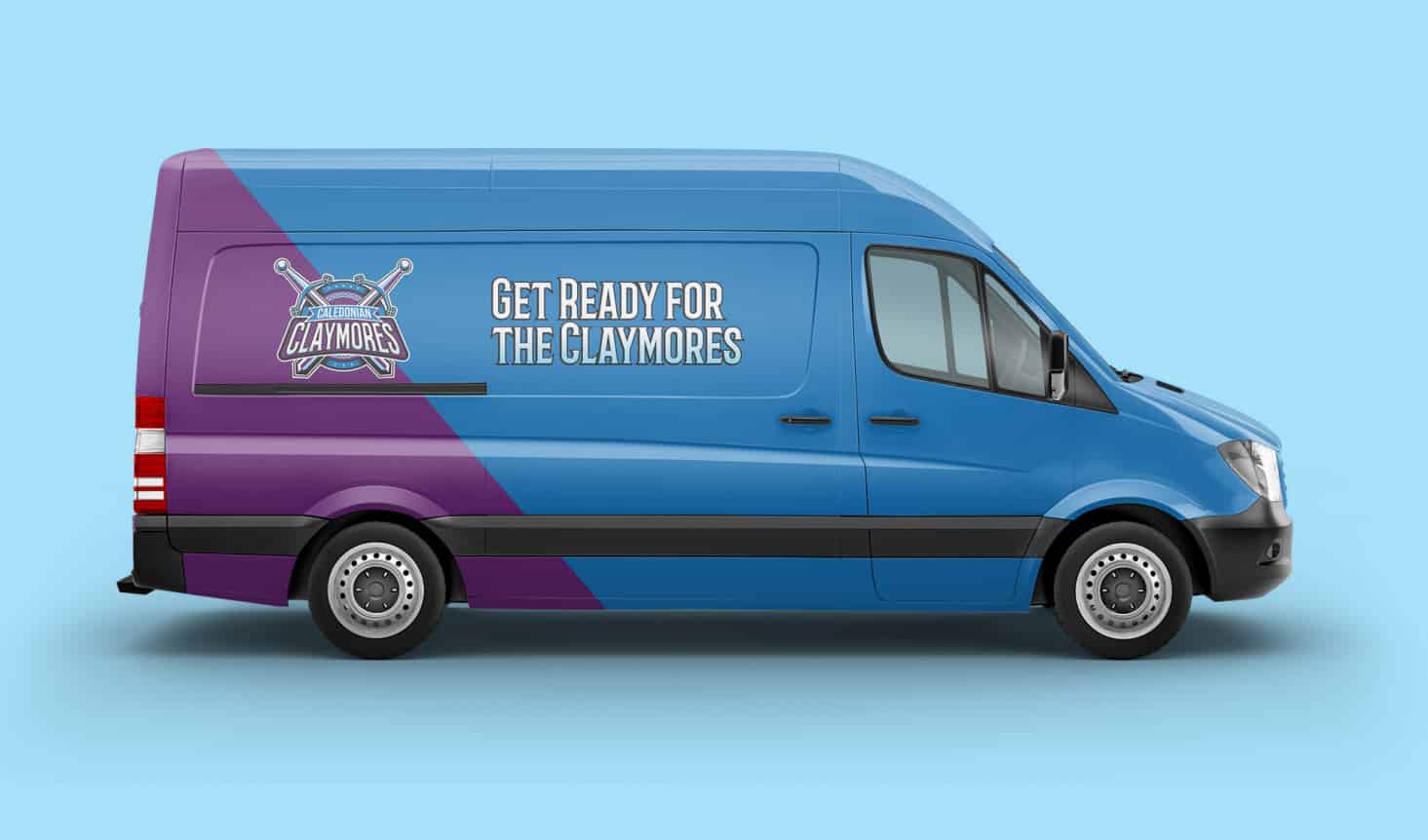
Branding for sports clubs
We also designed a range of brand collateral such as brand patterns for social media, branded attire and van liveries so the GWRC have a clear idea of how to use their brand going forwards.
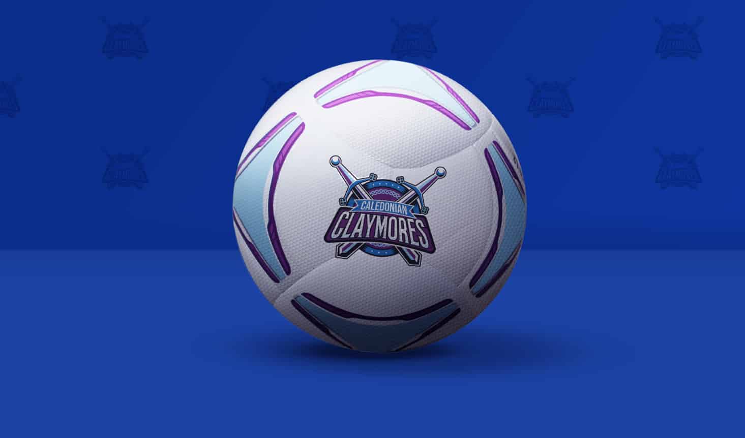
Branding for sports clubs
We also designed a range of brand collateral such as brand patterns for social media, branded attire and van liveries so the GWRC have a clear idea of how to use their brand going forwards.
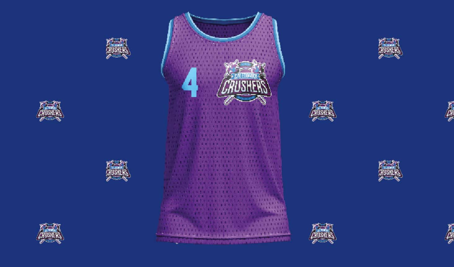
Branding for sports clubs
We also designed a range of brand collateral such as brand patterns for social media, branded attire and van liveries so the GWRC have a clear idea of how to use their brand going forwards.
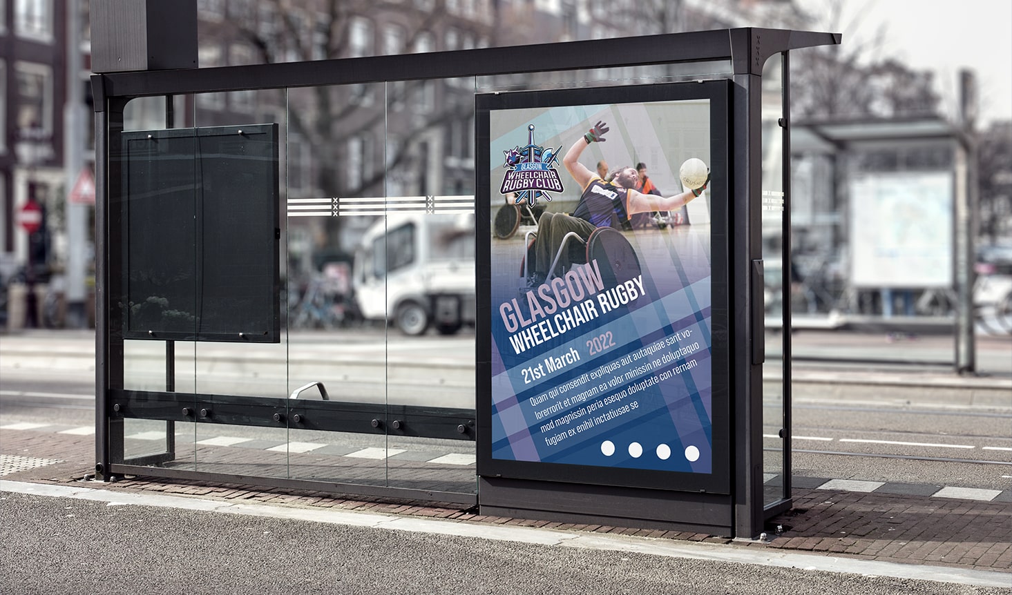
Branding for sports clubs
We also designed a range of brand collateral such as brand patterns for social media, branded attire and van liveries so the GWRC have a clear idea of how to use their brand going forwards.
Our Results
“
Nick at Design Hero was great, he talked us through the whole process. He took on board what we were all about and what we were wanting to portray with a new branding, before pitching his suggestions. I would definitely recommend using their service if you have a design project.
Donald
Glasgow Wheelchair Rugby Club
More Success Stories from Design Hero
Loading...
