A personal brand for healthcare professionals

Play Video
The Challenge
Create a new brand and design a new website to reflect the journey from pain to relief and to emphasise Catherine’s skills, empathy and expertise.
The Deliverables
Sectors
The Brief
Catherine Gillies is the leading UK specialist for chronic head pain treatments, an advanced nurse, and a BSc Neuroscience specialist. Catherine has 28 years of neurology nurse experience and has continued to educate herself in her specialism by becoming an Independent Nurse Prescriber, completing her clinical examination and OSCE qualifications.
She was offering great services but was struggling to sell her treatments, so she called on Design Hero to help create a brand and website design that would reflect the journey from pain to relief and showcase the fantastic work that she does.
She needed a personal brand to emphasise the level of skill she has in her field and the deep care she has for her patients and also needed coaching on productizing her service and coming up with attractive offers to promote on the website and social media.
We helped Catherine Gillies establish herself as an expert in her niche as the UK's leading specialist for chronic head pain treatments

The brand for Headlines Headaches is built around the transition from pain to relief. Chronic pain can be all-encompassing. The brand imagery invokes the intensity of these feelings behind chronic pain and focuses on the journey to the relief offered by Catherine Gillies.
We created a range of brand assets such as branded stationery for Catherine’s clinic, and social media assets she can use as templates to promote her services on social media.
Headache treatments and aesthetics web development
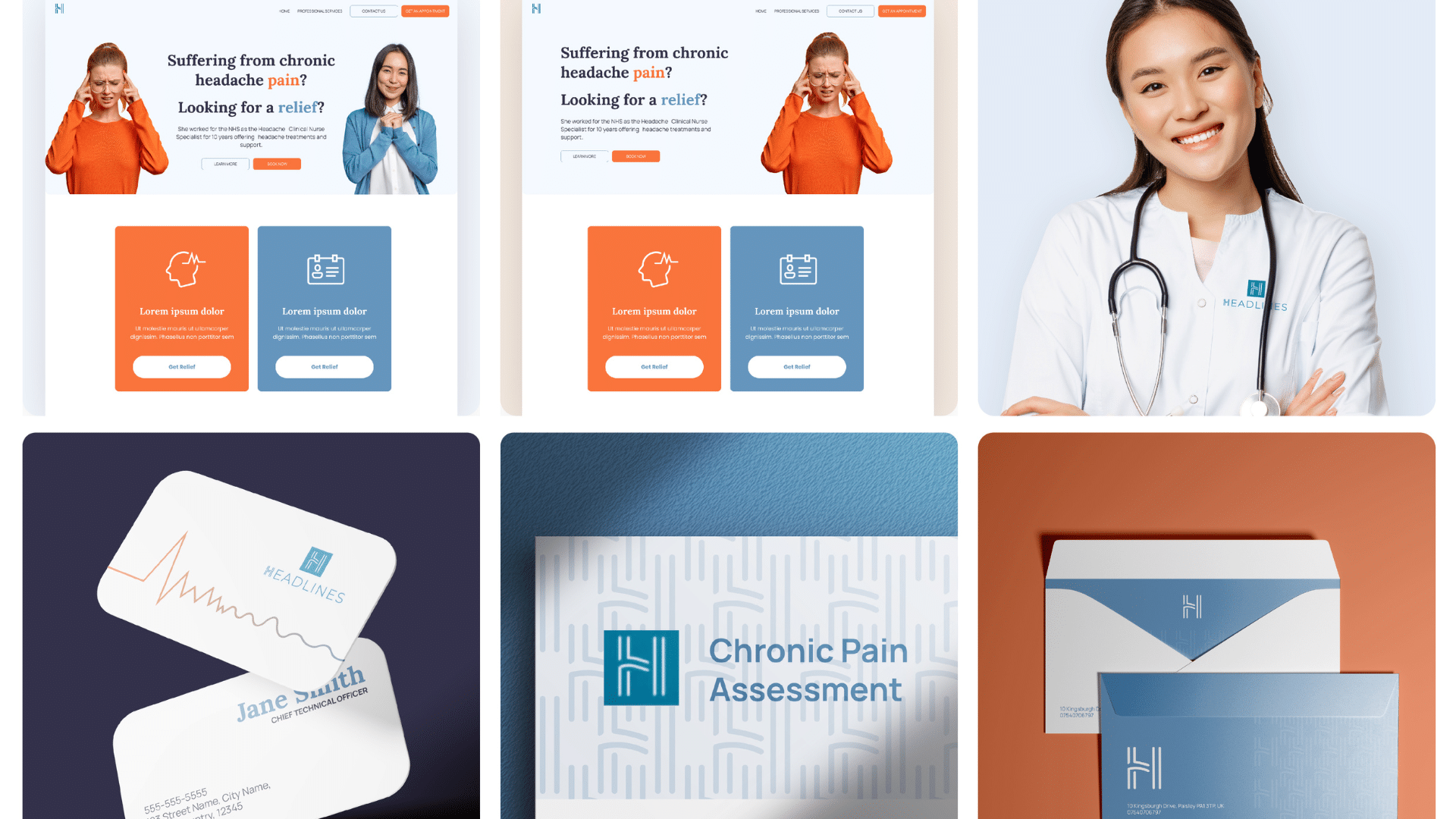
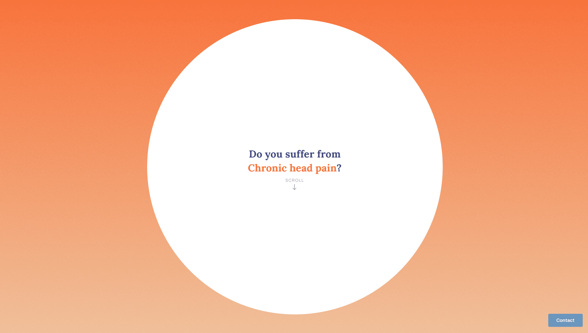
Design Hero created a WordPress website that is consistent with Catherine’s new brand. The website opens with an impressive storytelling piece, with a journey from debilitating chronic pain to soothing relief. We used tough textures transitioning to soothing imagery and helped Catherine build a credible personal brand to emphasise the level of skill she has in her field and the deep care she has for her patients.
She now has a consistent brand across her business and an understanding of how to productize her services into three core treatment areas.

Headache Treatment and Aesthetic website
The website design communicates the journey from pain to relief. The website home page begins with a harsh orange and rough grain texture and transitions to a more soothing light blue.

Credibility and Treatments
The consistent brand imagery used through the website gives the professional look that Catherine needed to demonstrate her expertise in the industry.

Branded stationery
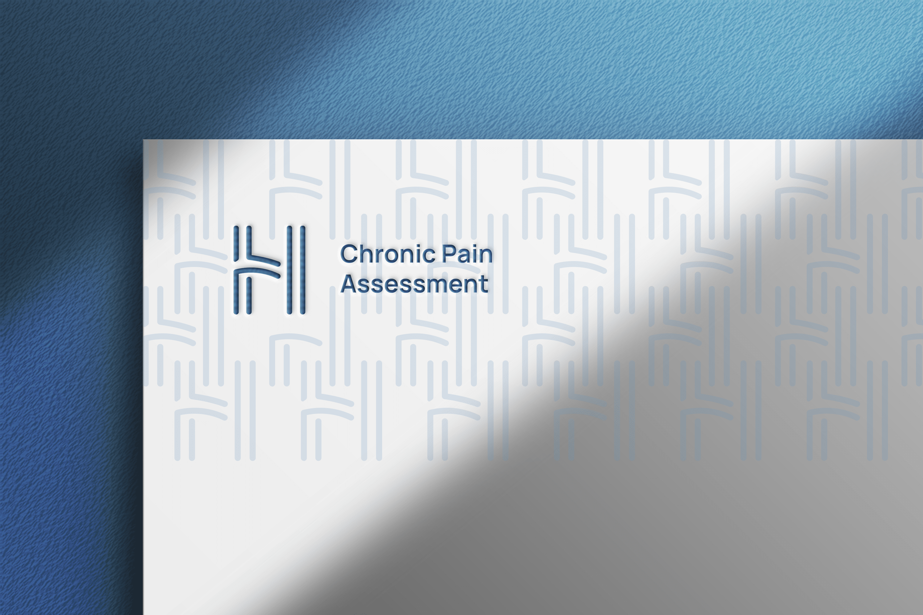
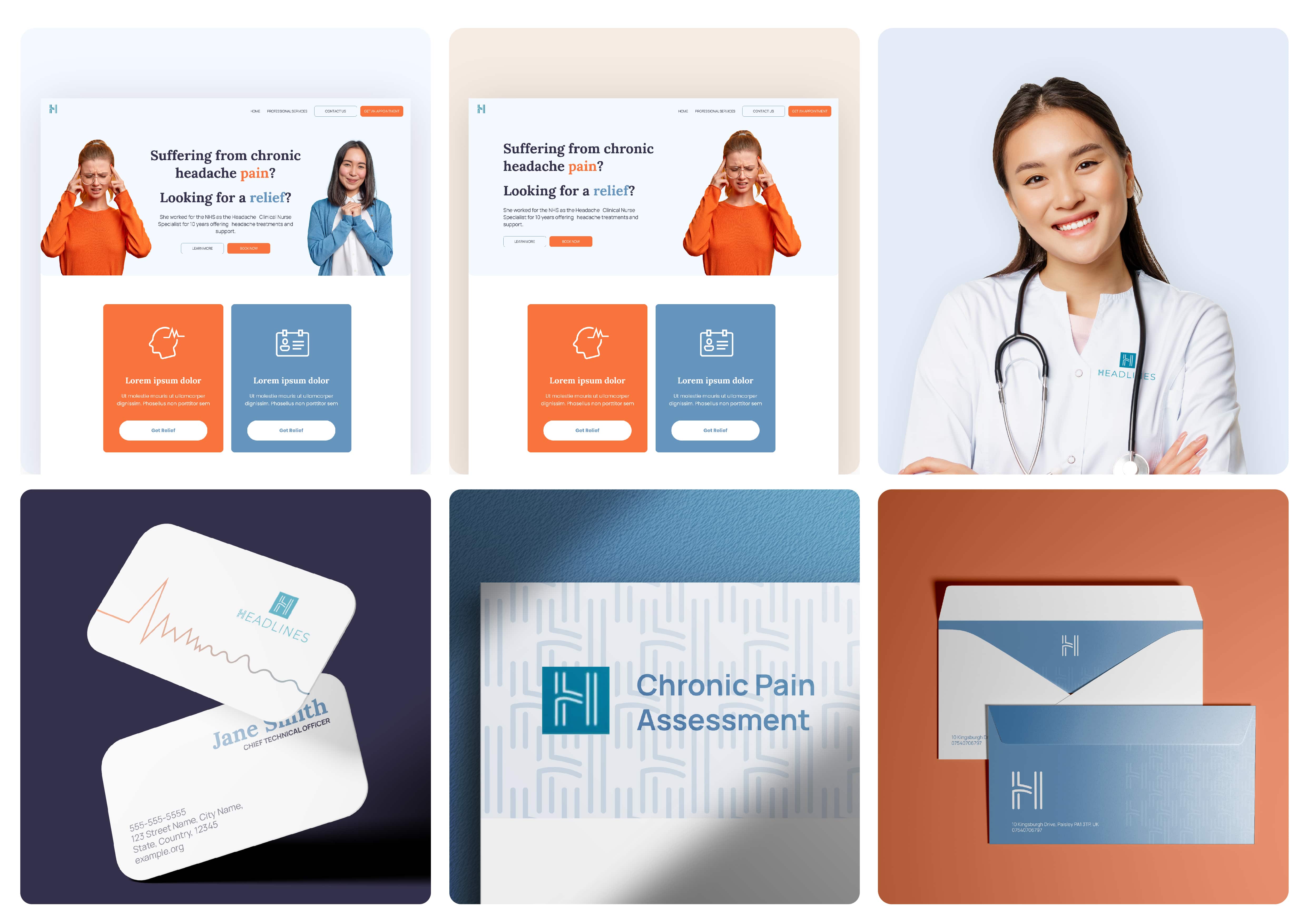
We designed a range of stationery using the brand pattern so that the branding remains consistent across every touchpoint of the business.

Brand boards
We created mood boards to find the right customers and brand concepts to explore different uses of the logo.
Our Results
More Success Stories from Design Hero
Loading...

