Branding and web design for a holiday home rental business
Sectors
The Brief
Kilfinan House is a luxurious four-star holiday home in a remote idyllic setting in Argyll & Bute.
Over many years, the family converted this old crumbling manse into a four-star holiday home, and built a business around the house, which now rents to Scottish and international tourists alike.
Kilfinan House had no branding strategy in place until I developed the existing brand elements into one consistent identity to be used across graphics, website and social media.
💎 Brand Identity
Facebook Marketing
🌟 Logo Design
📃 Branded Stationery
A luxury holiday house sells the Scottish experience to guests from around the globe
Kilfinan House had no official logo or branding and so Design Hero built a typography-based logo.

Brand refresh
I refreshed the existing logo to introduce a better sense of quality, and friendliness

Color Selection
The real character of the brand is in the minimalist use of black and gold as colours, along with high impact photography and subtle repeating patterns to create a feel of elegance and luxury but also maintain a homely and calming feel to the brand.
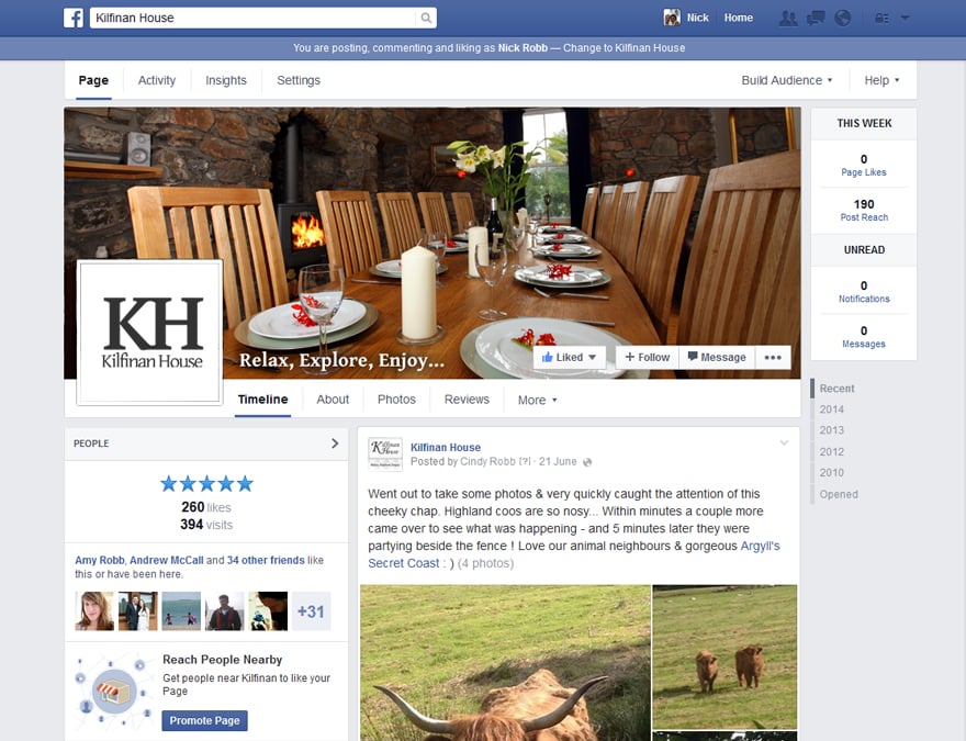
Social Media Marketing
I also helped manage social media accounts.
I was asked to help promote the business and connect with guests and potential visitors to Kilfinan House through Facebook.
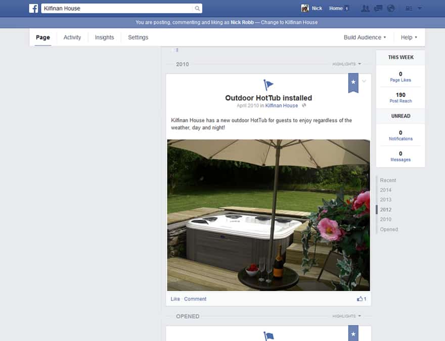
Facebook Management
I created assets for social profiles and images for social accounts and online marketing.
Profile and Cover Pictures
Strong photography and a personal approach was used across the Kilfinan House Facebook to create a tone that matches the brand.
Posts & Graphics
Design Hero was also responsible for the direction of the Facebook including vocal tone of posts, subject matter and photography.
Website Integration
The website has been designed with social media in mind, with the Facebook and other social media directly interlinked to constantly keep users up to date with the Facebook feed.
🔖 Booking website
💻 brochure website
Holiday Homes web development
I redesigned Kilfinan House’s website to bring it in line with the branding of the holiday house and present an impression of ultimate quality and relaxation in such a serene and scenic location in Argyll & Bute.
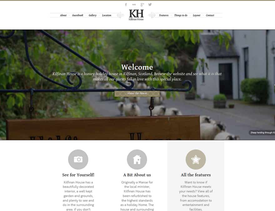
Homepage
Strong photography and a personal approach was used across the Kilfinan House website to create a tone of approachable quality. A full-screen scrolling slideshow with calls to action were used to convey the strong photography available.
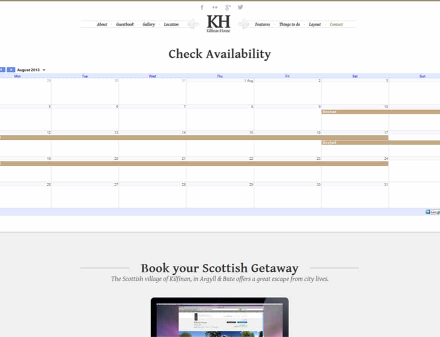
Booking Calendar
Users are able to view availabiltiy through a google calendar linked throughn the website for bookings.
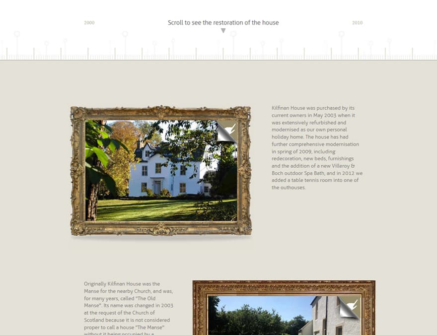
About
The website details the owners behind the house, aswell as the fascinating history of the Scottish village of Kilfinan. Each history fact is displayed in a picture portrait which displays historical photography and images of the house before and after restoration using hover transitions.
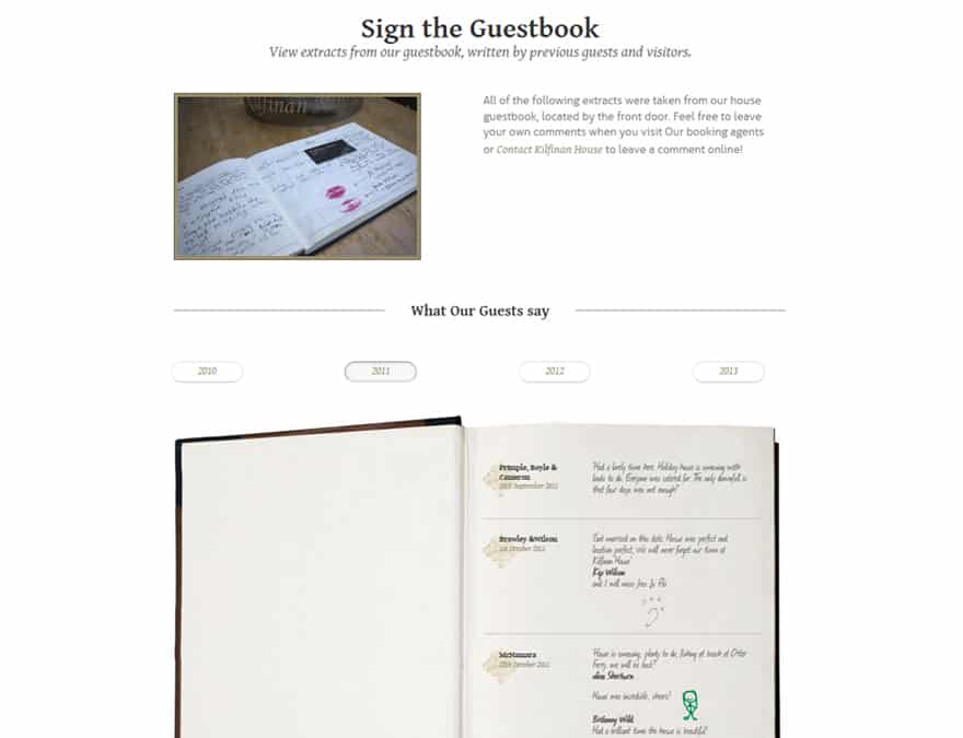
Guestbook
An animated guestbook was used to display all the positive comments left by visitors to Kilfinan House, with tabbed buttons to select a year.
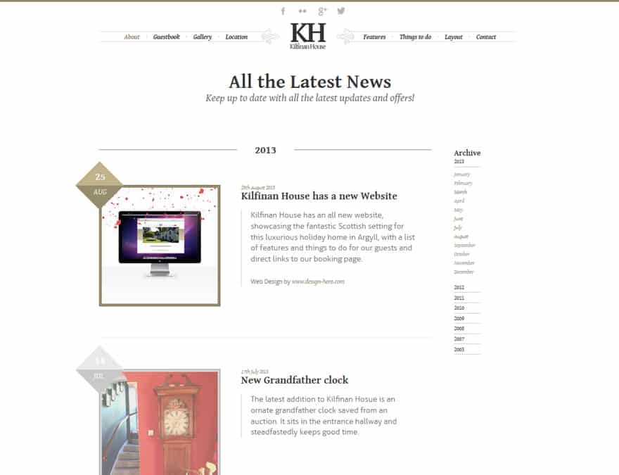
News
The latest news and information is displayed on the website, with a dated archive section which follows the user as he or she scrolls the page.
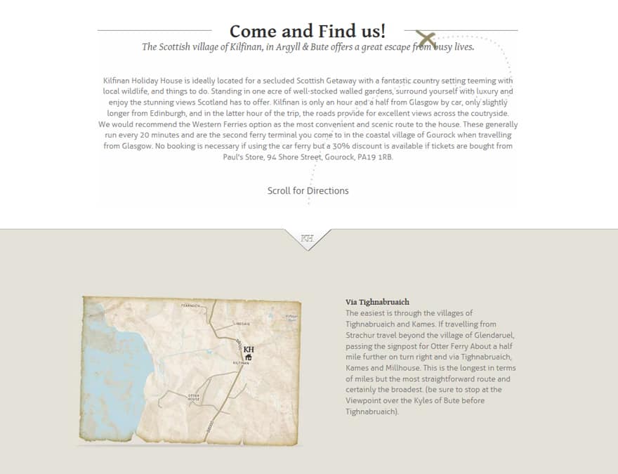
Directions
I integrated Google Maps, and customized the map to suit the Kilfinan House branding. I also created fly-in local maps to guide visitors to the house as well as inform them about the wealth of interest in the local area.
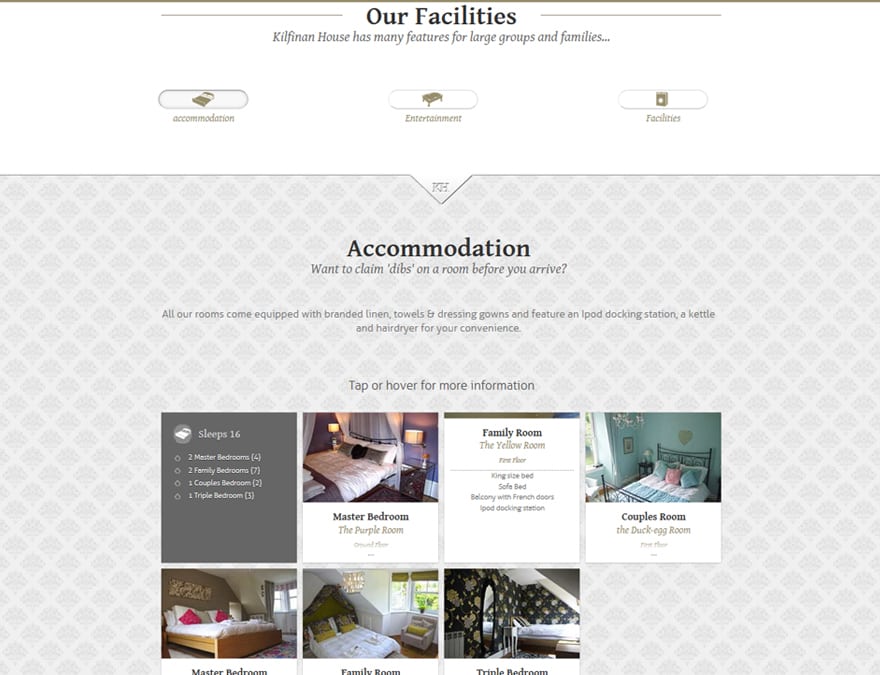
Features
The various features of the house were displayed graphically on interactive ‘card’ thumbnails which displayed more information when tapped or hovered over.
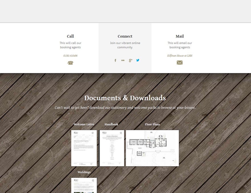
Things to Do
Kilfinan House has a wealth of things to do both in the house and in the local area. These were displayed graphically on interactive ‘card’ thumbnails which displayed more information when tapped or hovered over, as well as contact details for various businesses, forming a directory for guests to refer to.
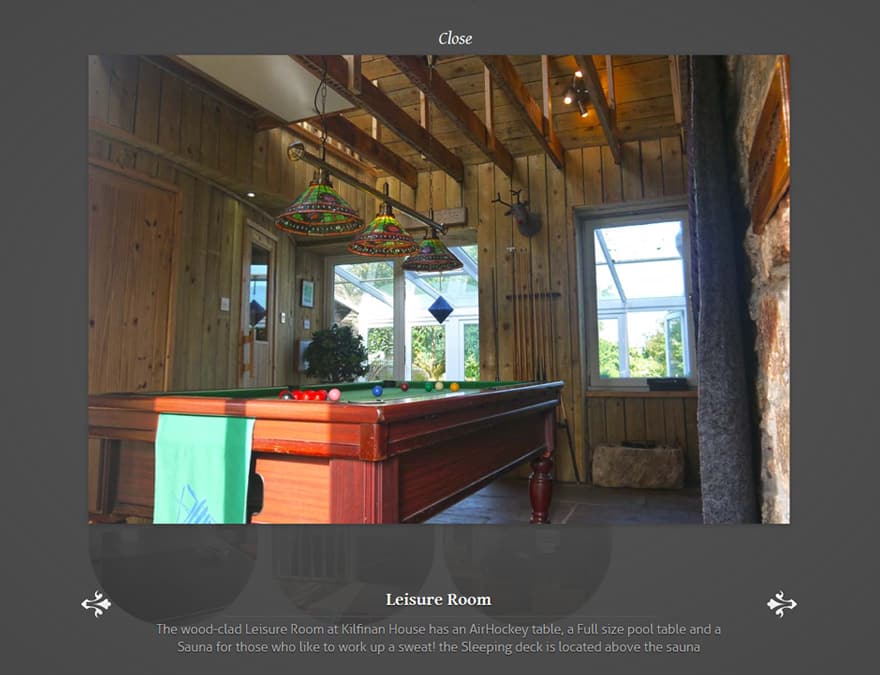
Media Gallery
I created a super-fast photo gallery to display images of the interior and exterior of the house. Each thumbnail image pulls up a responsive full page lightbox.
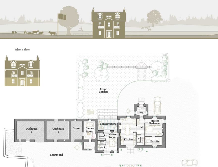
Plan your Visit
I drew up plans for the house and displayed them on the website, with the user able to select each floor to see the floor plans and layout. The drawings are also available for download in PDF.
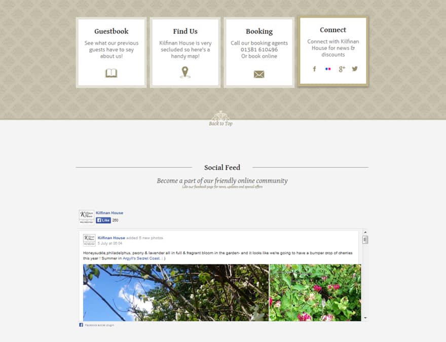
Social Media Integration
The website has been designed with social media in mind, with the Facebook and other social medias directly interlinked to constantly keep users up to date with the Facebook feed.
📃 Welcome Packs
📃 House Handbook
📢
Holiday Homes digital marketing
Kilfinan House was let down by its company stationery, which was scattershot and random.
There were many brand touchpoints such as letters to guests, welcome packs, booking emails, handbooks, with no set formatting or layout.
I aimed to bring the company stationery up to a high level of quality to reflect the rest of the house.
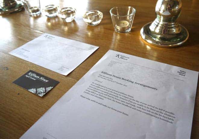
📃 Business Letterheads
- Booking Letters
- Cover Letters
- Invoices
- Invoices
- Signs and Notes
- and more…
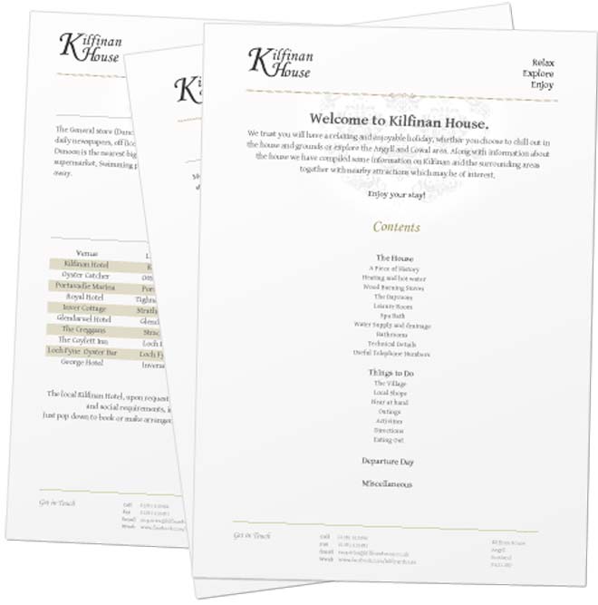
📘 Handbook
An A4 booklet containing instructions for the house. This 20-page brochure contains instructions for visiting guests on every aspect of the house and was presented on quality paper with links to social media and websites.
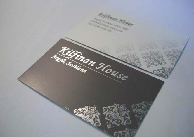
📇 Business Cards
Subtle patterns and gradients were used to reinforce subtle class. A silver foil was added to the business cards to give an extra touch of quality
Premium gloss finish with silver foil
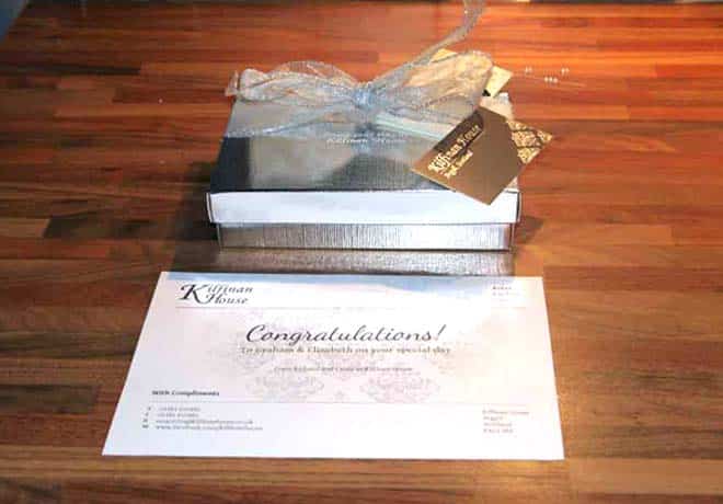
📘 Welcome Pack
This pack was assembled from various stationery and presented to guests upon entry with chocolates or wine
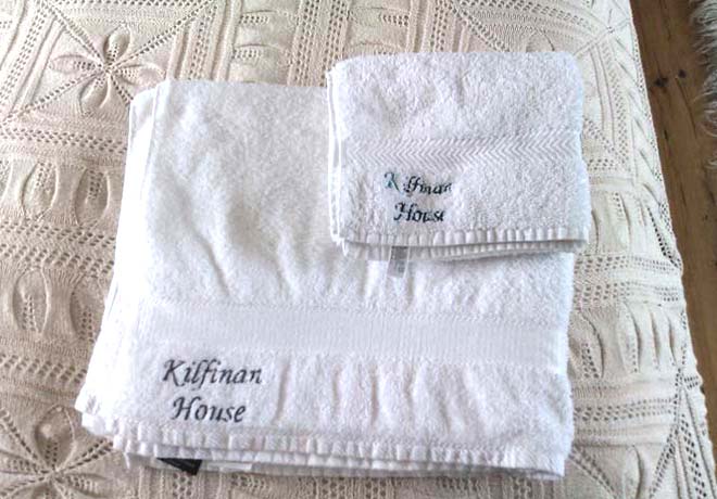
👝 Branded Linen
Branded attire and merchandise proudly bearing theKilfinan House logo.
- Towels
- Hand towels
- Dressing Gowns
Our Results
“
Nick’s done a fantastic job with Kilfinan House, our website is a massive improvement,
our guests love to go to the website and plan their visit before they come.
The online booking has also saved time and money on paperwork!
Cindy
Kilfinan House
More Success Stories from Design Hero
Loading...
