Website design for the Paisley Book Festival 2021 in Renfrewshire
The Brief
Books and reading have been a great source of comfort for so many people during lockdown.
The 2021 Paisley Book Festival is more important than ever, so they’ve decided to hold the festival completely online on a new digital platform. The new website had to be redesigned to host the entire festival, and showcase all that the festival in Paisley has to offer.
The Paisley Book Festival was launched in 2020, taking place over ten days, celebrating the writing arts in every form and promoting local bookshops and writers alike.
Design Hero worked with an amazing team to deliver the new digital platform for the Paisley Book Festival 2021; a new website designed for the festival by a creative team in Renfrewshire.
💻 Web design for Paisley Book Festival
Photo Credit: The Telegraph
💻 Web design for Paisley Book Festival
Photo Credit: The List
Online Festivals web development
Design Hero worked within a close-knit team cooperating with artists, developers, writers and council staff to deliver the website on time and on budget.
The website brief was to design and deliver wireframes and mockups for the new website, with a number of flexible design blocks for UX and UI design which the developer could use for any situation when building the site.
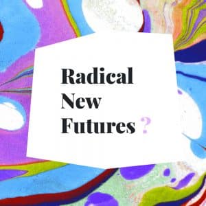
The new website for Paisley Book Festival is designed around the fantastic branding work by Jen Davies which incorporates bold irregular shapes and ink splashes which, to me, captures a writer’s messy drafts in a notepad.
Creative Team Credits:
Website designed by Design Hero
Site developed & built by Richard Plant
Brand Identity designed by Jen Davies
Supported by:
The new website for Paisley Book Festival 2021
The new website is designed around the branding work by Jen Davies:
bold irregular blocks of colour, and ink splatter effects form the visual language for this new website.
The page layout is carefully designed to look irregular and random while conforming to a grid that makes it still highly legible for the reader.
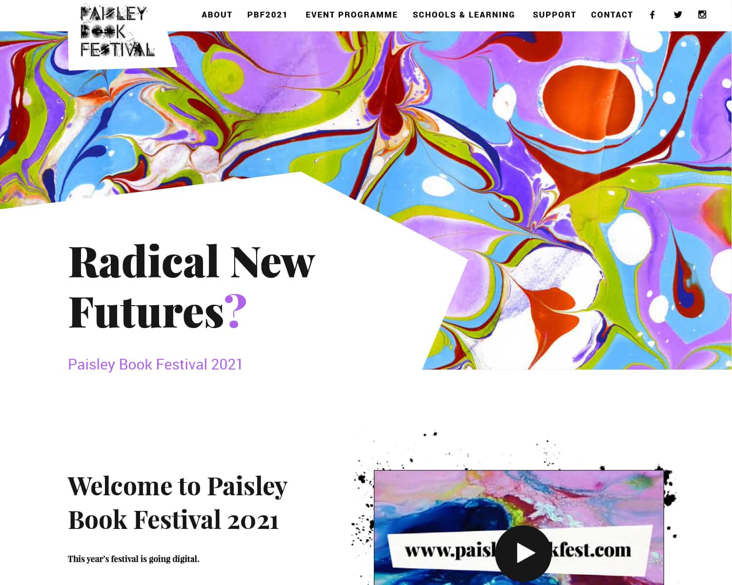
Homepage
The Paisley Book Festival website opens with a bang: a full width animated marble background punches out a bold punchline that draws the user into the festival experience. Radical New Futures?
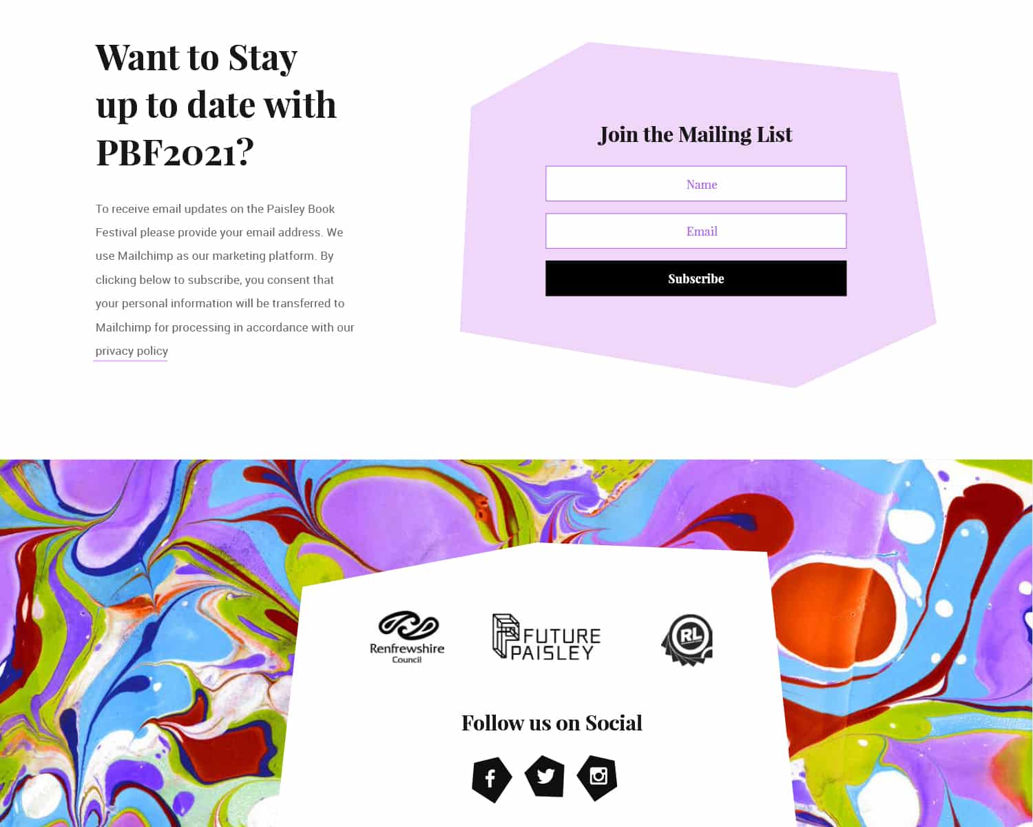
Mailing List Integration
It was important that the new website integrate closely with social media and email marketing to allow Renfrewshire Leisure to connect with their viewers. I designed a number of blocks for the website to integrate social media and newsletter signups into the footer. A bold marble background helped these elements stand out on the page.
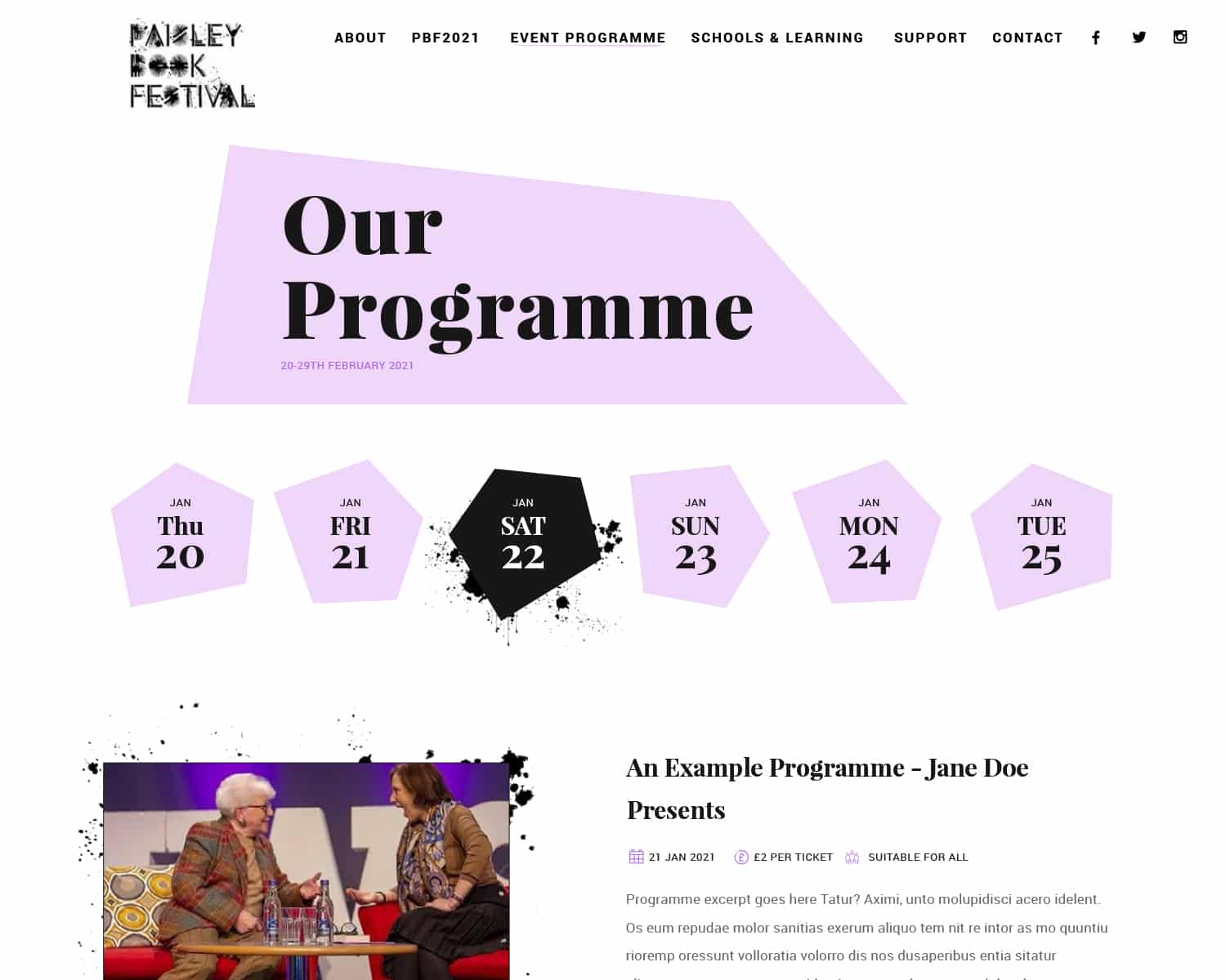
Online Programme
The core of the new website revolves around the online programme which hosts the festival events.
I designed a template so Renfrewshire Leisure can create their own programmes on the site, and navigate the programmes by date.
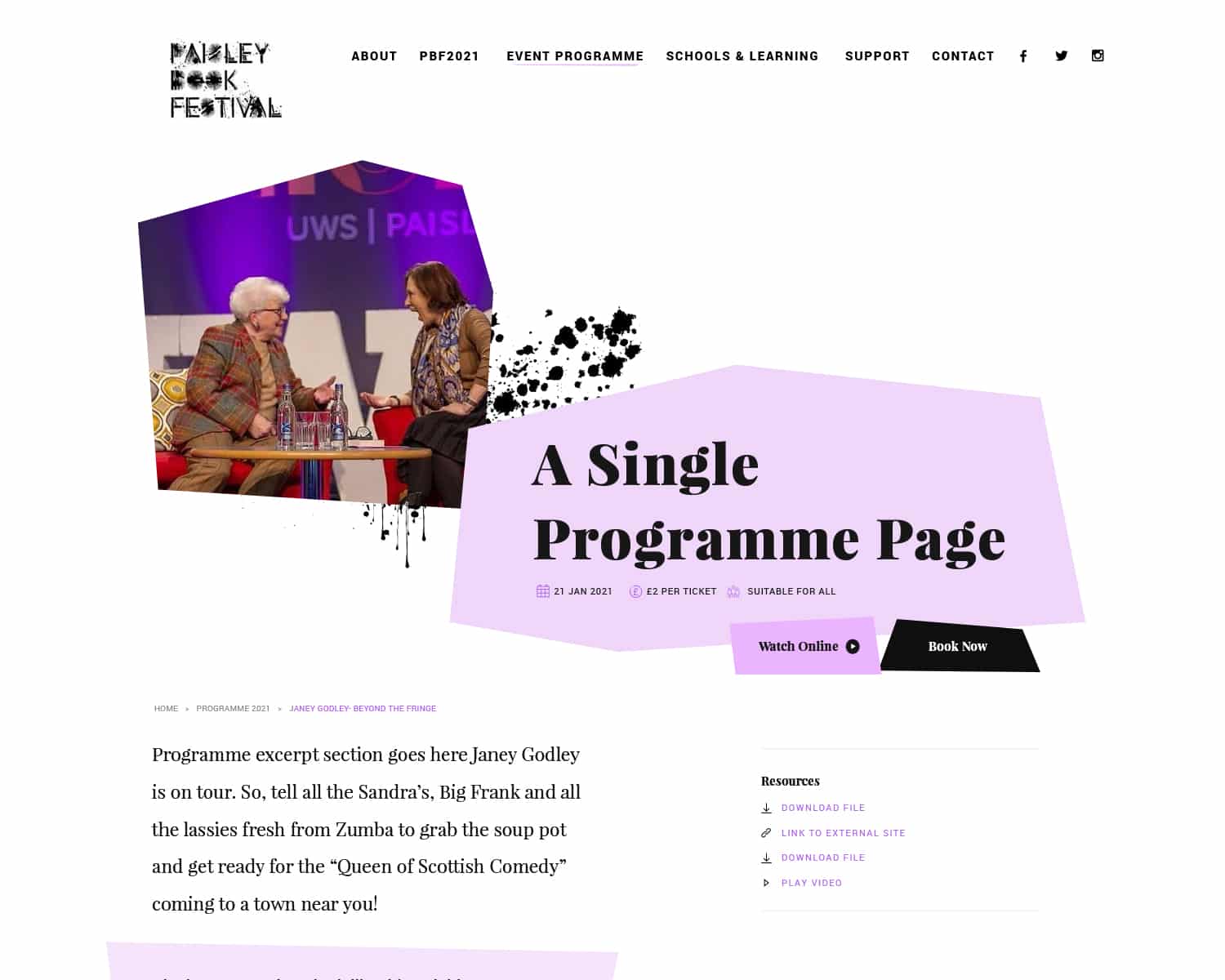
Online Programme
Each Programme page is neatly organized with all the key details, book and “watch online” buttons, as well as a featured summary of the programme. All of this information is densely, but neatly organized on the page so the user has all the information they need at a glance, whilst blocky background elements and splashed ink graphics give the illusion of a messy notepad page.
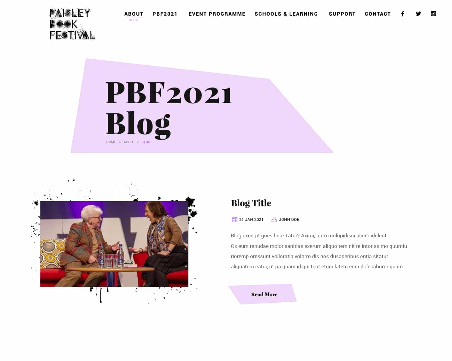
Online Blog
I designed a series of blog templates the Renfrewshire Council can use to create numerous blogs for the Book Festival in Paisley. The blog uses a magazine-style layout to help images and text pop out from the page.
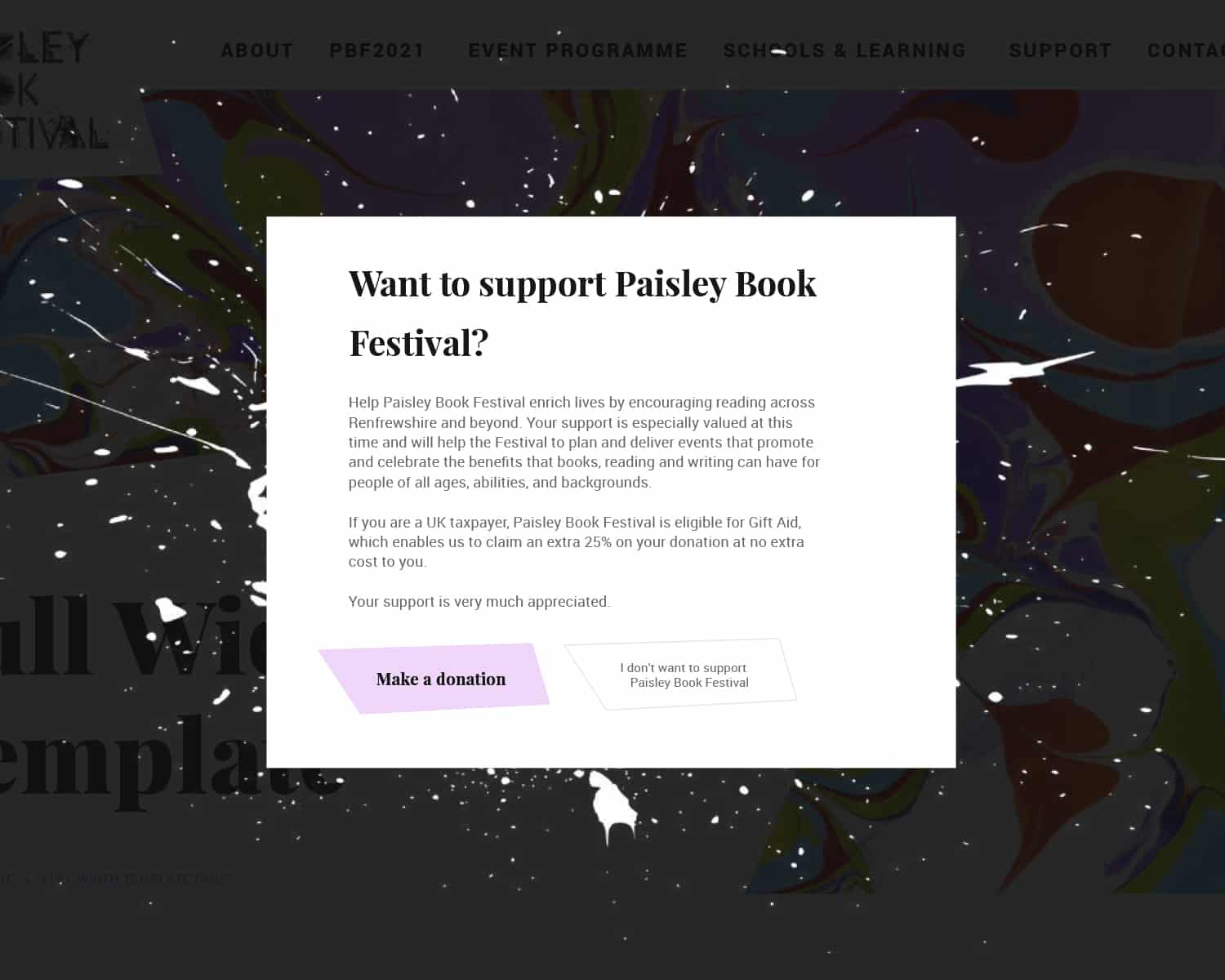
Popups for Support
To increase support and donations for the festival I designed a number of “support our festival” flashbars, and a dynamic popup which encourages users to donate to this important festival
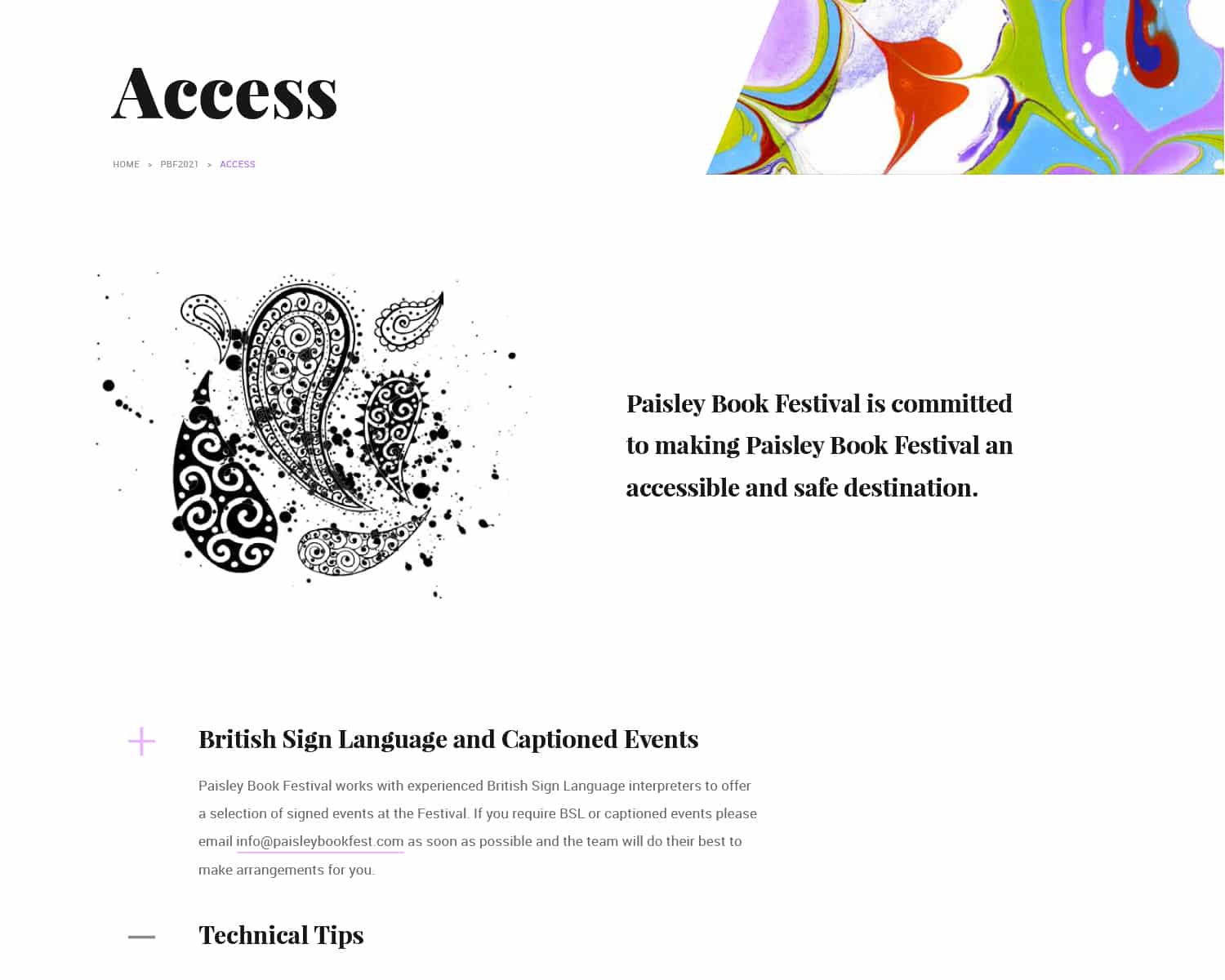
Accessibility
The accessibility page on the website ensures the online festival as as inclusive as possible, with dropdown accordions so users can easily find the information they need.
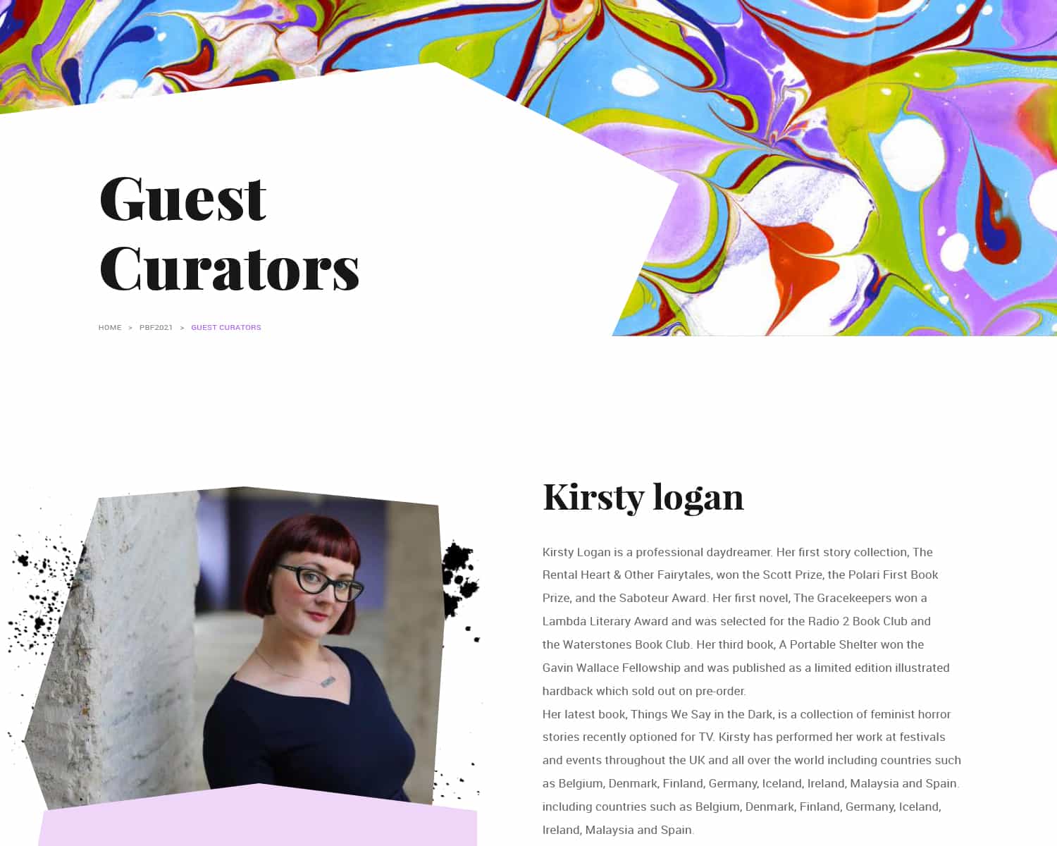
Guest Writers
The new Paisley Book Festival website features a page to showcase their guest curators with high impact imagery and a restrained layout to create a bio for each creator.
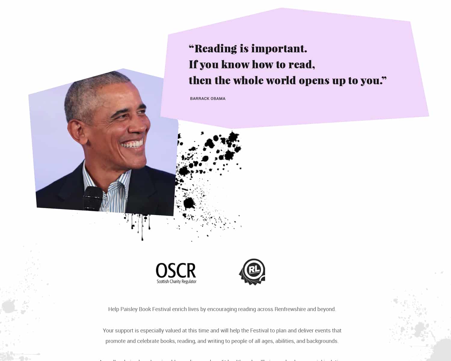
About the Paisley Book Festival
I also designed a number of custom pages to help the website stand out from the crowd, with these bold, block colour blocks and polygonal imagery to create the vision of a scrappy draft page from a writer’s notepad.
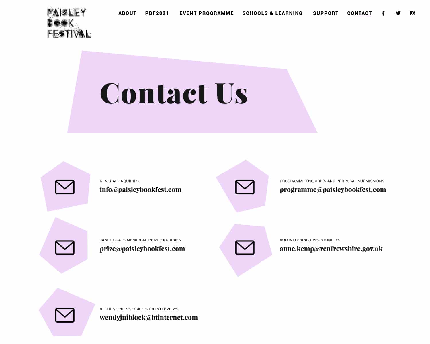
Contact Page
The new website design features a neatly arrayed contact page so users can easily get in touch with the relevant person at Renfrewshire Leisure.
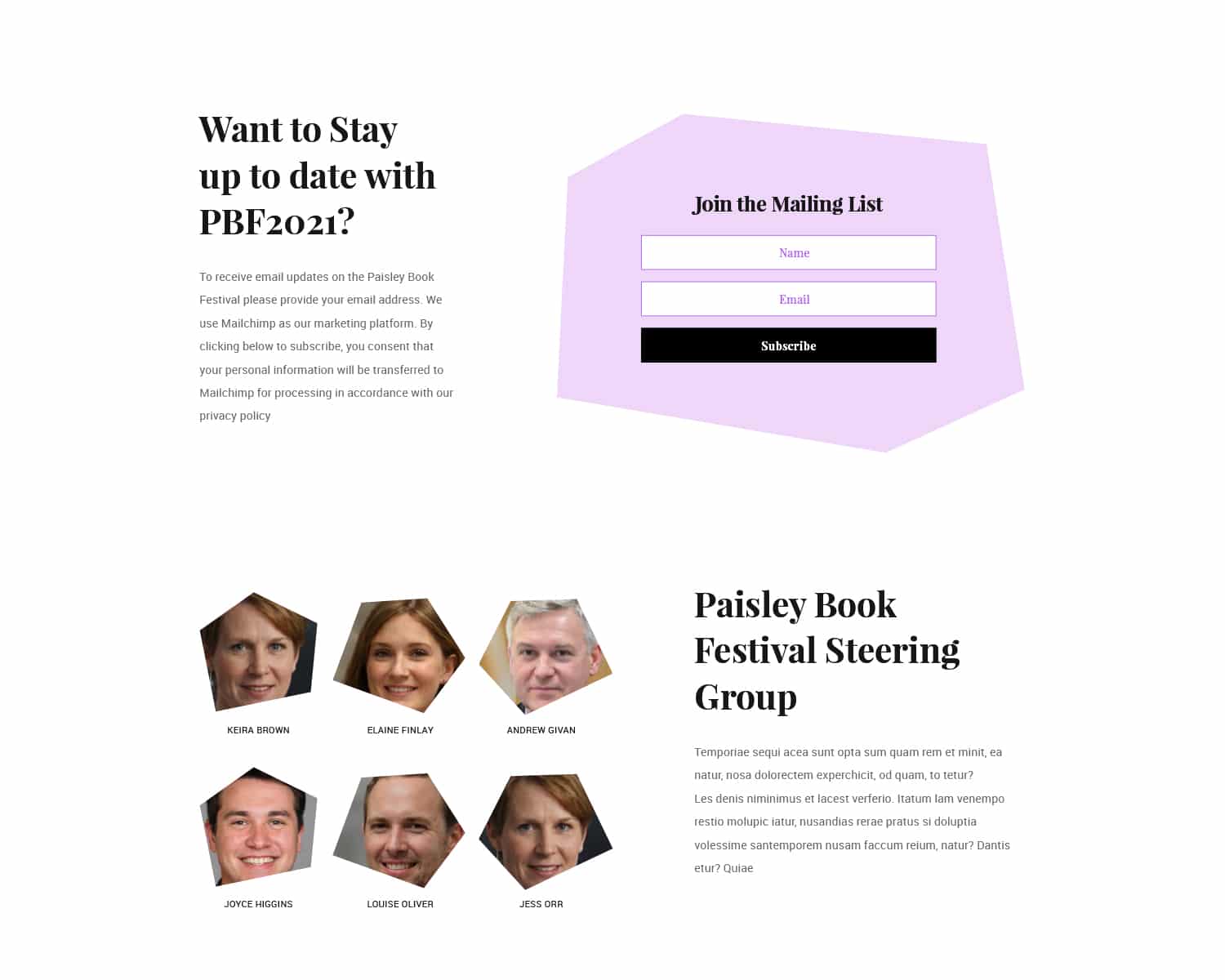
About the Team
The about page on the new Paisley Book Festival 2021 website uses the strong brand language with polygonal colour shapes, and bold cropped imagery along with generous whitespace to give the page a random appearance, while in actual fact, the design conforms to a tight grid for legibility.
Our Results

“
Very quick to turnaround a UX job that was at short notice, we were very impressed with Nick’s response to the brief. Would urge you to consider them for website design
Keira Brown
Paisley Book Festival
More Success Stories from Design Hero
Loading...
