A new brand identity for an ethically-sourced seafood company in Scotland
Play Video
The Challenge
Design Hero was challenged to design a new brand that would establish each business with it’s own personality, whilst still paying homage to the parent brand’s heritage.
The Deliverables
Sectors
The Brief
West Coast Fish Market is a family-run seafood company, who were in the process of expanding from 2 local fish vans, into “West Coast Sea Products”, launching x3 new business ventures, each with a different target market and goal. Design Hero was asked to help guide the new brand strategy and dvelop a visual identity for each of the child brands.
We designed a range of brand collateral to support all x4 brands, including signage, graphics, printed promotions and social media assets.
A high impact brand to help an ethical seafood company expand their business

Design Hero helped West Coast Fish Market expand to the new “West Coast Sea Products”, with a new brand to encompass 3 “child” business ventures, each with their own distinct personality, but all clearly living under one umbrella brand.
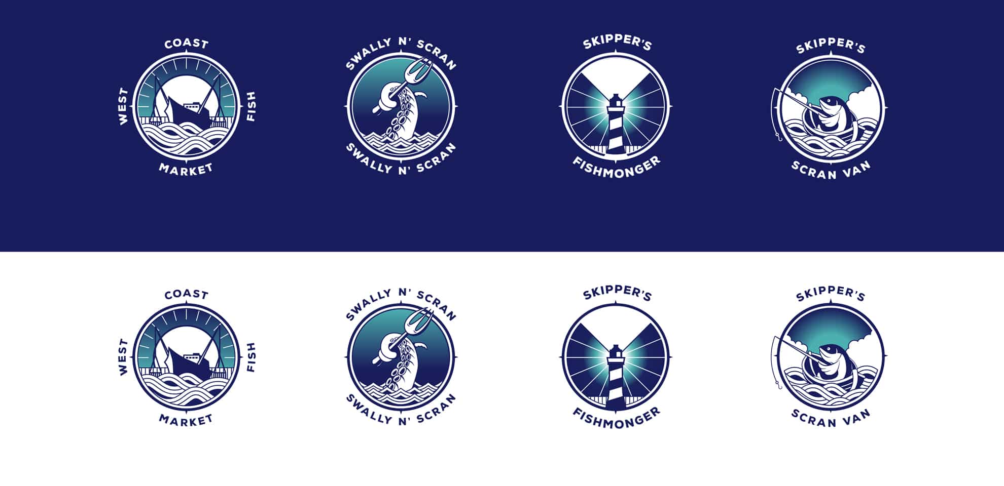
Family of logos
The brand is designed with flexibility and futureproofing in mind.
To that end, we have created a family of logos for each arm of the business.
As a whole, each subbrand is instantly recognisable as the same family.
But individually they can stand alone as a brand by themselves
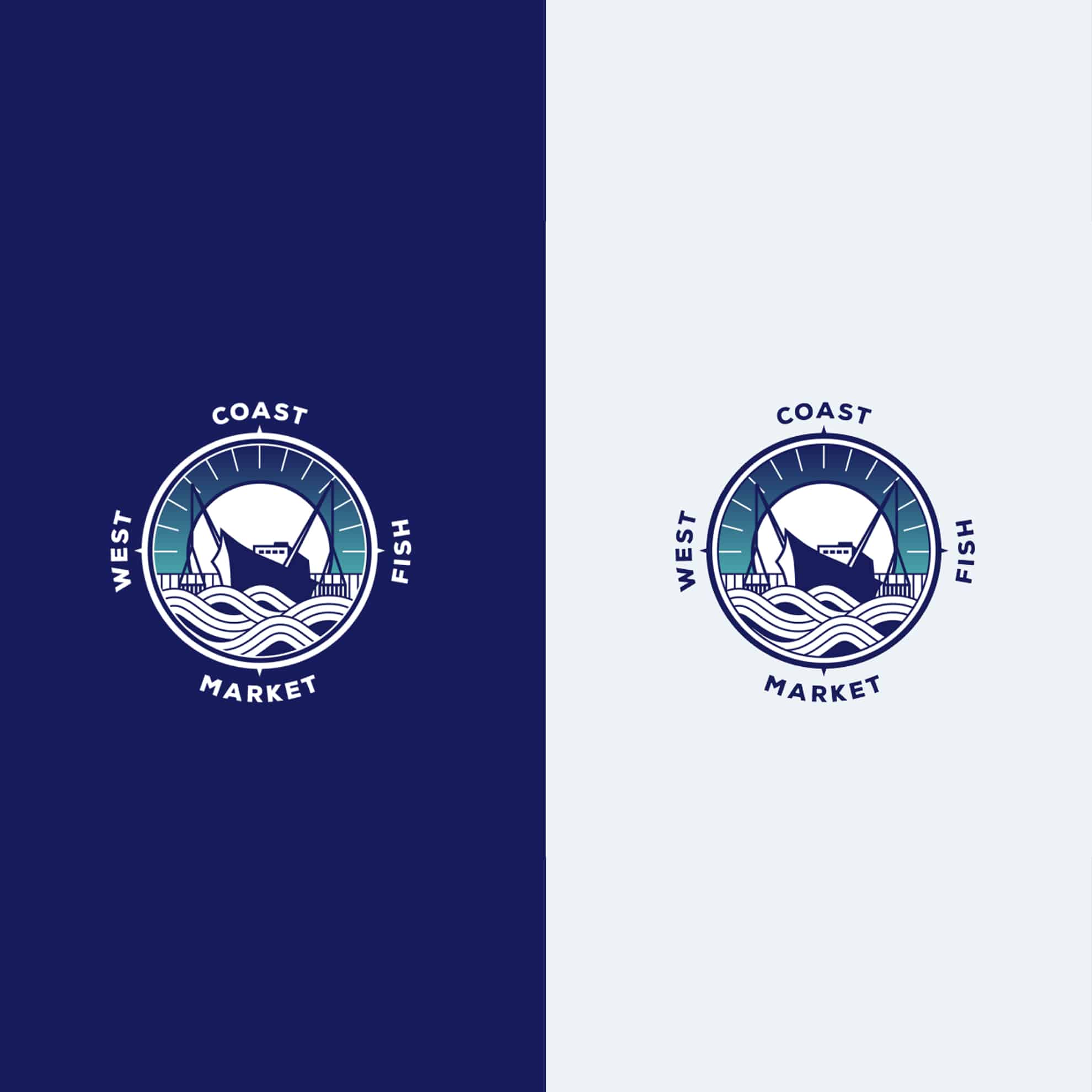
Parent logo
The parent logo for the core brand.
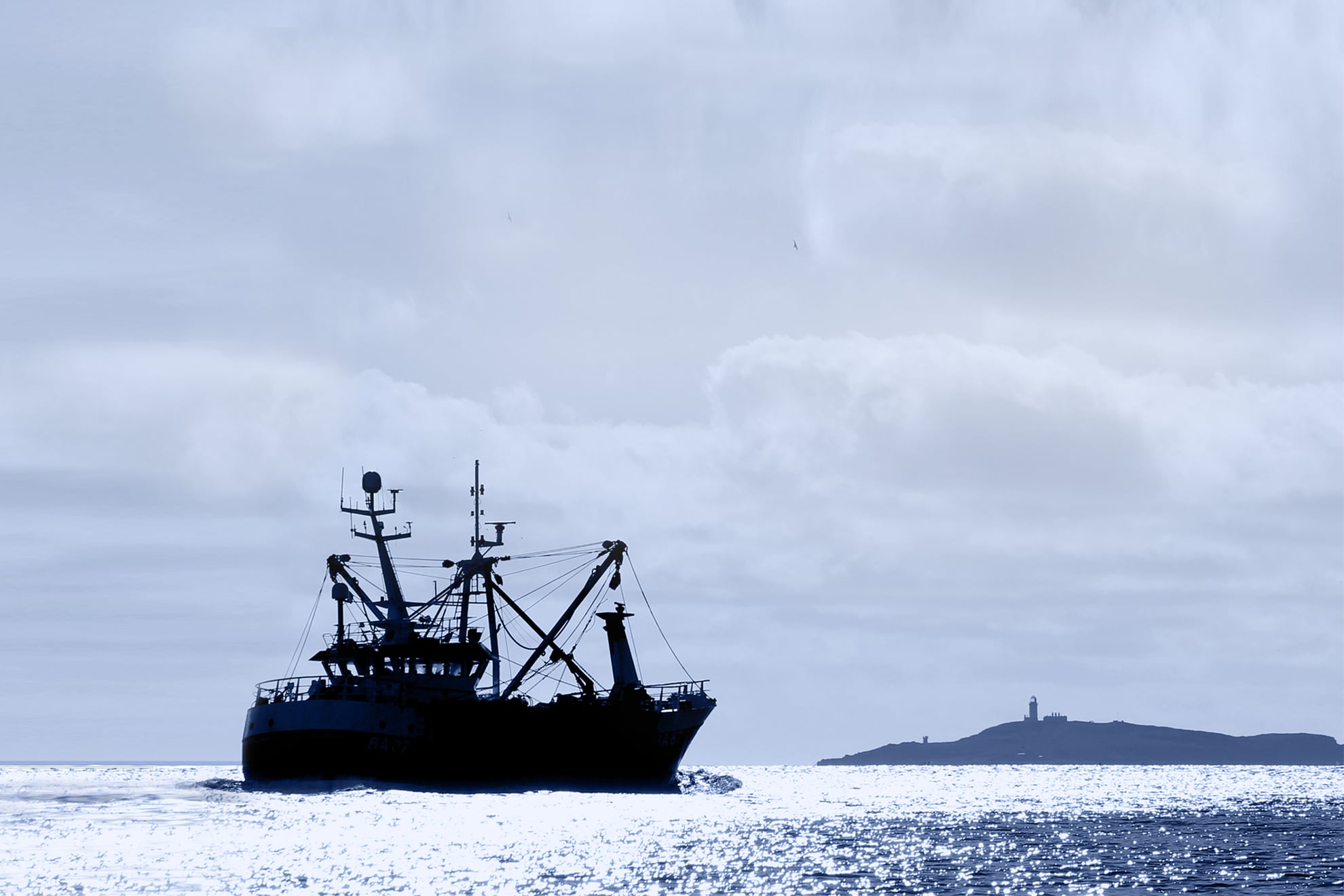
This logo design uses the iconic cliffs of Little Ross, along with the signature silhoutte of a fishing vessel. As these cliffs come into sight our boat captains know they aren’t far from home port.
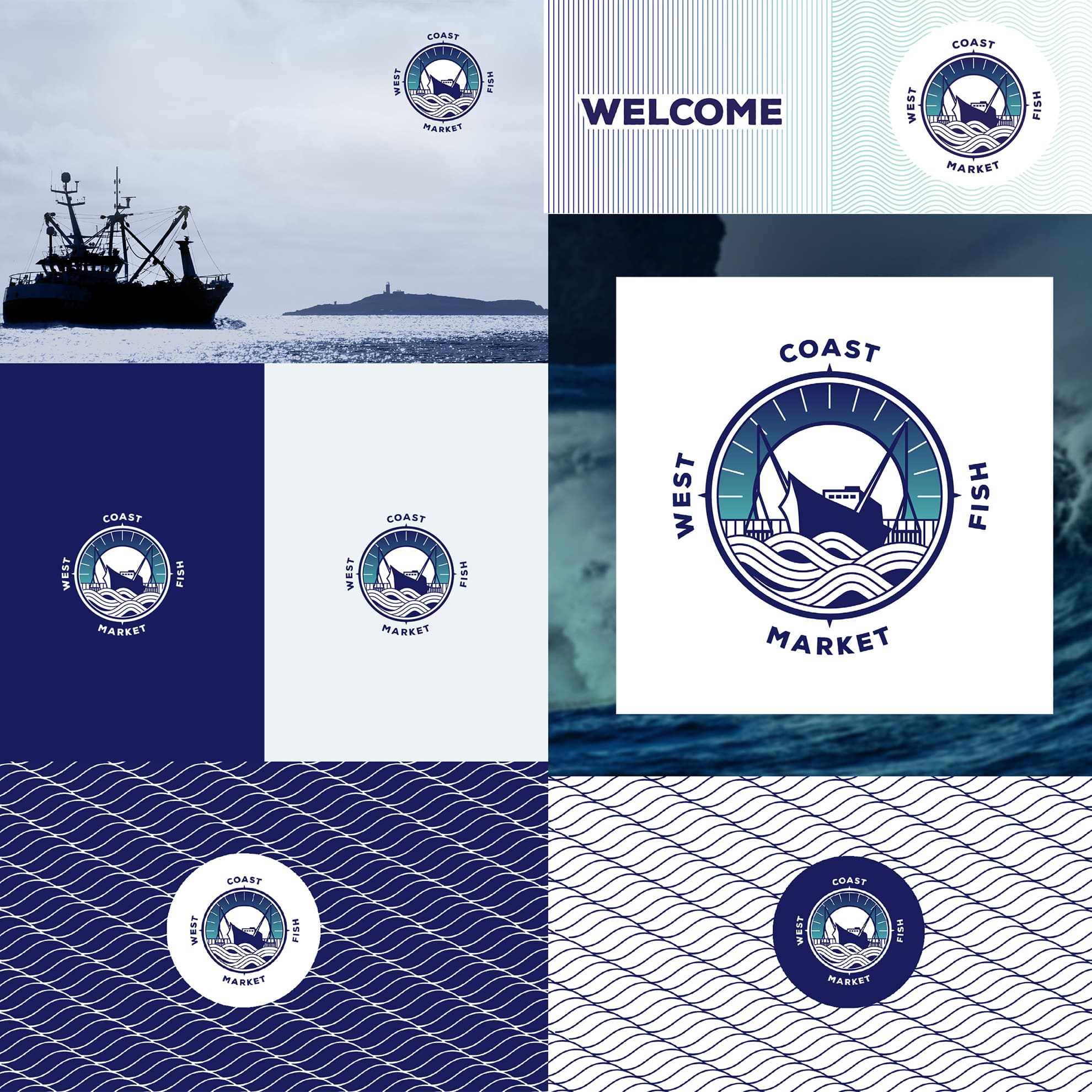
Logo use
The logomark can be used across a variety of backgrounds including colour background and photography
Brand vision and tone
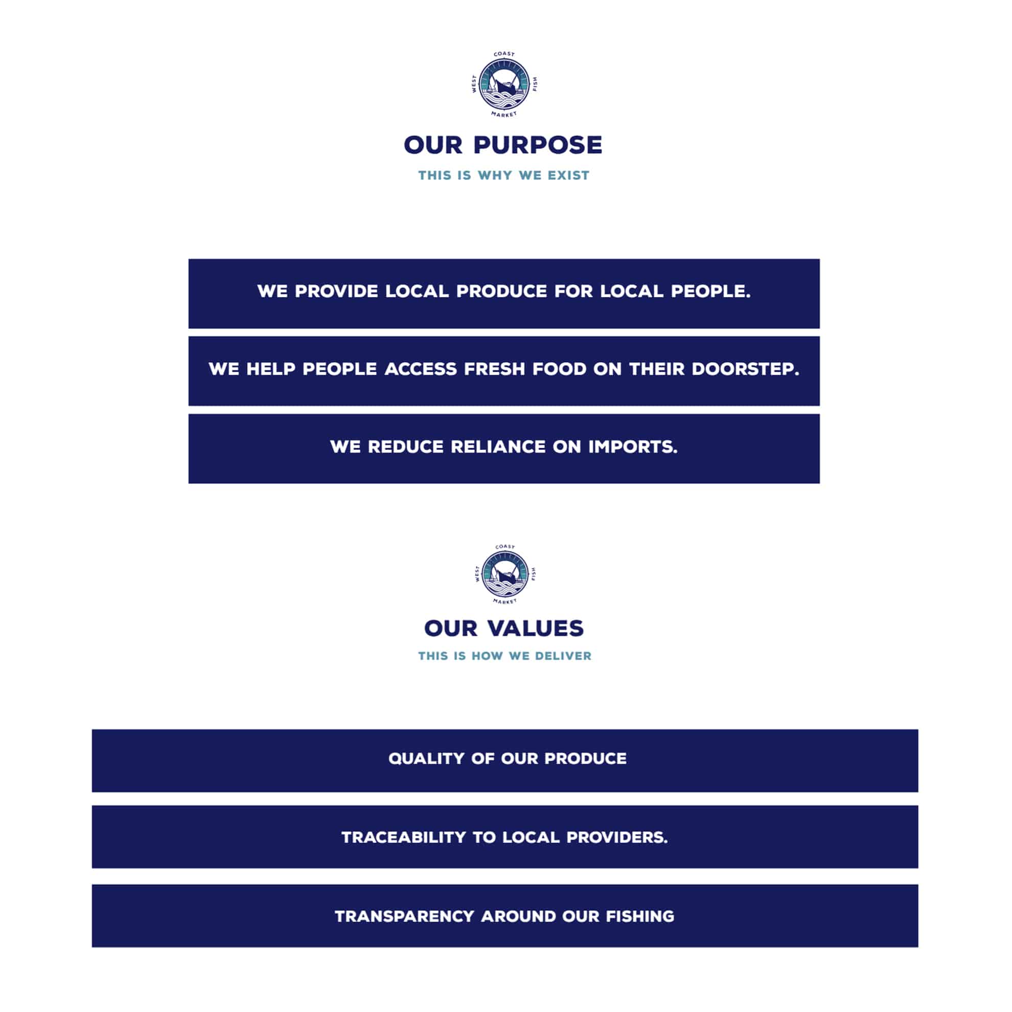
We helped West Coast Fish Market with brand strategy to gain clarity on their purpose, vision, mission statement and goals, and aligned the new brand with this new sense of direction.
Brand collateral
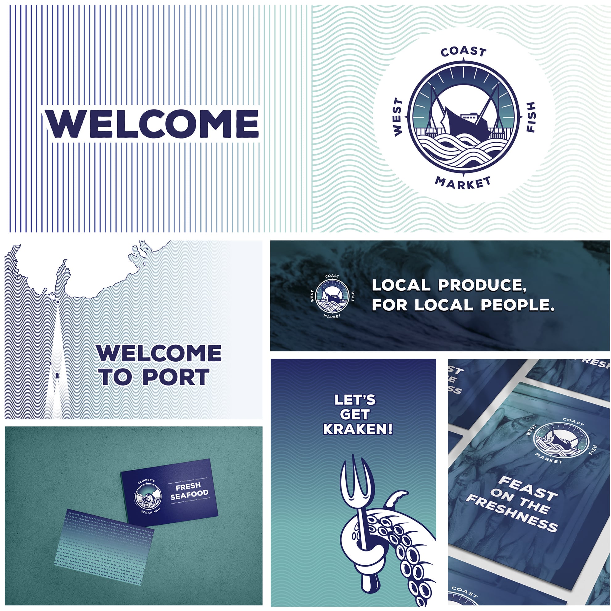
We designed a range of brand collateral to support all x4 brands, including signage, graphics, printed promotions and social media assets.
Skipper's Fishmongers logo design
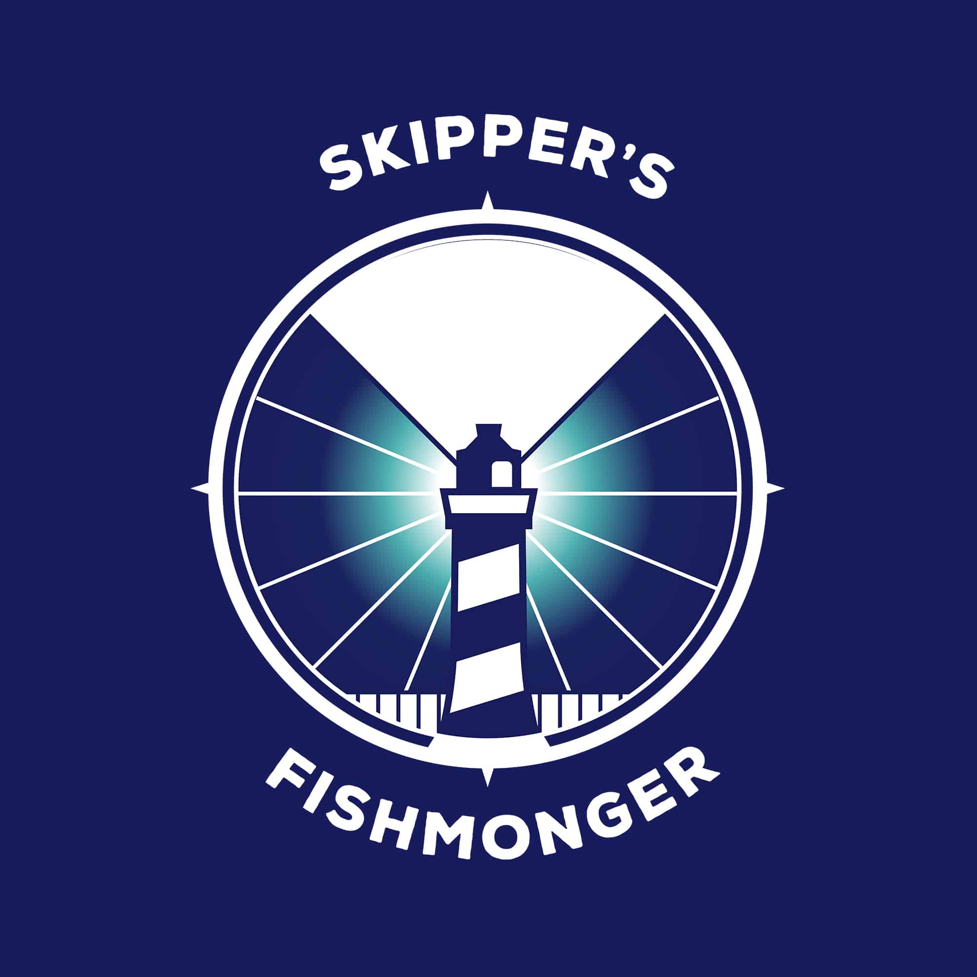
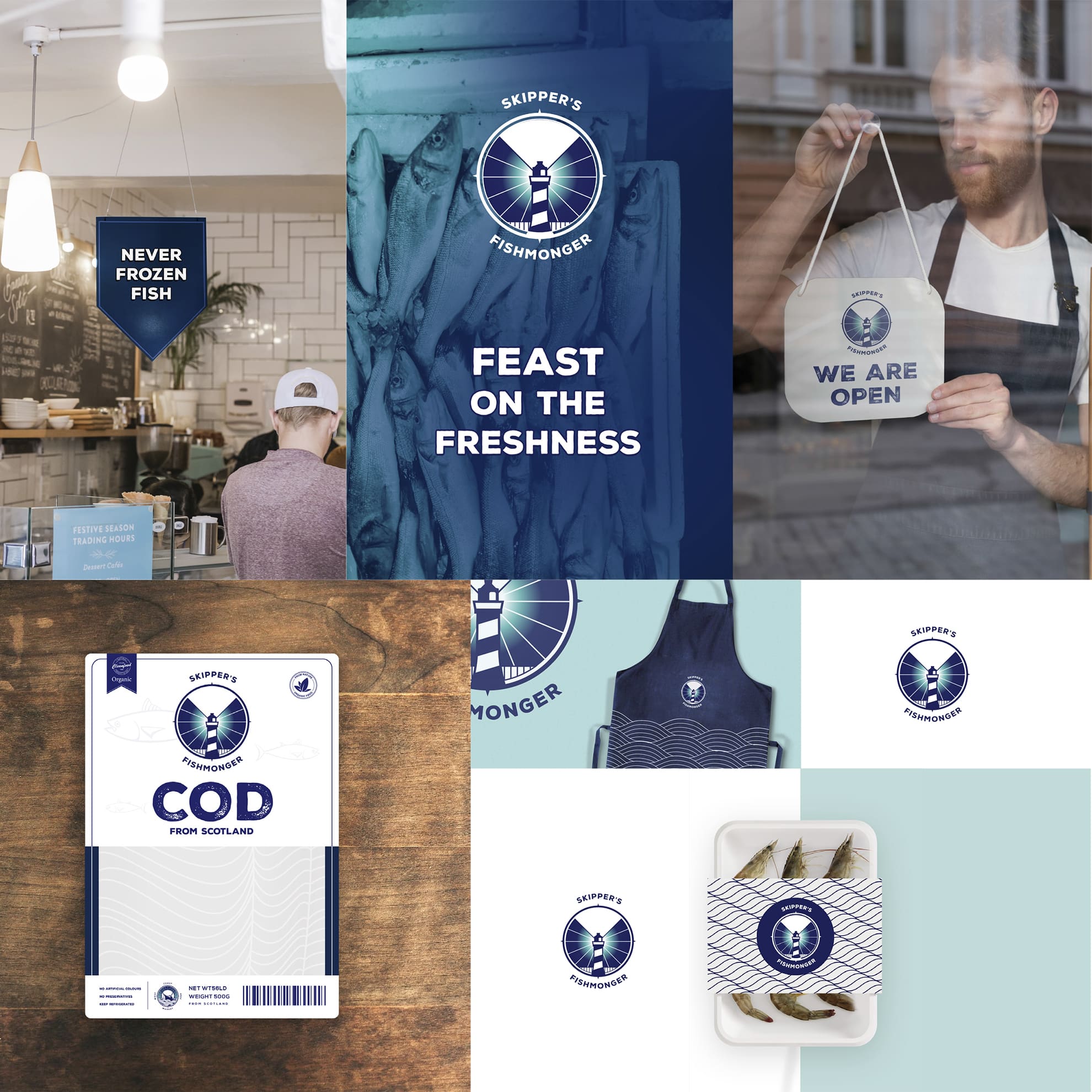
The sub-brand for the fishmonger arm of the business.
This logo draws directly on the imagery around Little Ross lighthouse to anchor the brand to the local area….
pun intended.
Skipper's Fishmongers brand
Skipper's Scran Van logo design
The sub-brand for the mobile arm of the business: the seafood vans and stalls
The playful nature of this logo reflects the more casual approach of this sub-brand, appealing to good times and family eating
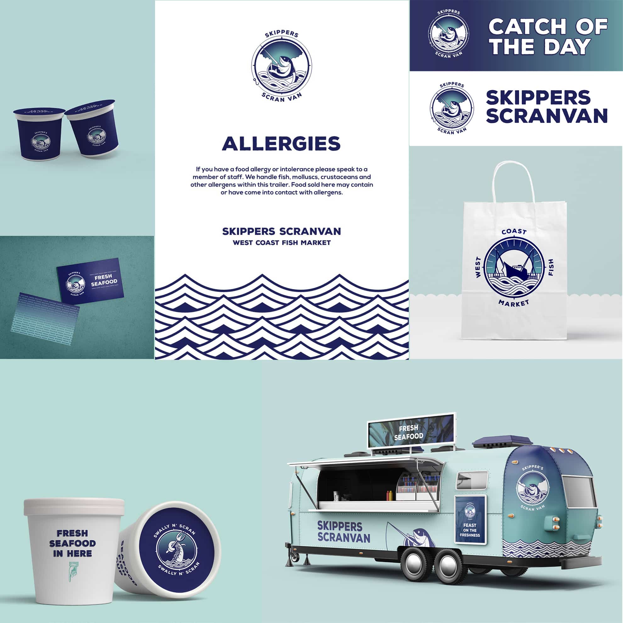
Skipper's Scran Van branding
Swally n' Scran logo design
The sub brand for the foodcourts and seafood restaurants and bistro.
Similar to the scranvan, this subbrand uses striking imagery of a kraken tentacle, piercing through the waves with a contradictory fork.
This surprising imagery gives this subrand a young-hearted, fun nature, and allows more playfulness than with the more serious WCSF parent brand
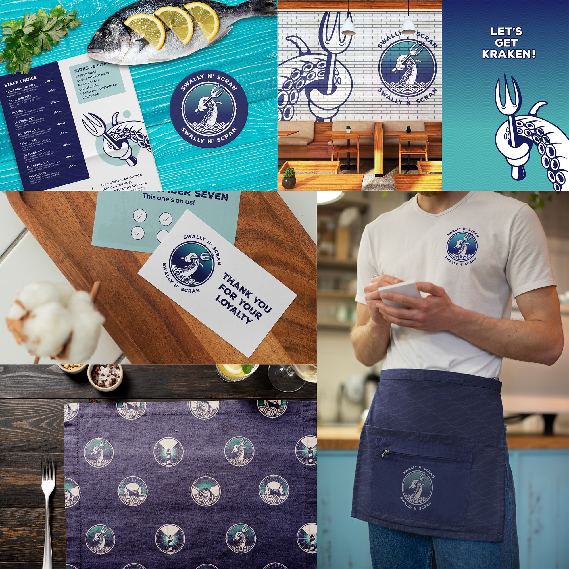
Swally n' Scran branding design
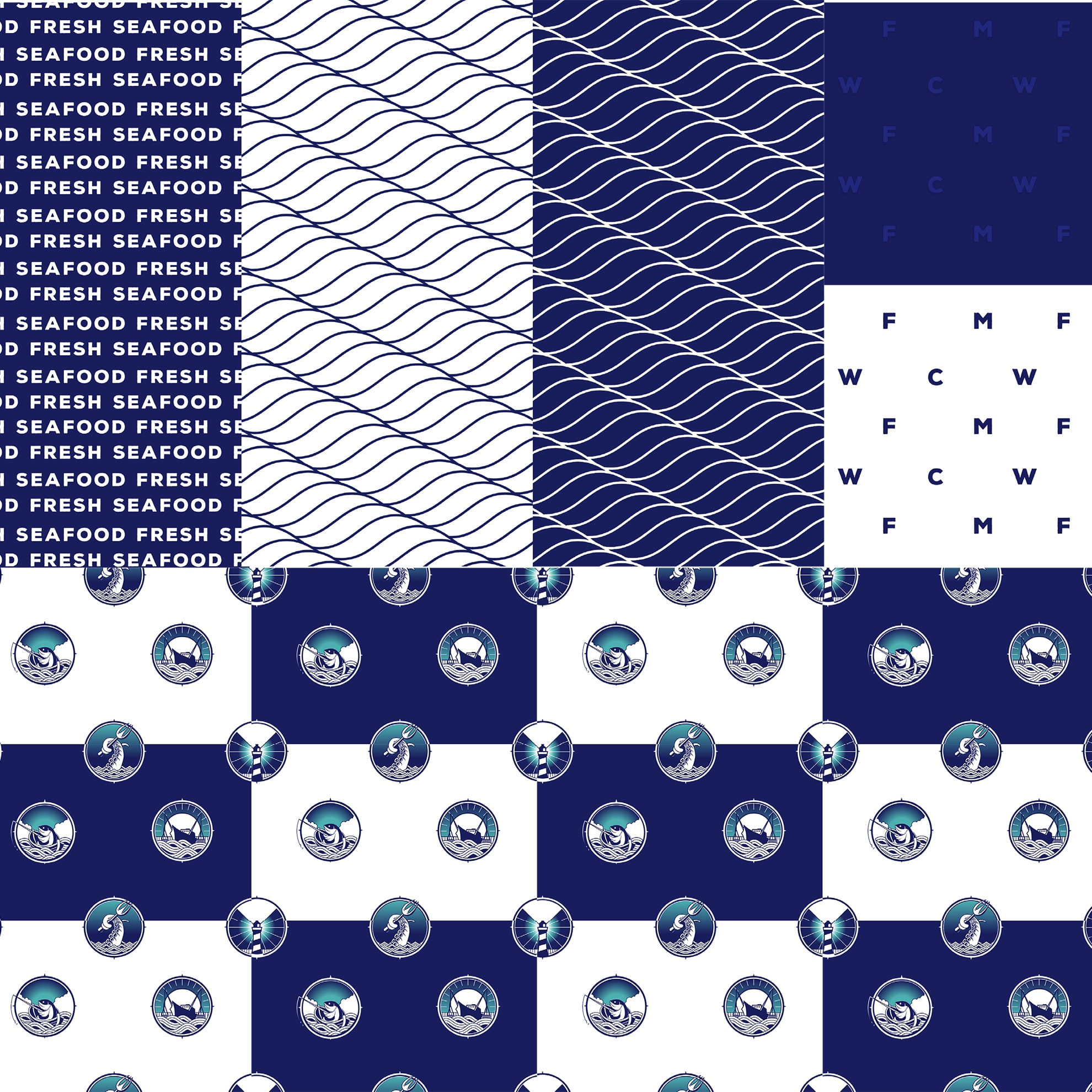
Brand patterns and iconography
Brand patterns are an effective and exciting way to create instant brand recognition that carries through your business’ physical presence at most touch points.
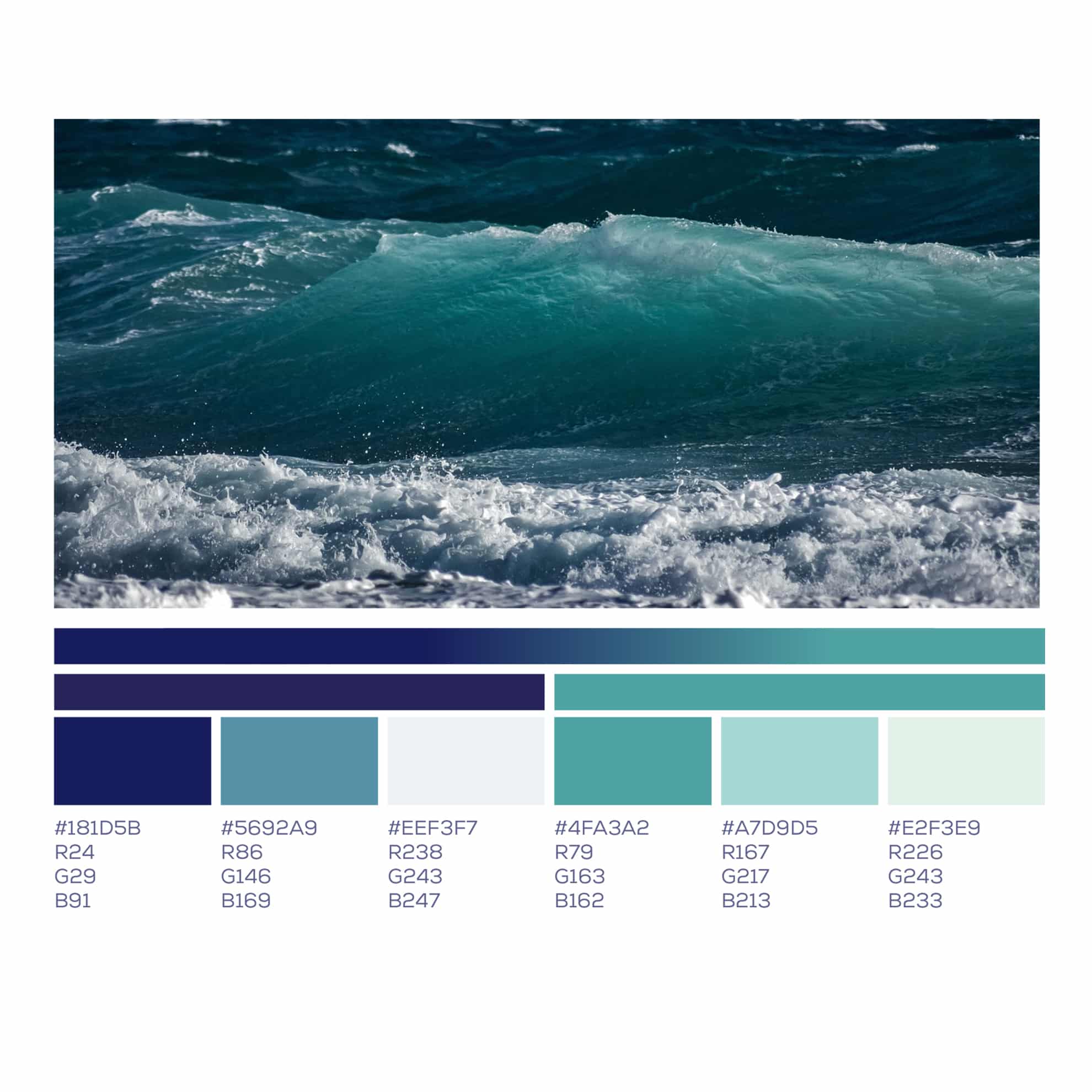
Colour and typography
The brand colours are inspired by the source of our products: Salt, spray
& sunbeams through sea waves
The brand font a “rough edge”
to cut through the sterile, professional fonts seen in competitors, and gives a
more casual, rustic, weathered appearance.
The weathered appearance adds to the age of our rich heritage
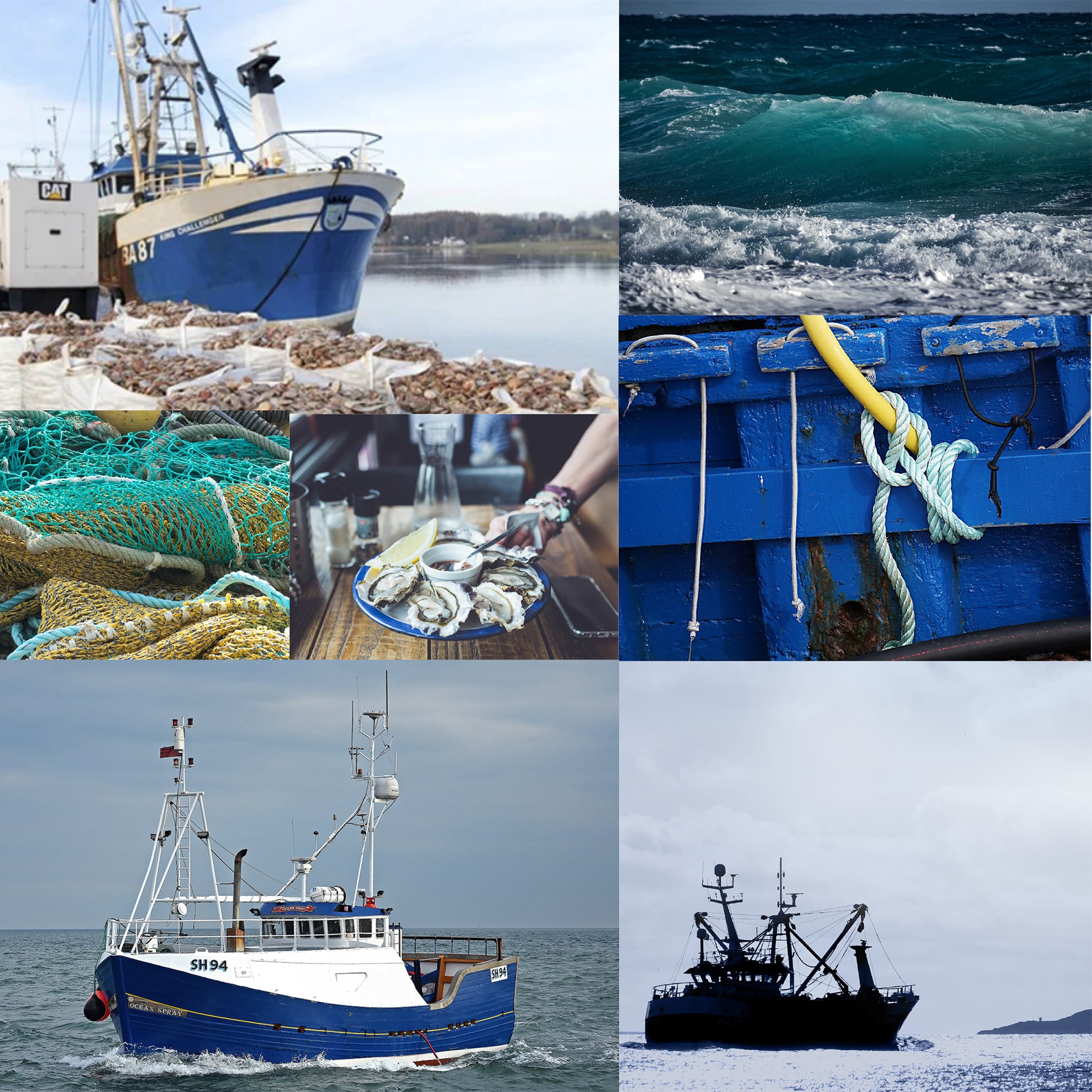
Visual direction
In this brand we build a picture of traditional nautical mythology, but with just a hint of comedy
in the logos to give a modern, casual twist.
The visual style of the photography uses a consistent nautical theme, combined with almost mystical, subjects which tie in with our fantasy nautical theme.
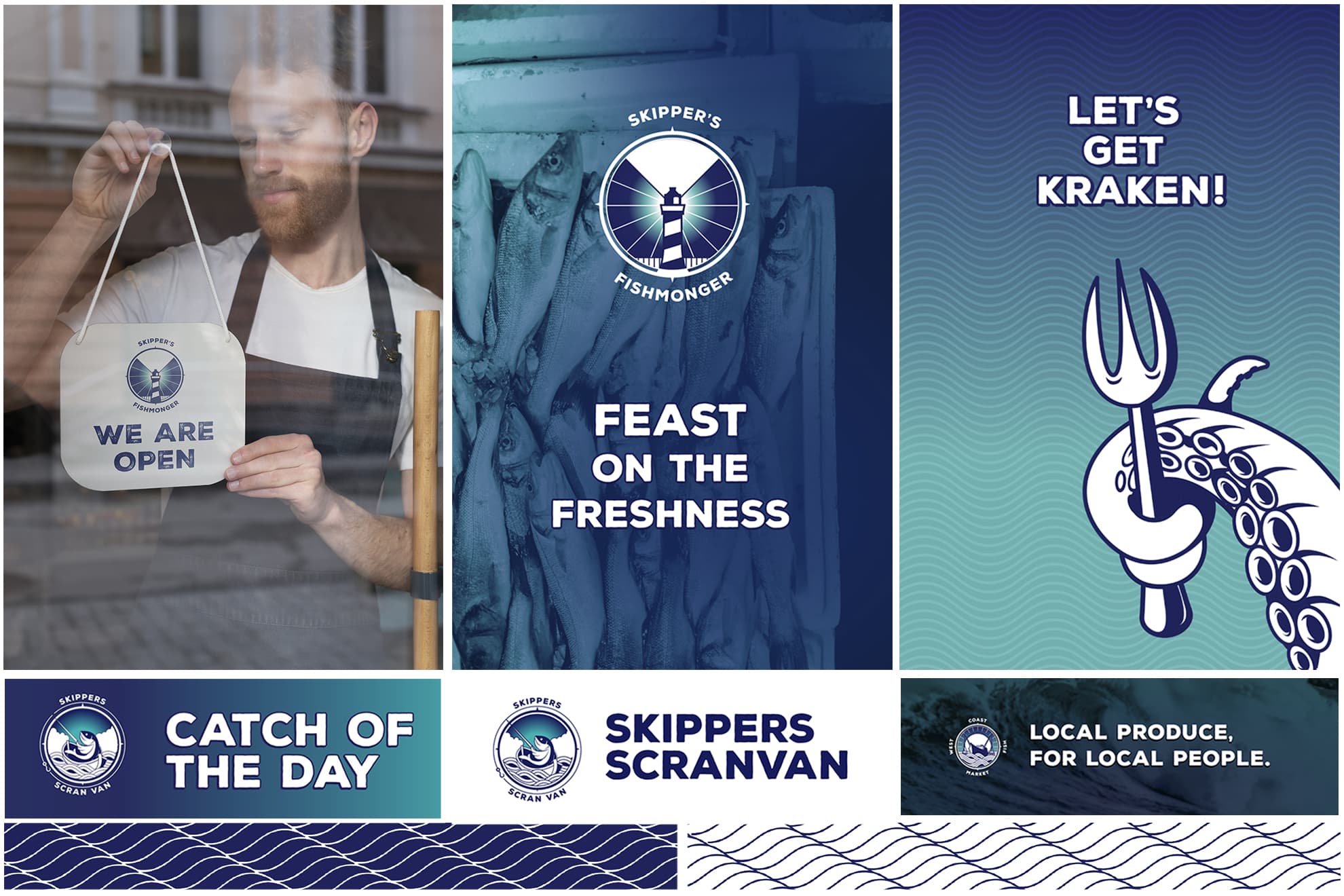
Signage and graphics
The visual style is bright and vibrant.
with recurring visual patterns and repeating elements to tie the brand together.
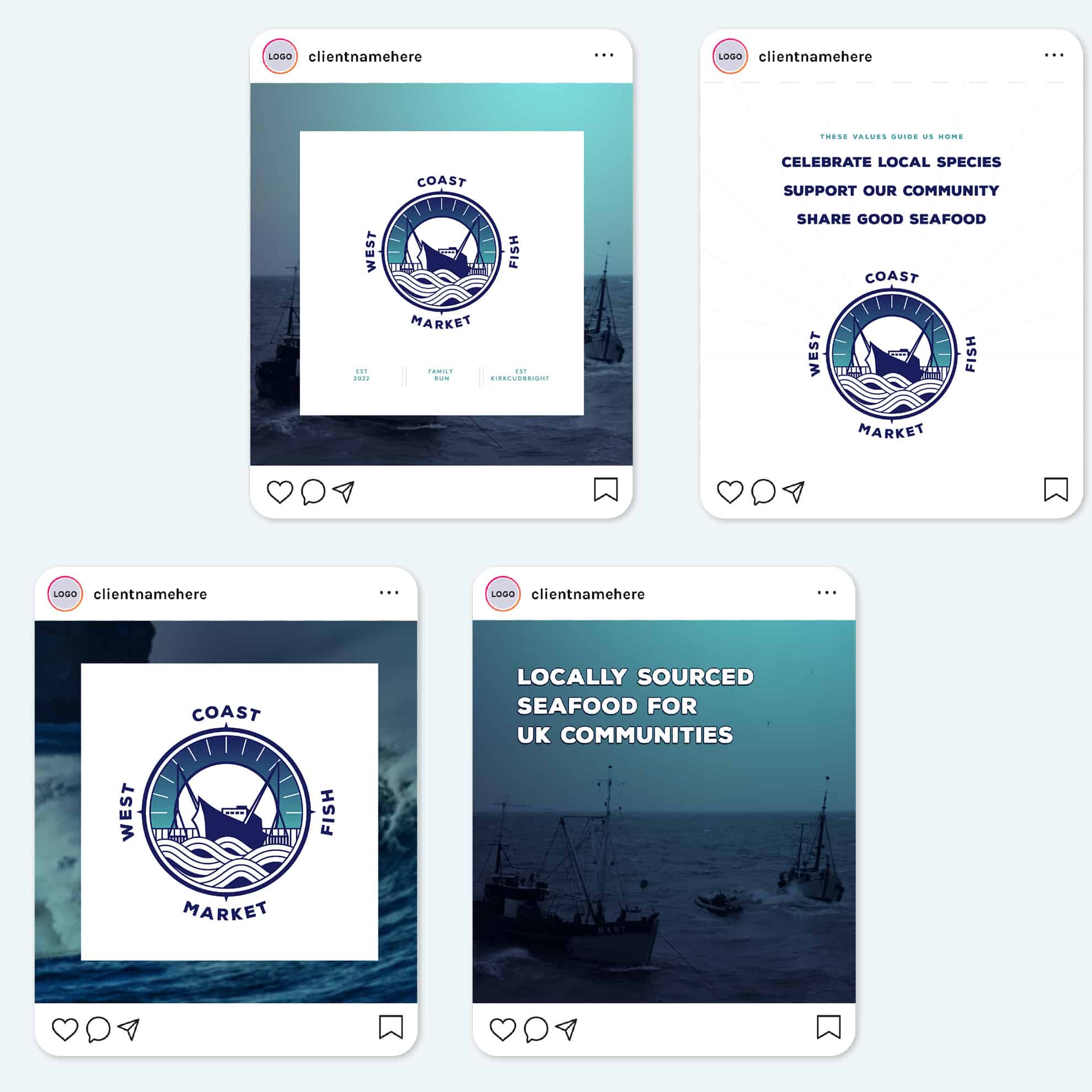
Social media assets
We also developed a range of social assets and templates for the client to use across their channels
Our Results
“
Nick provided a fantastic service and delivered everything we asked for. We are so pleased with the final designs for our business. We had 4 brands to tie together which he created excellently. We are looking forward to launching the new brands in due course! Thanks, Nick. From Alice and Hannah – Skipper’s Scran Van
Alice & Hannah
West Coast Fish Market
More Success Stories from Design Hero
Loading...
