Want to achieve the best design for your Ecommerce Landing Pages?
Struggling to squeeze more sales out of your ecommerce site?
You could be missing key points that will help you to improve your sales funnels on your website to boost sales for your online shop…
Design Hero web developers build the best ecommerce websites in the UK. We use a fail-safe formula to boost sales on any and every E-Commerce website that we design.
We’ll walk you through a perfect example of the best landing page design principles that convert website visitors into sales in 2021,
Here’s a real-world example of an ecommerce website we developed in Glasgow, UK, to help Arkay Sales sell their new mattress online.
We’ll go through a real-world step-by-step case study for their new landing page on their online shop in the UK.
Ecommerce landing pages hero section
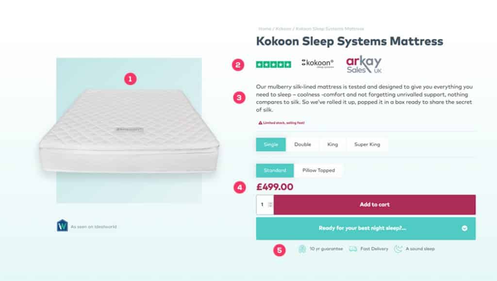
The hero section on your ecommerce landing pages is one of the most important parts of your online shopping experience.
This is the customer’s first glimpse at what you are offering so use it to present the buyer with all the info they need. Ecommerce web design needs to be clever- so the challenge is to get as much information as you can into this mini sales page without it looking messy.
Make sure your UX designers specialise in landing page design, using up to date tools such as Figma to present the design before moving onto the web development phase.
Good online shopping website developers understand how to concisely provide the customer with the key information they need whilst keeping the page appealing and simple.
This is the key to designing high converting ecommerce landing pages:
- A clear image
- Accreditation & Trust signals
- A clear description of what they are buying into
- Clearly show the price
- Main benefits and features
Build trust in your ecommerce sales funnel
You quite simply wouldn’t buy from someone or somewhere that you didn’t trust would you? Good retail website design highlights testimonials and focuses on building this trust. This section is really your way of saying “don’t just take our word for it”- let your existing customers show them just why they’re going to love the purchase. So the next tip for good landing page design is for it to lead into the main ecommerce landing page with nice images and follow these by short snappy review snippets. Online shopping websites are fully dependent on trust and credibility so the importance of these testimonials and reviews is critical for e-commerce.
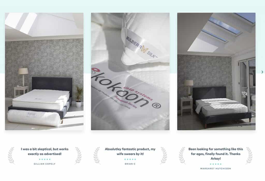
We also recommend professional level photography to help your users buy into your online shop, show them that you’re the real deal and your products are worth investing in.
Design Hero contacted Harrison Reid at PhotographEverything for professional staged product photography
Highlight benefits to increase sales
When selling to your customers you have the what and the why, the features and the benefits. Now nobody buys a plane ticket to just get on the plane do they? They buy a ticket to get to their destination so- sell the destination.
In other words, good e-commerce web design prioritises the why– the benefits. Short pieces of text that tell your customers exactly why they need this product will do the job. No one reads excessive blocks of text so make sure your benefits aren’t lost in large texts.
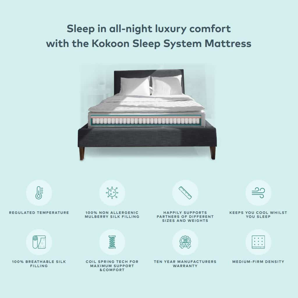
Of course explaining to customers what they are getting is also important. Good online shop website developers will often use icons to present the main features. This is a really clean and concise way of visually presenting that information to the customer without chunks of text.
Provide proof on your landing pages
How can you prove to your potential customers that what you have said is true and why that makes it worth purchasing?
This is where it’s actually ok to mention features and expand on any information you have given already. Make sure you aren’t making wild unsubstantiated claims… remember that thing about trust?
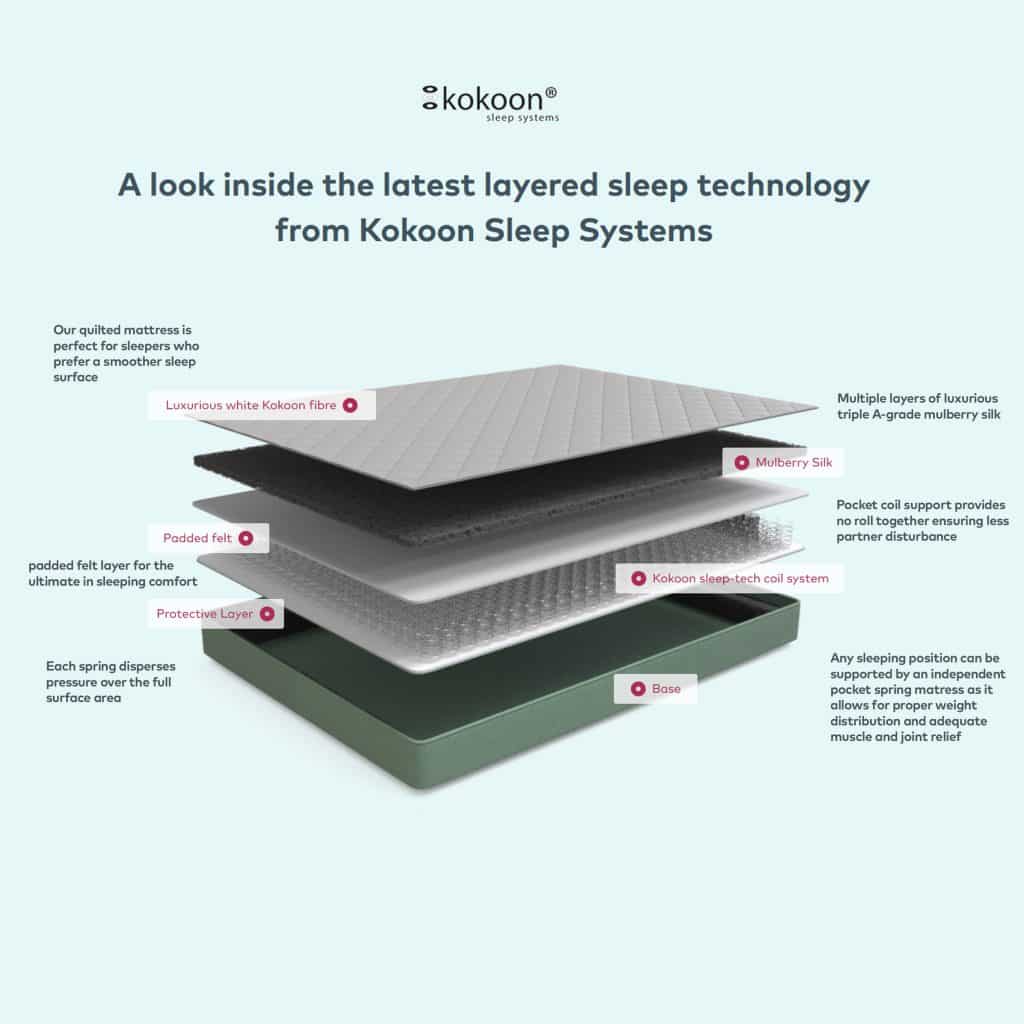
For the Arkay mattress, we back up our points with proof throughout the landing page. Now this is our way of saying “Don’t just take our word for it- it’s science!”. A professional 3D render for products shows the tech behind the product from a scientific-led angle. In some cases accreditations, certifications or even customer testimonials prove that you’ve gone the extra mile and are worth buying from.
Build USP by going the extra mile
So now that they want your product, convince them why they should buy it from you. It really helps to show what you do differently from the competition. So how can you go the extra mile?
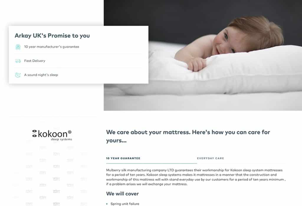
Set yourself apart from competitors so that the customer knows they want to buy from you and not them. Highlight any guarantees, free returns, free trials or special delivery you may offer.
Build your brand throughout your sales funnel
This is another form of building social trust on your ecommerce landing pages. People like to buy from people they know, so let them get to know your brand!
Many consumers also operate by feeling, rather than logic when it comes to online shopping and purchasing decisions online.
A strong brand will help your customers identify with your products and business, and buy into the products or services you sell.
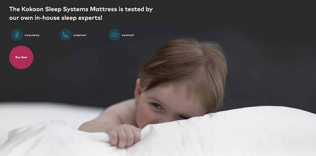
So it isn’t just perks that appeal to customers. Build your brand to set yourself apart from the competition and create a business that people want to buy from. On Arkay we shamelessly used Martin’s baby (free labour!) to emphasize this is a small family business not a large corporation.
Offer incentives on your landing pages to improve online buy-in
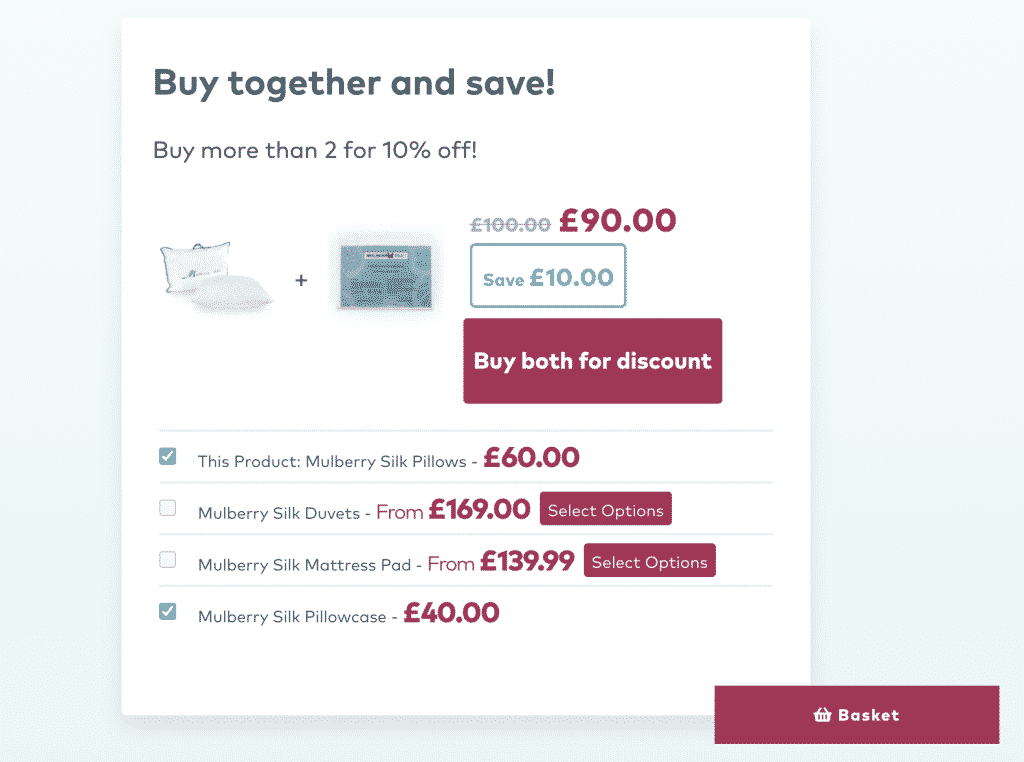
Your customer has reached this point- they are definitely interested! Make them aware of any discounts or incentives to buy that you have and that could be the final little push they need to complete their order. Good retail website design will also add in cross-selling and upselling at this point so that your customers’ orders can include everything they need.
On Arkay’s new e-commerce website we even highlight exactly how much the user is saving at the cart!
Close the deal and convert your site traffic into Sales
Don’t fall at the last hurdle. E-commerce website developers know that the UX/UI process is key- ensure that your retail website design is simple and user friendly. Every time you overcomplicate something it is another chance for a user to leave and a sale to be lost. You want the sale to be as easy to carry out as possible. We use a sticky “buy” button on Arkay so that the user can jump to close the sale at any point.
Summary- improving your ecommerce sales funnel.
E-commerce web design should be simple and concise:
- Sell the product
- backup your points with evidence,
- sell your brand
The best E-commerce web designers will cleverly combine visual and written text to highlight different information to your customers. Retail web designers need to understand the customer, their shopping habits and how to make the online retail experience seamless- that is how e-commerce landing pages convert in 2021. The Arkay mattress landing page has done exactly that and is a prime example of bespoke e-commerce development.
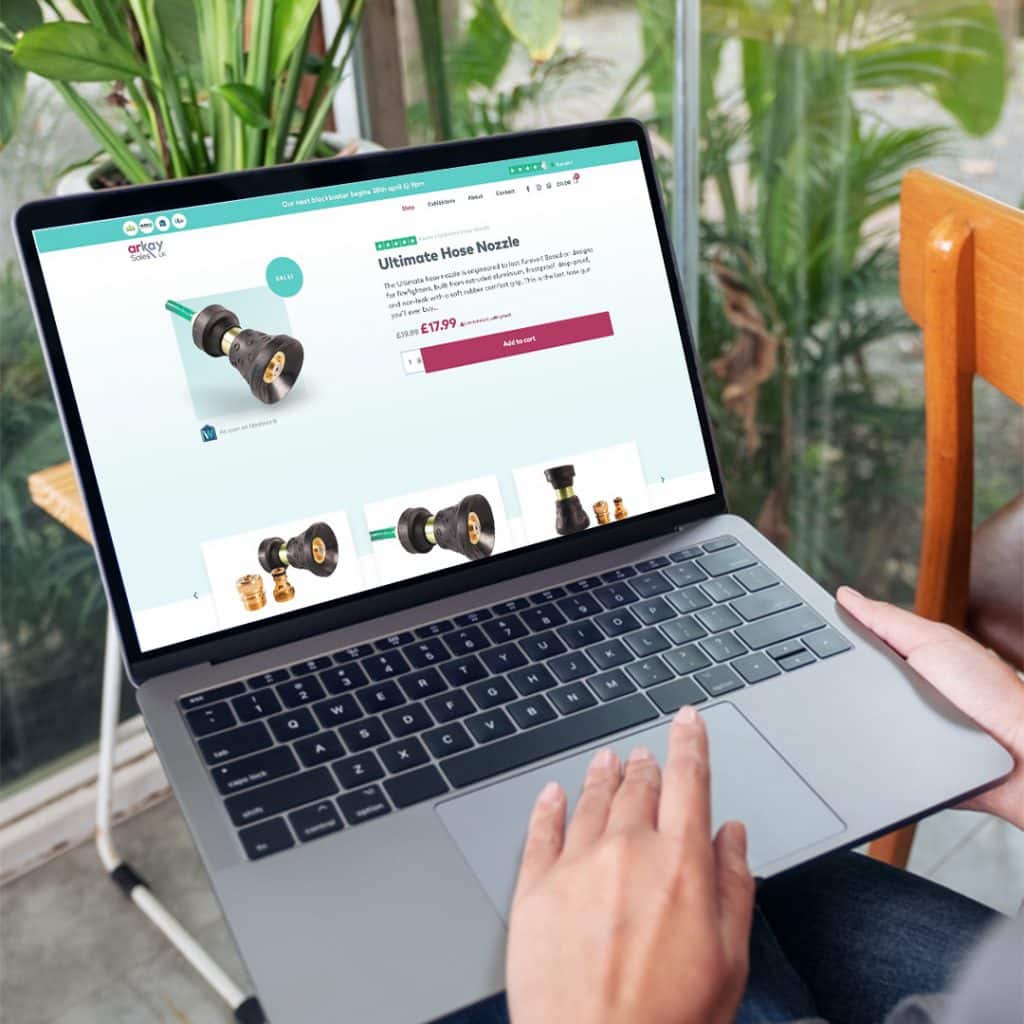
Do you run an online shop or ecommerce store?
Now that you know how to design the best landing pages, you may also want to read about our magic formula on how to improve your landing page conversion, plus there are lots of other ways to boost sales from your e-commerce website, including ways to target existing customers for resale with email marketing
If you’d like some help improving conversion, increasing sales on your online shop, get in touch with Design Hero for a free ecommerce consultation, or even just some free advice!
About the author

Nicholas Robb, Founder
The original Design Hero founder, solopreneur and marketing expert; Nick will help you supercharge your business success with a broad skill-set spanning a range of digital marketing fields.
If you want help growing your business...

