Want to squeeze more conversions out of your landing pages?
You might be spending a fortune in PPC google Ads, or running the most amazing social campaigns but if your site visitors don’t convert then you’re wasting your money!
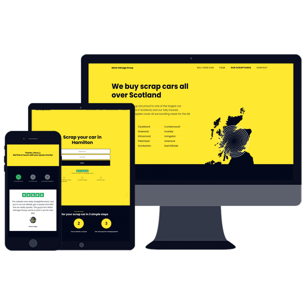
We’re going to look at a specific case study of a lead generation website we did for Motor Salvage Group,
This new service business website converts like crazy, it started gathering leads from pretty much day one and is average 5-10 leads a day about a month after launch.
We’ll show you how we squeezed more conversions out of this landing page, and how to turn site visitors into sales 🤑
The best bit?
These tips are also applicable for day to day sales processes whether it’s your website, a face to face or an email pitch…
and you can apply them again and again to any sales situation, by mesmerizing your users with a scientific formula that works every time.

The right landing page design can improve your conversion rate
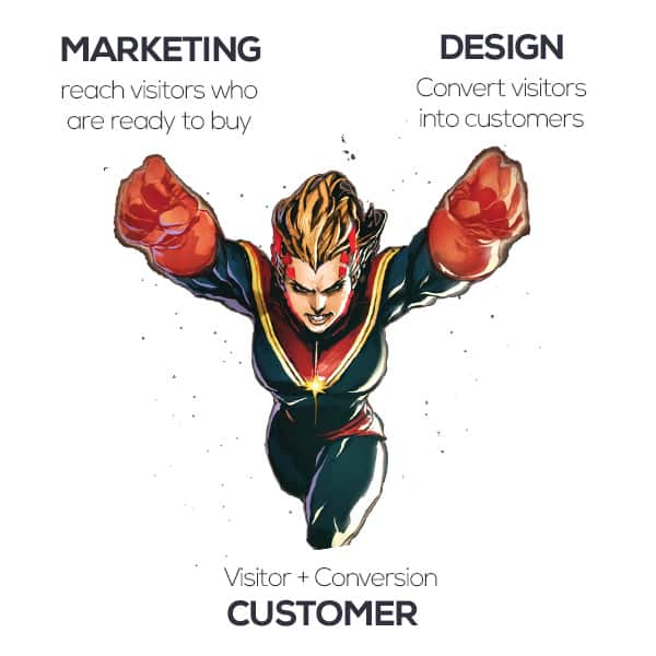
Usually, clients ask me how to get more traffic to a website, but this is only half the story.
The first half of the battle for more leads is getting people to your website.
But what happens then? At this point, your customer has stepped into your shop to browse, but you still have to buy!
Any good marketing agency knows the second part of the marketing process is turning those visitors into customers.
Trust = Conversions = Sales
How to build trust on your website landing pages
The actual design of your website landing pages might vary;
The fonts, the colours, the imagery will be specific to your brand.
But the best landing pages have a well-disguised formula at work;
the goal of which is to make you trust the brand, and buy into the service or product on offer.
Perfect your Sales Pitch & Offer
The best bit about this magic formula is it doesn’t just apply to landing pages. A landing page is basically just a sales pitch on a website.
And any sales pitch can be optimized.
So you can use these tips and apply them to any sales pitch in your business
That means:
- Website Landing pages
- Face to face sales
- Elevator pitches
- Email proposals
- Advertising
Read on to see how Design Hero has applied these marketing conversion strategies and sales pitch principles to a landing page for Motor Salvage Group to improve their conversion rate, increases sales and ultimately boost profits…
Your Unique Value Offer
People don’t like being sold to, and will only stomach so much sales talk so make sure you get straight to the point and either:
- Provide an essential service which they can access cheaper or more easily than the competition.
- or highlight the unique value you offer over the competition.
With Motor Salvage Group we know that the customer just wants a quick easy service.
Our focus is on highlighting the ease of the scrap car selling service.
Get Straight to the Point
Don’t force the user to scroll through pages of content to get to the core of what you do. tell them straight up so they know why they are here,
You’d be amazed at how many users convert straight from the landing page, so it’s best to give them a way to do this if they wish:
On Motor Salvage Group we know that the customer just wants a quick easy service.
So we provide them with a simple form immediately on the landing page for the website, and tell them why they’re here:
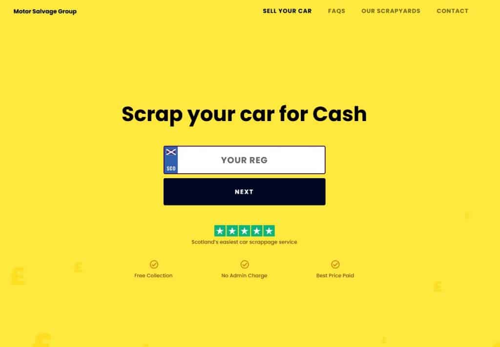
This is a service business niche, so we can afford to be more direct than in other sectors.
If your marketing a consultancy business, or for websites for professionals you will want to highlight your key benefits, rather than go straight for the kill, however the same tips apply:
Short, simple statements are nearly always more successful at converting than flowery language.
So now our user knows why they are here.
But why should they buy from you over someone else?
Create Social Trust
People are social animals.
Despite what those awful Santander adverts say, people do like to follow the crowd.
It’s hardwired into our brains as pack animals as a way to avoid dangers in the natural world.
Nowadays we don’t have much to fear from predators,
Instead, we’re bombarded by advertising and marketing and constantly vigilant against dodgy deals and buckshee salesmen.
But people only trust people they know, and naturally distrust those they don’t.
It’s why we cross the road to avoid someone handing out “free samples”
(or used to before we crossed the road to avoid them because of…you know… COVID).
Even in this modern world even with online shopping websites, remote learning, zoom consultations, and VR meetings where distance is no longer a barrier to communication and cooperation,
people still search for business in their local area first, and don’t like dealing with outsiders who aren’t part of their tribe.
So if the customer doesn’t know your business, they don’t trust you.
In fact they’d probably trust a total stranger more, because the stranger isn’t trying to sell to them anything.
The opposite is also true:
We like to buy things from people we know, like and trust, even if we don’t necessarily need that product or service!
So here’s how to break down the barriers and establish trust with your customers.
Testimonials
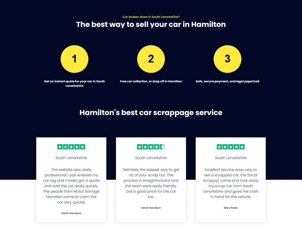
Testimonials on your website, even if they are from strange, help your customers grow to trust you, since you provided a positive experience to other customers.
Seems obvious, but many people still do testimonials wrong.
- Unless you are on a specific case study page, aim for 3 testimonials.
- Use testimonials which talk about the value you provided, not what you did for them.
- Keep your reviews simple and legible on a high contrast background.
- Show names, titles and ideally a picture of the person.
- For your testimonials, use images with eye contact and smiles if possible.
Bonus tip, eye contact and smiling is a cornerstone of trust, so staff photos, profiles, about us with real photos of your team smiling and making eye contact will help establish trust. Let your customers get to know you, rather than being a faceless corporation. And everyone knows corporations are evil. We’re looking at you, Facebook.
Don’t make them too long, the value of your business needs to be clear from one skim read.
On Motor Salvage I’ve used “trustpilot” style reviews for added bonus points.
Accreditations
Do you have any legal accreditations? Has your business won awards? Does your staff have recognised training certifications or are you associated with a major national brand?
If so nows the time to shout about them.
This all shows your business is established, legitimate and isn’t disappearing anytime soon.
Features
If your business doesn’t have accreditations, put in some kind of feature boxes with the main benefits your business offers over the competition.
- Are you the cheapest?
- Do you offer an instant online quote?
- Is your services the best quality in the area?
What we’re doing here is establishing why a customer should go with you over any other competitor;
So what does your business do that’s unique?
In this case, we didn’t have any legal accreditations so instead, we’ve highlighted the extreme simplicity of Motor Salvage’s scrap car sales process, as well as excellent customer rating
So given how simple our landing page for Motor Salvage Group is, look how hard it’s working in terms of conversion:
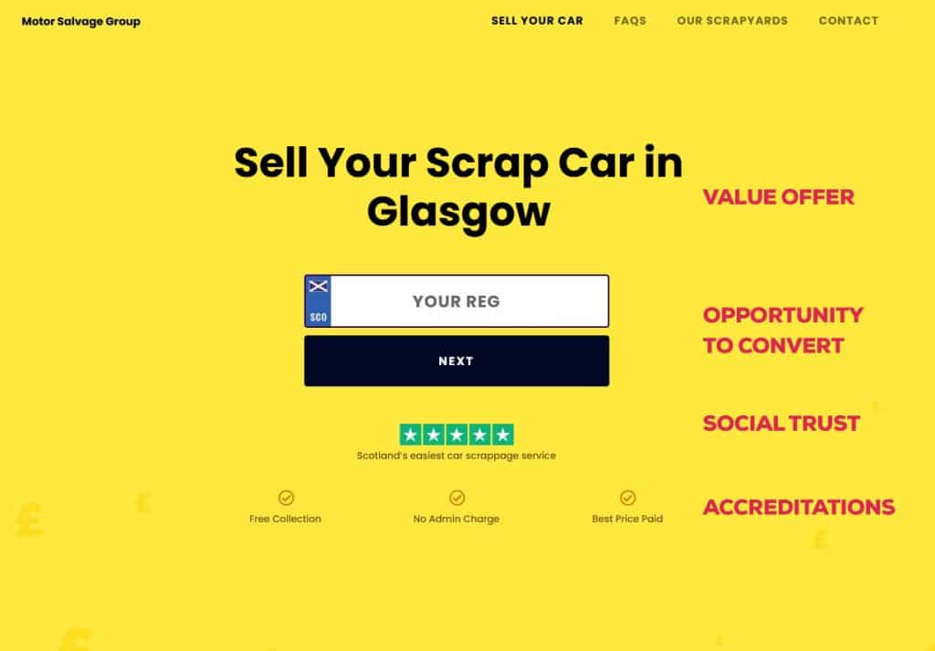
The hero section of this landing page, is itself a mini-landing page with lots of trust-building elements within the first pass from the user.
Influencer Endorcement
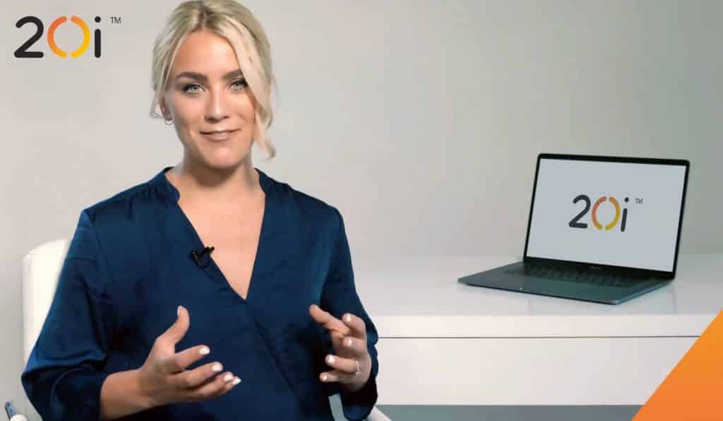
If you have an authority figure you can lean on to endorse your services even better for building trust.
If your customers already trust that personality, then that trust will be passed onto you.
Unfortunately, there aren’t any celebrities in the scrap car business.
Here’s an example for 20I web hosting’s landing page using Georgie from the Gadget Show to promote the tech behind their service.
If you’re not on first-name terms with an A-grade celebrity, then you can use a “customer profile” as a substitute;
Pick a customer who has had a fantastic experience with your business and ask them if you can write a short bio, and summary of their experience with you, and ask them if they can endorse your business on your website. You can always offer a wee voucher or gift as a bribe in return for their time and patience.
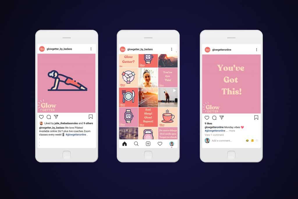
Social Feeds
Motor Salvage Group doesn’t have much of a social presence so we didn’t use a social feed on this landing page.
Only use a social feed on your website if you actually run a social feed, nothing looks worse than a social feed with nothing on it.
It’s a bit like a bar with no-one in it 🍺😢
But if you do have a social page it’s good to show the customer engagement around your service and build your brand.
People feel at ease when there’s some bustle around your business, and other people have already taken the conversion leap first!
You can embed social feeds onto your website to show social engagement, and show an active, thriving business.
FAQs
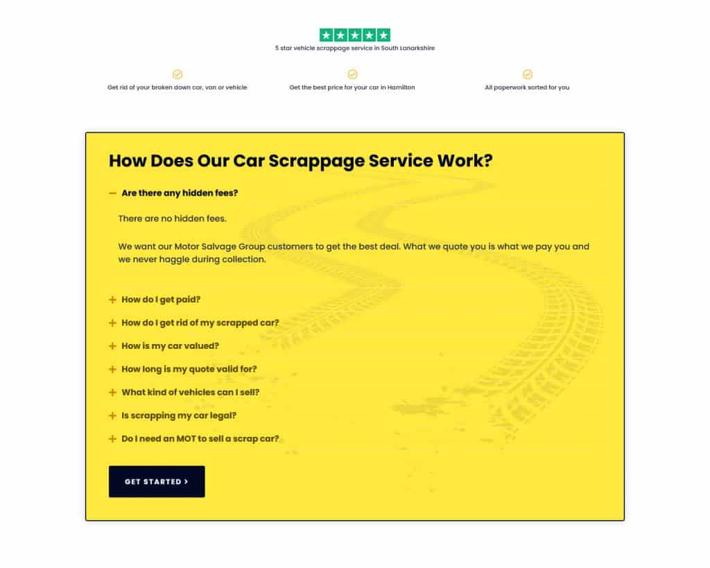
This is mostly just classic sales advice that has been around forever.
Any concern your customer has is a barrier to making a sale.
So get ahead of these concerns, and remove any barriers by answering customer questions before they are asked.
Try to nail any concerns that the customer might have.
On my own hosting page I address frequent concerns my clients have about signing up to web hosting:
The most common questions for any service are
- How much does it cost?
- How do I pay?
- How does the process work?
- Can I cancel, does it come with guarantees?
- How do we start?
Case Studies
If you have any projects or services your particularly proud of, show how your business has provided value to a particular customer or client with a case study. Even include a gallery on your website, or a project portfolio on your website.
This will help your customers get to know your brand and how you work, and provide evidence of the value you offer.
How to Improve Your Website Conversion Process
Hopefully by now your customer is hopefully ready to contact you or to buy your products and services from your website.
So how do we turn them into a lead?
You have to provide the opportunity for them to convert when they are ready.
Provide the User Opportunities to Convert
Remove all distractions, and focus on the main goal of the website; to generate more leads for your business.
The landing pages for Motor Salvage Group have one nice, minimalist section with the contact form front and center:
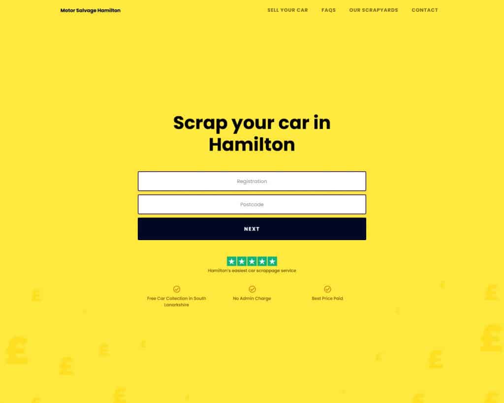
In fact later we went one step further and optimized this landing page even further to have just one field on the enquiry form:

Use value packed Call to Actions
So at this point, you’ve…
- Answered your customer questions
- Provided testimonials
- Shown your accreditations
- Show of a case study
there’s nothing worse than a hot lead ready to convert and they have to go searching for an obscure contact pag e on your website, tucked away somewhere
Instead, provide a short, catchy call to action with an easy, simple, clear conversion action such as a button or contact number or contact form on the website.
I find “Call to Action” misleading, because the best call to actions focus on the benefits, not the action:
Don’t say “Learn more” Say “Save your business money with our utility switch service”
Be specific aswell,
“Free quote” is fine, “Get your Free quote instantly online, with no strings attached” is better
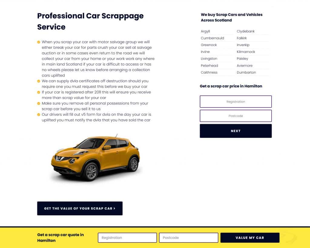
You can see on this page we’ve provided a button at the foot of each paragraph, a contact form in the sidebar, and also a quick contact form which sticks to the footer at all times.
This means the user has 3 points to convert at any one time!
Bonus Conversions Tip
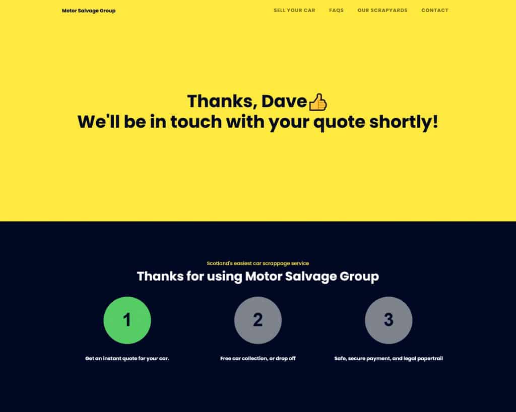
Technically, they’re not a conversion till the money’s in the bank, so remember to provide a branded experience at all times:
when the user gets in touch provide ap personal, branded experience to improve your chances at retaining them as a customer.
On Motor Salvage we provide a custom success screen, using the customers first name to build familiarity, and reassure the customer with the next step in the process:
The Secret Formula to landing page conversions
So we put all these parts together and what we have is a killer formula to improve landing page conversions:
- Get straight to the point
- State your value add
- Build social trust with
- testimonials
- social feeds
- endorsements
- accreditations
- features
- brand building
- Provide opportunities to convert
The specifics of this formula will vary with each niche and each business, however the process is the same each time
And it doesn’t just work for landing pages, try applying these techniques to your phone sales pitch, or even at face to face meetings.
Want me to show you EXACTLY how to increase landing page conversions?
I hope these conversion process tips help you secure more leads for your business.
Have a specific problem with your sales funnel you’d like to pick my brains about?
Design Hero specialise in designing high conversion landing pages in Figma and can take a look at your landing pages and let you know how they can be improved.
this is a live website audit, we’ll go over your site together and give you total clarity on WHY your marketing isn’t getting results.
This isn’t a sales pitch and there’s no hard sell. We don’t work that way. you’ll take away some fresh ideas to work on yourself.

