Are you leaving your font selection up to chance?
Have you ever stopped to ask WHY you use the fonts you do? 🤔
The font you use tells your customers a story about your business…
Serif, Sans-Serif, Slab, Script, Handwritten, Decorative….
Every font tells a different story, the font you use should never be left up to chance.
If you understand how to use these 6 font types, you can boost your brand message on a personal level.
Want to know how to master the 6 types of fonts and choose the right font to connect with your customers?

A strong brand identity will help set you apart in a crowded marketplace and create a loyal following. but building a hero brand is not an easy task.
Your logo design, brand message, brand colors, and brand fonts all come together to weave a story of your brand that your customers can buy into.
No one element will bring you more customers, or drive sales, It’s your brand story that your customers will buy into and keep them coming back to you again and again.
In this post, we’ll tackle one aspect of your brand: choosing the right fonts to use.
Choosing the right font is critical for brand recognition, and when done right can instantly establish a rapport with your customers.
By the end of this post, you’ll know more about your brand than you did before, and you’ll have everything you need to choose a font which will connect with your customers on a personal level.
How to choose the right font for your brand?
Before you can choose the right font for your brand, you should first know the unique characteristics of each font.
But there are literally thousands of fonts, so how do we choose from such a huge selection?
First, let’s narrow down our options.
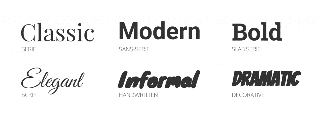
Most fonts can be boiled down to one of six basic categories.
Here are the personality traits of the 6 top font categories:
- Serif fonts are classic, traditional, and trustworthy
- Sans-serif fonts are modern, clean, and help create minimal designs
- Slab serif fonts are bold, quirky, and confident
- Script fonts are elegant and unique
- Handwritten fonts are informal and artistic
- Decorative fonts are stylized, distinctive, and dramatic
When to use a Serif Font
Serif fonts are the oldest type of font in the book (literally).
These fonts can be traced back to the 15th century and are named for the tails at the end of each letter (known as the serif)
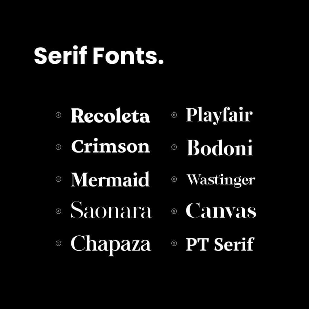
What a Serif Font says about your business
The timeless appeal of serif fonts mean that we associate serif fonts with age and experience.
This makes Serif fonts perfect for brands that want to seen as:
- Respectable
- High Quality
- Traditional
- Established
- Professional
When to use a Sans-Serif Font
Sans-serif fonts are fonts for the new age; modern, clean and minimalist.
They are named such because they lack the tails (serifs) of their traditional counterparts.
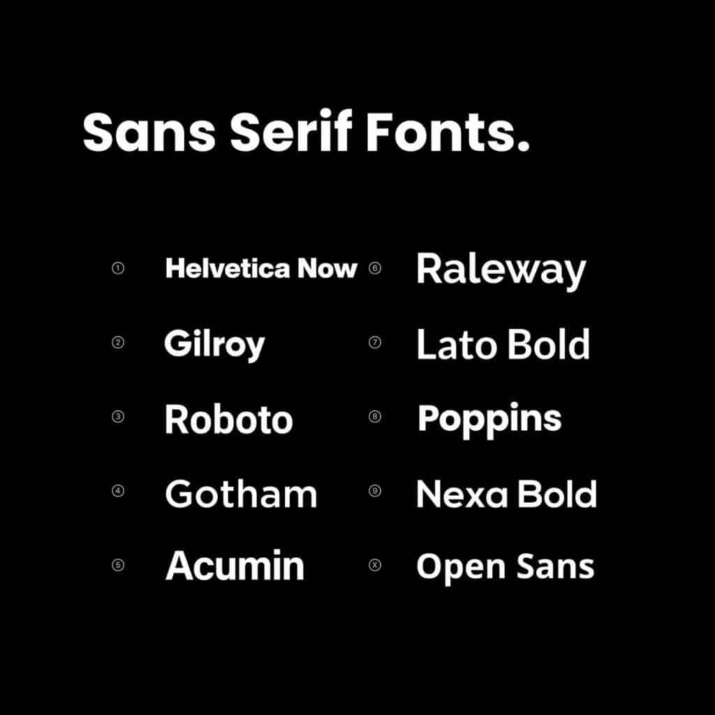
What a Sans-Serif Font says about your business
These types of fonts came about with the digital age, after the decline of calligraphy and the typewriter.
As a result, we see Sans-serif fonts as…
- Modern
- Innovative
- Trendy
- Efficient
When to use a Slab Font
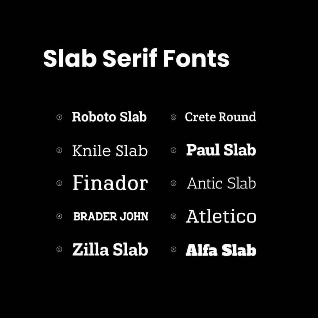
Slab fonts are a variation of your traditional serif fonts. Slab fonts are blocky, solid fonts with squared-off tails. They tend to be more rounded than traditional serif fonts.
What a Slab Font says about your business
Slab fonts bridge a gap between serif and sans-serif fonts. They convey quality but are quirky enough to introduce more playfulness than your serious serif fonts.
Slab fonts help your brand come across as:
- Thoughtful and Caring
- Bold
- Confident
- Friendly
- Knowledgeable

When to use a Decorative Font
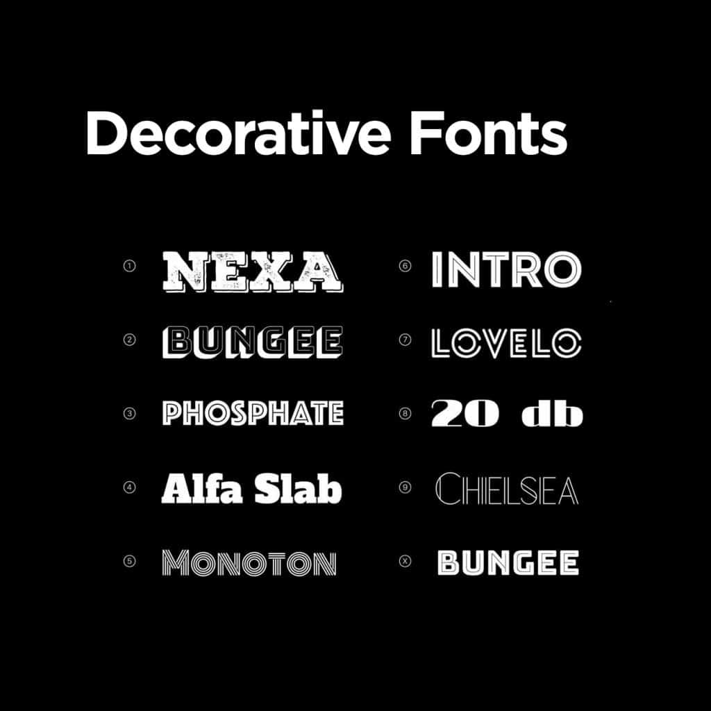
Decorative fonts are the most diverse category of fonts.
They tend to be punchy, distinctive and elaborate.
Decorative fonts come in a wide variety of shapes sizes and colours and often have additional stylized features such as graffiti, textures or embossed effects.
When used correctly Decorative fonts can help your brand become extra memorable.
But be careful, in the wrong context they can often be overdone and can come across as tacky.
What a Decorative Font says about your business
Decorative fonts are best used in small doses such as for your logo or in headers. they aren’t very legible for large paragraphs of text.
They are best used for brands which want to be seen as:
- Off the Wall
- Dramatic
- Different
- Exciting
- Unique

When to Use a Handwritten Font
Handwritten fonts are just what they sound like:
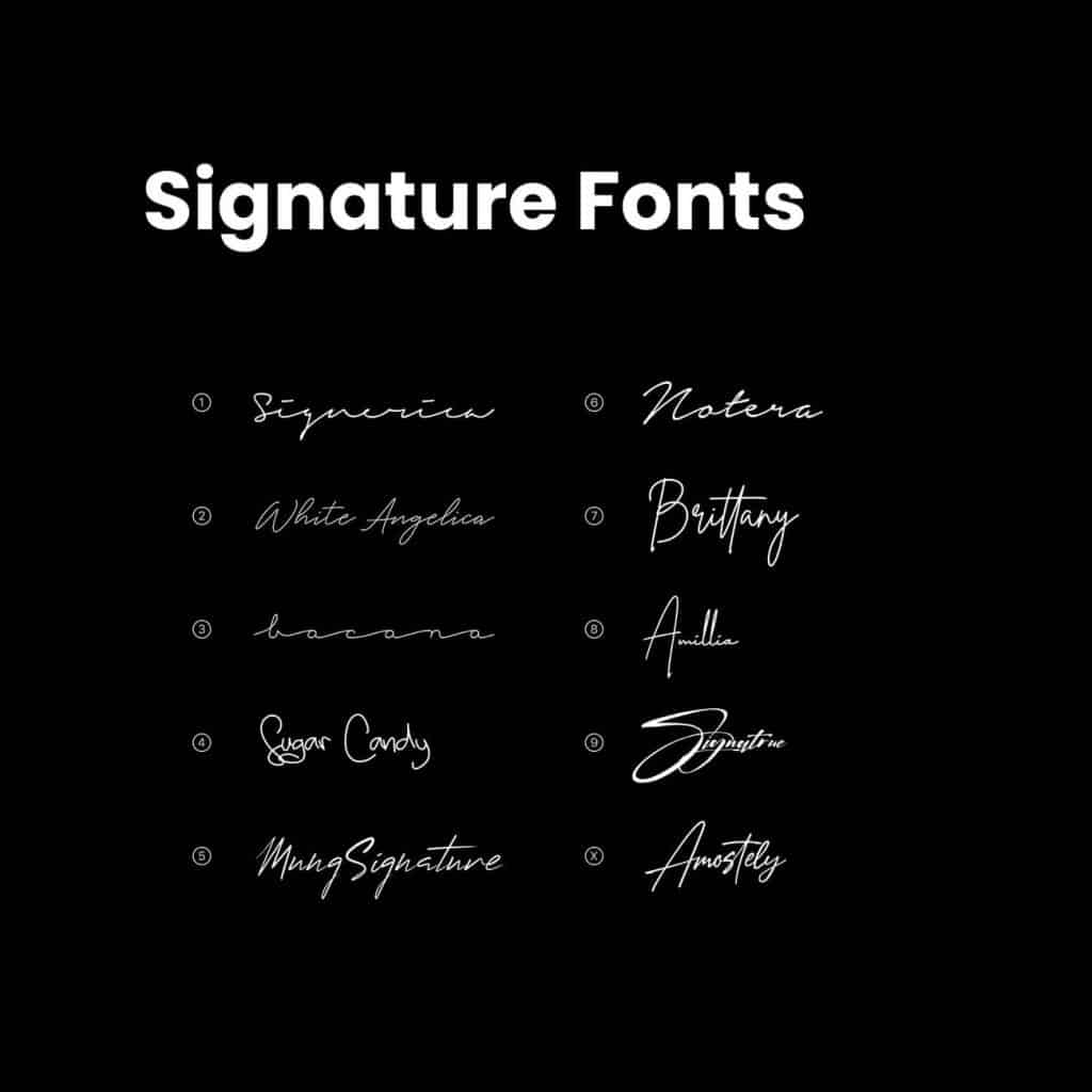
the mimic a hand-drawn style. These handwritten fonts come across as very informal and artistic. They are also known as Signature fonts, as they resemble a hand-drawn signature.
This category of fonts is at the opposite end of the scale from Serif fonts.
What a Handwritten Font says about your business
Handwritten fonts come in a variety of styles. The neatness or style of the signature can be used to control the quality of your brand, from scribbly fonts for casual brands to elegant looping fonts for creatives. For this reason, there is some overlap with “Script” fonts, which you’ll learn about next.
Handwritten fonts are best used by brands who want to be seen as:
- casual
- approachable
- personal
- fun
- Low fuss
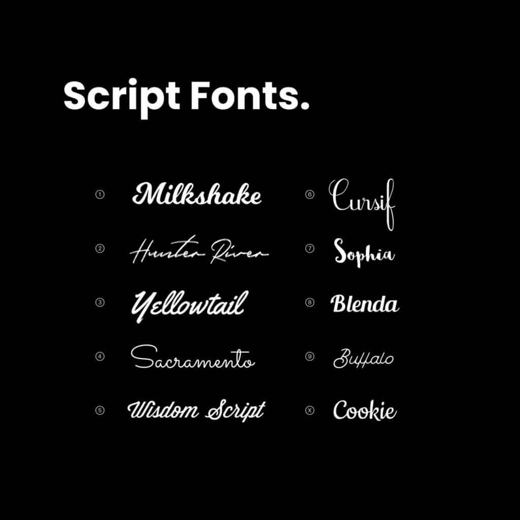
When to use a Script Font
Script fonts are elaborate fonts which help convey elegance and class.
Similar to Handwritten fonts, Script fonts also mimic handwritten signatures.
Script font are designed to feel individual and unique.
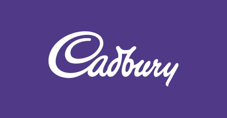
This type of font can be difficult to read, due to the elaborate swooping tails, so are best used for short brand names or minimalist typography-based logos.
What a Script Font says about your business
Script fonts should be used when you want your brand to be seen as:
- Unique
- Classy
- Elegant
- Creative
- High Quality
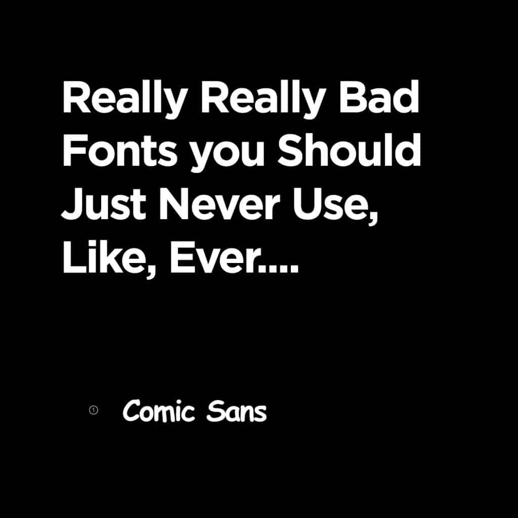
When to use Comic Sans
Never.
This overused font is universally agreed by designers to be a blight on the design world, and should be ab0lished on pain of death.
So why is it used so often?
When I asked my clients why they often make this mistake these were the most common replies:
- Friendly.
- Easy to read
- Happy
All valid enough reasons. But here’s why NOT to use Comic Sans.

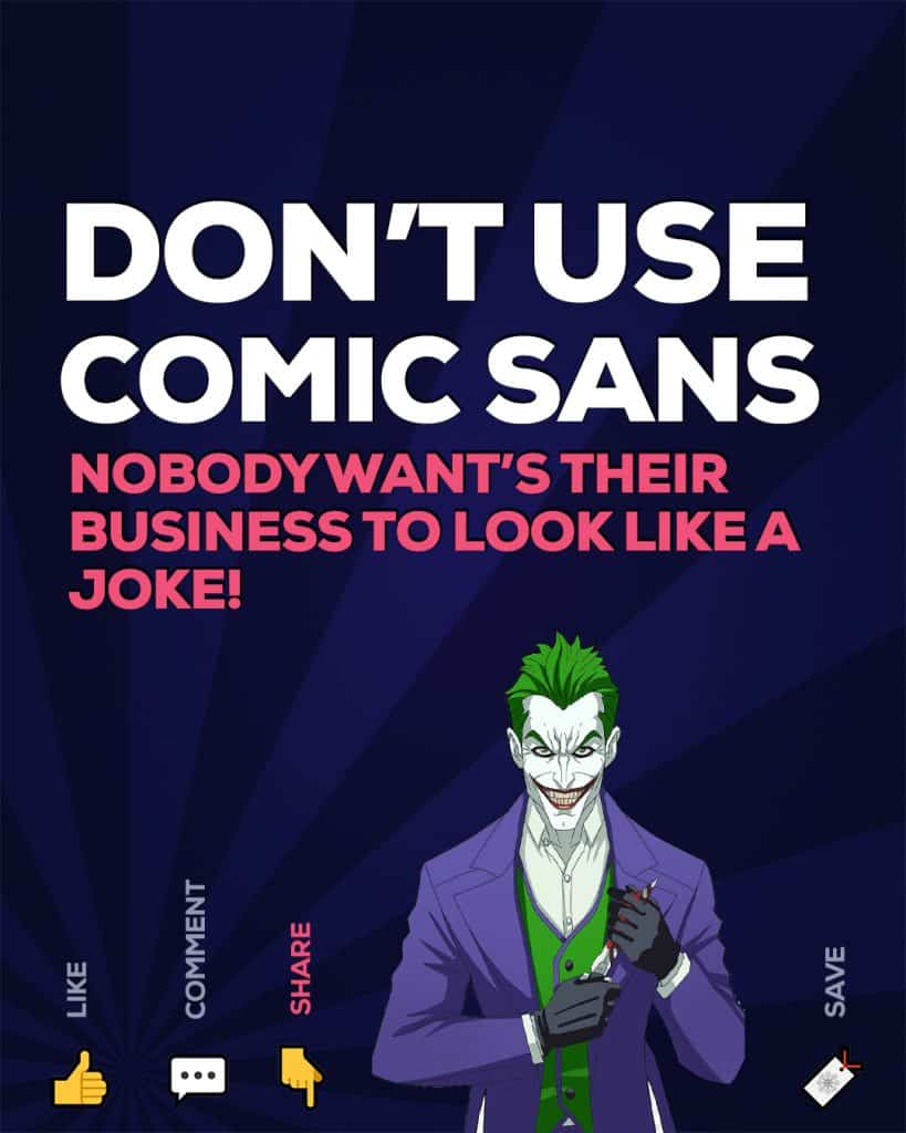
What Comic Sans says about your business
The clue is in the name:
This font will help your business come across as
- Laughable
Unless you are in the comedy business, you shouldn’t be using comic sans. Because nobody wants their business to be a joke.
Using the 6 font families to connect with customers
So now you know what each category of font represents.
but how do we use this to our advantage?
Imagine the font you use as the dress code for your brand.
Think about what you would wear for:
- A Funeral
- A Halloween party
- A Job interview
All of these require very different dress codes!
Your font speaks volumes about the personality of your business.
It must be carefully be selected to match the tone of your brand.
The right font will help you communicate your brand to customers
Make sure your brand is dressed appropriately
The most successful brands have a clear identity.
A strong brand personality will be what your customers relate with, connect to and remember you for.
So in order to know what font to use, you have to know your brand personality.
Luckily I’ve already written an article about defining your brand personality. The easiest way to do this is to develop a brand persona. If you don’t have a strong grasp of your brand, you can read my guide to developing a brand persona in 3 simple steps.
Get to know your brand personality
Every brand identity needs a well-defined brand personality. A clear brand personality will be what your customers relate with, connect to and remember you for. This can play a role in increasing your brand awareness.
Luckily I’ve already written an article about defining your brand in a simple 3 step process
If your brand personality isn’t already well-defined, spend some time thinking about how you’d like your brand to be perceived before you try to find your brand fonts.
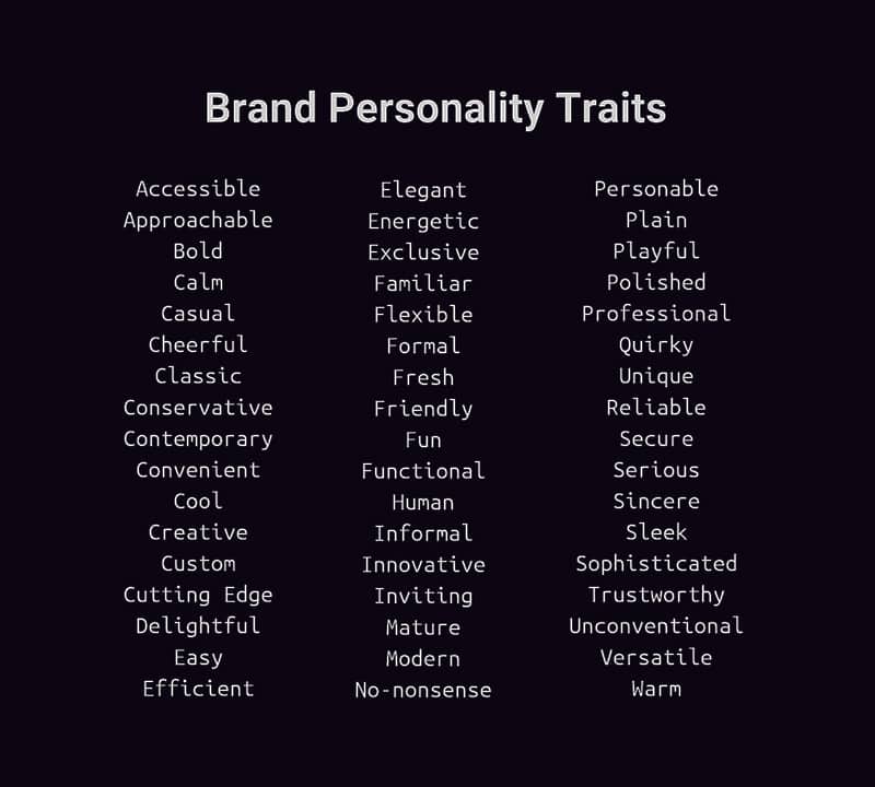
Not sure where to start? Work with your stakeholders to pick 3-4 adjectives from the list below:
Once you know your brand personality, you can pick the right adjectives which describe your brand. Here are some suggestions:
With your brand personality in mind, now it’s a simple case of matching your brand, to a font with the same personality.
Some things to keep in mind when choosing a font for your brand.
Before you start diving in, here are some important pointers to keep in mind before settling on a final font for your brand.
Flexibility
Once you’ve chosen the right font for your brand you’ll be using it for years to come!
You’ll use it on your website, on flyers, on your business card, on the side of vans and more!
Make sure that the font you choose is flexible enough to handle any medium. Here are the most important things to think about.
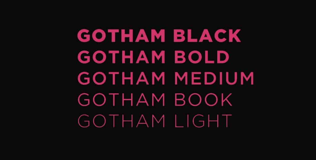
Font Weights
Try to use a font with at least 3 font weights;
this will give you the flexibility you need to use your brand font in any situation be it on web or print.
Styles
Similarly, ensure your font comes in a variety of styles so you can use your brand font in any situation such as in headers, in body text, in quotations, and more.
Casing
There are many fonts which seem to fit the bill; they look great, they have multiple weights. But things fall apart when you realise the font only comes in Uppercase!
Make sure the font you select can be used in lowercase so your brand font is consistent across headers and paragraphs.
Legibility
A font which is readable is far more important than fancy effects and features.
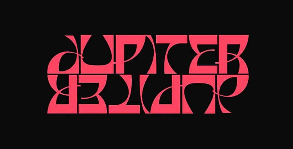
I’ve written a whole article about how legibility is the most important factor in logo design.
A logo which is readable at a moment’s glance will be more likely to be recognised and remembered by your customers.
Availability
It’s important to use fonts which are readily available.
Some of the best fonts can be expensive, but there is nearly always a similar alternative that is free.
There’s no point in spending thousands of pounds on a professional font when there’s a free alternative that’s nearly identical, or just as good!
There are hundreds of gorgeous, well-designed fonts that are entirely free, and I’m going to show you how to find them:
Resources for Finding the Right Font
Some font libraries offer free, open-source fonts, including:
Google Fonts– Google’s Free library of web-ready fonts.
Font Squirrel– Thousands of free fonts, and browse by category and tags
Font Library– New fonts every week!
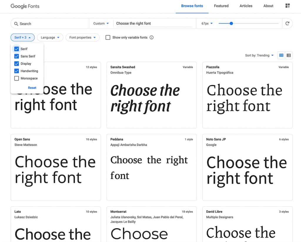
I’d recommend test driving your font in a variety of contexts to make sure it works across your brand such as
- Headlines
- Paragraph text
- social media
- website
- quotations
Conclusion

You know the characteristics of the 6 main font families.
You know the personality of your own brand.
You have free sources of great fonts at your fingertips.
Now comes the fun part:
It’s time to put it all together and find the perfect font for your brand;
When you combine the right font, with your brand colours, and the right message, your brand will come to life and paint a story of your business that resonates with your customers and builds a loyal following.
I hope this guide helps you build your own brand story!
If you need any help with building your brand, get in touch with Design Hero for a free consultation.
About the author

Nicholas Robb, Founder
The original Design Hero founder, solopreneur and marketing expert; Nick will help you supercharge your business success with a broad skill-set spanning a range of digital marketing fields.
If you want help growing your business...


