Grab Attention with the right logo design
This week I’ve been tweaking a logo for Superior Maintenance Services.
I’ve been working with Superior Maintenance Services to develop a new website, refresh their brand and develop printed graphics.
He asked me to improve his current logo.
Protect your brand legacy
The original design isn’t bad.
I didn’t want to lose brand cohesion so if you have an established brand avoid making sweeping changes.
The changes I’ve made to his logo are quite subtle.
I always avoid making changes for change’s sake but these changes help the logo stand out a bit more:
- I’ve tweaked the gradient a bit to add a bit of drama, rather than a boring flat 45-degree gradient I’ve created a shine to the text, with a soft glow to some of the letters where they catch the light to give a sense of depth.
- I’ve changed the spacing of the symbol and added a small shadow gap to make it pop out a bit more.
- The biggest change is the fonts. The logo was using two different fonts and looked quite bitty. I’ve corrected this with one geometric font which is a bit chunkier and more modern and will look much better.

A simple change can make a huge impact
The changes are pretty subtle, and at first glance, it doesn’t look like much, right?
But see what happens as the logo gets smaller:
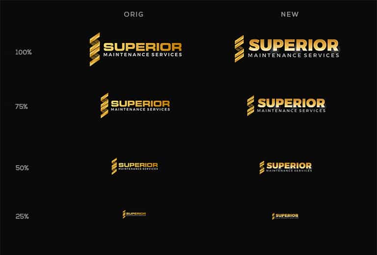
Your logo needs to jump out and grab your attention instantly.
At smaller scales such as business letterheads and printed graphics, the new logo becomes much easier to read.
The next time someone needs maintenance services, Superior Maintenance Services, with their distinct golden logo, will spring to mind!
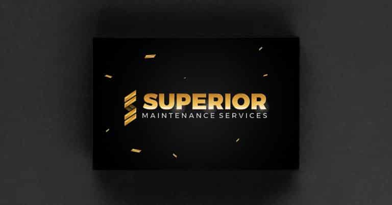
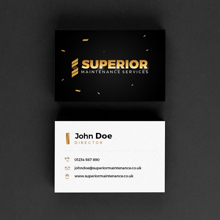
I’ve killed two birds with one stone and put the new logo on the front of some business cards so you can see the tweaked logo in use.
The business cards were crying out for some metallic gold foil effects so I’ve thrown in some falling gold emblems around the logo, the effect will be quite dramatic when they catch the light. The gold parts on the front of the business card will be metallic gold against matt grey/black.
Stand out from the crowd with a superior logo design
Font choice for your business logo design is an important decision which can make a huge difference in helping your business stand out from the competition.
If you think your logo is looking weak or outdated, it might be time to make a change.
As you’ve seen a small change to your logo design can have a huge benefit to your business. There are many ways to improve your current logo, or update your business branding.
Get in touch if you’d like to chat about your own business branding.


