Does your website look great on all devices?
Your website should look great on all devices. Not just desktop, and especially mobile. Let’s take a look at what mobile-first design is, why it’s absolutely essential for your business, and how and why to optimize your website for mobile.
Why should you optimize your website for mobile? Because users spend more time online on mobile devices than they do on computers. Browing, researching, sussing out brands, shopping, and SPENDING!
Why is mobile browsing and shopping so popular? Mobile devices are increasingly powerful, and more people are using them to do things like shop for products and get directions. This means that a user’s first impression of your website—and whether or not they’ll come back—can be made from their phone or tablet.
Putting mobile-first design first
Mobile devices are also convenient to use because they’re always with us in our pockets and bags; it’s easier to pull out your phone than it is to find your laptop when you need something right now (like directions). And if you’ve ever tried typing on an iPhone keyboard while walking down the street, then you already know how much easier it is to navigate with one hand while holding a coffee cup with another!
Finally, mobile devices have become personal items: they have our photos and private messages; we use them at work; we might even sleep next to them at night (I’m guilty of all three). As such, there may be sensitive information on these machines that users wouldn’t want shared publicly via search engines like Google.
If your website isn’t fully optimized for mobile, or you don’t know what mobile-first design is exactly, it’s about time to learn…
Why Mobile-First Web Design Is Important
Mobile-friendliness is a ranking factor. It’s a well-known fact that Google is pushing mobile search results. This is why you see the mobile version of your website when you search on a smartphone.
Google prioritises mobile-first websites. Google will scan your website on mobile first, then on desktop and other devices.
Why has Google done this?
Because they want to provide the most relevant content to users, and they believe that if a user is searching on their phone, that means they are probably looking for something specific and maybe even in need of it right now! The desktop version of your site might be great for many different reasons, but if it isn’t optimized for mobile then it may not show up as high in the rankings because Google knows that searchers tend to prefer sites with good mobile experiences over those without them.
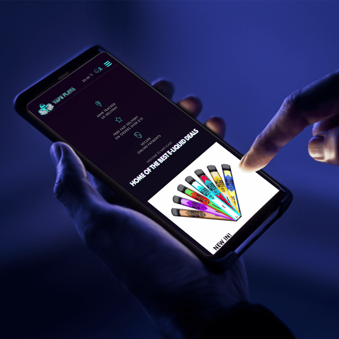
Unfriendly pages can deter users from visiting other parts of your site
If you don’t optimize your website for mobile, you can expect to see some negative effects on your site. Unfriendly pages can deter users from visiting other parts of your site, and cause them to bounce from your site, which can hurt SEO and brand. It also affects conversion rates and revenue!
You don’t know who or how people will access your content, so you have to make sure it’s ready for all users. If you only optimize for desktops, you might be missing out on a lot of potential customers.
If you want to connect and convert consumers, optimizing your website for mobile is a must
If you want to connect and convert consumers, optimizing your WordPress website for mobile is a must. Here’s why:
- Mobile users are more likely to convert. If you are building an eCommerce site, mobile shoppers are more likely than desktop shoppers to check out and make a purchase. This is true even when they’re on the go—and given that most people use their phones while at home or in transit (like on public transportation), this means that your site should be optimized for these audiences as well. When it comes down to it, if you want conversions, then optimization is what will get you there!
- Mobile users browse more pages on your site than desktop users do. Optimizing for mobile can help ensure that visitors aren’t getting frustrated with slow loading times or having too much content clog up their screens at once when browsing online on their phones (or tablets).

What you really need from your mobile-optimized website…
Don’t get me wrong, a well-designed WordPress website is a great way to take your business to the next level. But you didn’t come here because you need a website. You came here because you want to learn how to optimize your website for mobile, why mobile-first design is important, and ultimately, to grow your business. You came here because…
✉ You want more enquiries
🤩 You want your website to stand out from your competitors
🔥 You want to grow your business
Mobile-first WordPress web design to Futureproof your business
Your new mobile-optimized WordPress website is the marketing tool you need to supercharge your business:
- It’s easy to use.
- You have full control of your site
- It can be as simple, or as advanced as you like
- It supports various media
- It has a huge online support community
It simply can’t be beaten for flexibility and futureproofing your website for future growth. WordPress websites are perfect for small to medium business owners looking to create a website for their business. At Design Hero, we love WordPress because it offers maximum flexibility to create any website you want. WordPress is also simple enough for non-experts to use so you can update your own site after launch.
If you are looking to sell products you will also want to look at E-Commerce websites, which are an extension of a CMS platform like WordPress.
More than just pretty mobile responsive websites…
Beauty is only skin deep. it’s sad but true. even the most stunning website design is useless if your website isn’t optimized for mobile devices.
Your website is a crucial marketing tool to generate more leads for your business and optimizing it for mobile ensures the best chances of generating the most leads, reaching the widest audiences and making to most sales. Want to make sure your website is mobile-friendly?
Want our mobile website experts to review and optimize your website for mobile devices?
Book a website audit below and I will review your website for mobile friendliness and go through it with you to show you EXACTLY why your website isn’t optimized for mobile.
This isn’t just a surface-level scan.
There’s no point looking at a website in isolation though,
You have to look at the full marketing mix!
That’s why I do a full site review which includes:
✅ design review
✅ conversion optimization
✅ SEO report
PLUS
We’ll review the results together in a free half-hour consultation so you know EXACTLY how to fix it.
My Guarantee
If you feel you haven’t gotten value out of this service, then I promise to refund 100% guaranteed!
Book a website audit
FAQ’s about mobile-friendly websites
How much does a good web designer cost?
We have a saying in the UK web design industry:
“Bad web design costs a lot more than good web design”
There’s a lot of “digital villains” in the UK web design industry, offering cheap websites at rock bottom prices.
But as with anything, pay peanuts and you’ll get monkeys! You wouldn’t believe how many websites I’ve redesigned from scratch because someone has thrown good money at a bad web designer. I advise skipping this step and doing it right the first time. At Design Hero we offer real value for high professional web design. We’ll make sure we design a new website that meets your budget.
If your website budget isn’t sufficient to achieve your goals, then we’ll be honest and tell you so. Because Design Hero aren’t interested in being the cheapest web designers. We’re more interested in helping you grow your business!
How much does it cost to run a website?
Every website is different:
Do you want a simple scrolling site for a startup business, or an e-commerce booking website for your chain of hotels?
The budget of your website is determined by how much content you want to have online, and what functionality you need from your website.
Either way, the budget is within your control:
I offer a tiered fee structure so you have the flexibility to create a website that suits your budget.
Don’t forget you’ll also need an SSL Certificate, Hosting and a Domain, so remember to budget for these as well!
How much does Design Hero charge for mobile-first web design services?
All of my prices are agreed upon in advance, and set out in writing.
My detailed design proposal sets out everything in detail so you’ll know exactly what you get for your money.
I understand that a website can be a large expense for a business, that’s why my design fees are split into 5 payments throughout the project.
A 20% deposit secures your place in the work schedule. The final 20% is to paid just before the site is launched.
If you decide you’d like to add to the scope of the project, or add more content to your website, that’s fine!
I will always discuss any extra costs with you in advance, so there are no surprise charges, or hidden fees.
How long does a new website take?
You could get your business online in just a few weeks!
A starter website can take just a couple of weeks, while more complex sites typically take a few months.
The timeframe depends on the scale and complexity of your site.
The most important part of getting online quickly is having your content ready, and responding quickly to any queries so make sure and do your homework on time to ensure your project runs smoothly.
What will my new mobile-first website design look like?
The style of your new website design depends on your brand. every new website from Design Hero is custom designed around your branding and your business. unlike most web designers. Our professional UK web designers custom design your website around your brand so that your new business website reflects what makes your business special. You will have input during the design process, and will be able to review our progress at any time using a live link so you can be sure the new website design is going in the right direction.
Can I edit and update my mobile-first website once it’s done?
In a word: yes!
With every Design Hero website you have access to your own customized dashboard where you can add or edit posts. Every website also includes my pro page builder, so you can create beautiful posts, and even make your own pages.
Of course, if you don’t feel comfortable making changes I’m just a phone call away and I’m happy to make changes on your behalf.
What web hosting and support do you offer?
After launch, I will teach you how to use your new website and if you have any questions I’m just a phone call away!
I also offer a maintenance and support package to take the hassle of setting up and maintaining your hosting, so you don’t need to lift a finger if you don’t want to.
Please see my web hosting page for details.
What do I need to get started with my mobile-first website?
All I need to get started on designing your website is your content:
This means text, images, videos, and anything else you’d like me to put on your website.
I’ll guide you through the whole process, from start to finish.
I can help you secure your domain and hosting, steer you through gathering your content, and will keep you informed on progress throughout the project.
I’ll always give you honest and practical advice about the best way to market your business online.
A 20% deposit secures your place in the work schedule, and I will get started on creating your new website right away!


