Portfolio Website design for property developers
It’s not an exaggeration to say Alfie was severely disappointed with his previous website:
His brief had been ignored, everything was charged as an extra and he was just about fed up of web designers all together.
His previous website leaned heavily on an Italian theme, and failed to convey the extensive expertise and passion behind Alfie’s business, and wasn’t helping to convince potential investors.
Investing in property is something that nobody approaches casually.
Any investment is built on trust. And without a business website, potential investors could be scared off altogether.
Alfie needed a professional website which conveyed a sense of gravitas to help promote his portfolio of investments.
Alfie knew he needed new a website to help convince potential investors to buy into his property portfolio, and so he approached Design Hero in a last-ditch attempt to get his website right.
When I initially provided Marturano Homes with a quote I think it’s fair to say Alfie was sceptical: it was twice as much as he’d paid for his previous website.
But in the end, Alfie discovered the value that an affordable website brought to his credibility as an investment manager.
The results?
A business website which provides real value as a sales tool for the business, and helps elevate Marturano Homes’s credibility.
Property Development web development
Alfie was unsatisfied with his previous website, his brief had been ignored and he just about fed up of web designers.
He needed a website which was professional, and trustworthy, to help sell his portfolio of investments.
Investing in a property is something that nobody can take lightly, especially when large sums of money are involved.
His previous website leaned heavily on an Italian theme, and failed to convey the expertise and passion behind Alfie’s business.
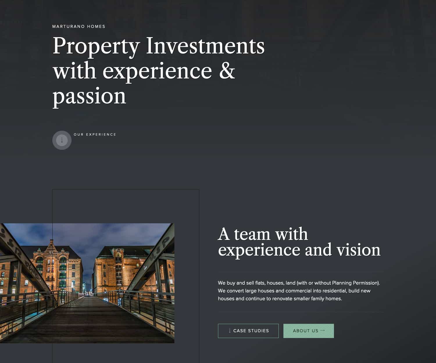
The new website uses a dark, minimalist palette and elegant fonts, and presents Alfie’s investment opportunities with a clear, concise message, and a strong sense of brand trust.
Homepage
The whole website was designed with a minamlist approach in mind: to strip anything extraneous and present the facts, and Alfie’s investments as professionally as possible.
Experience
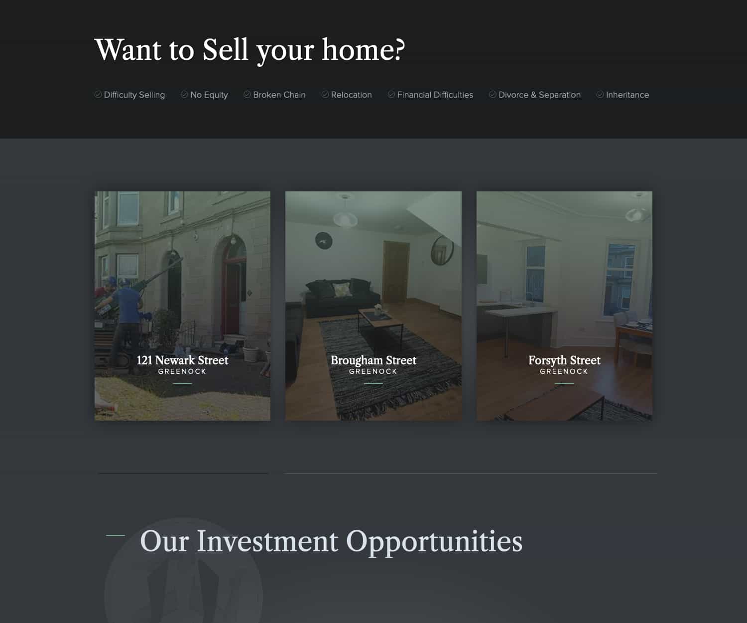
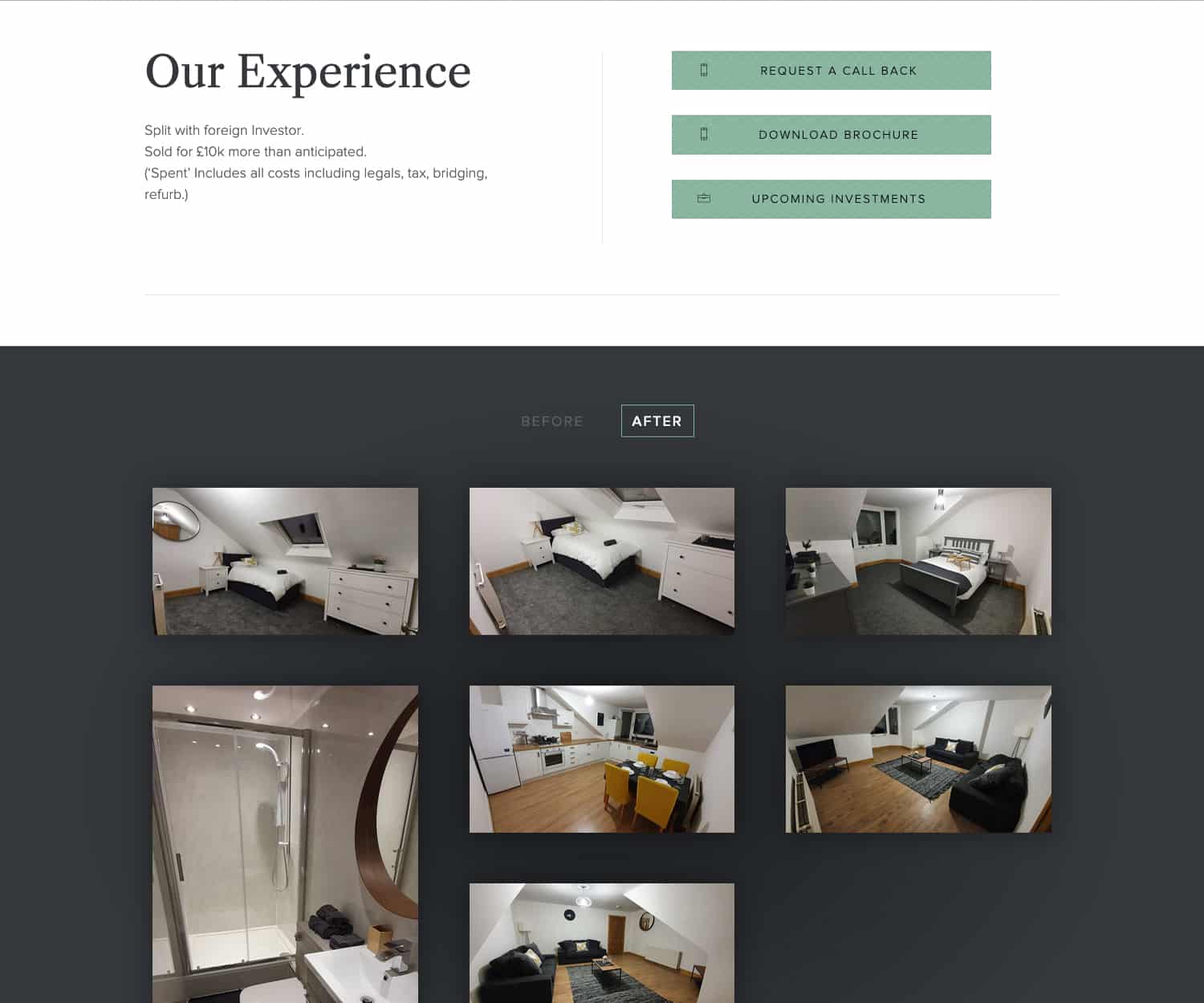
Experience is the key trust signal for Alfie’s clients. I built an online portfolio for Alfie’s previous projects to show his success with previous investments.
Project Pages
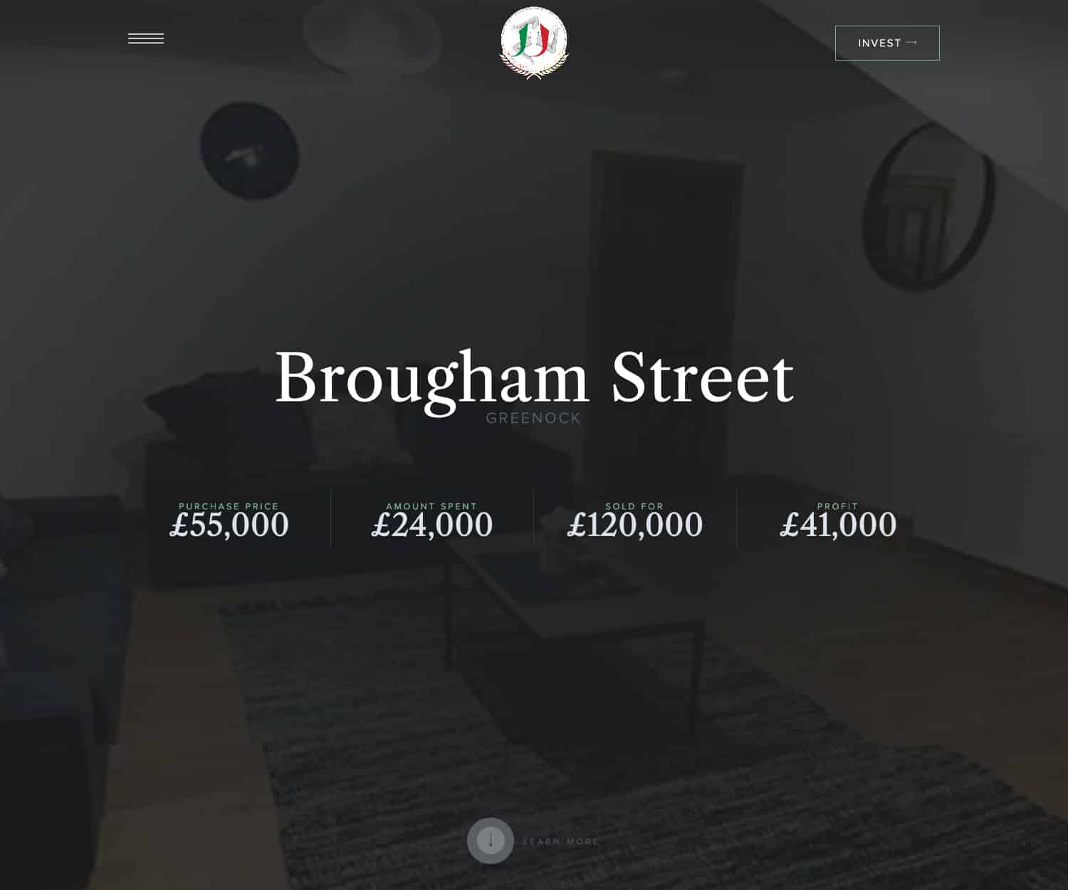
Each project is given it’s own page on the website, with key facts presented as flyin infographics.
Testimonials
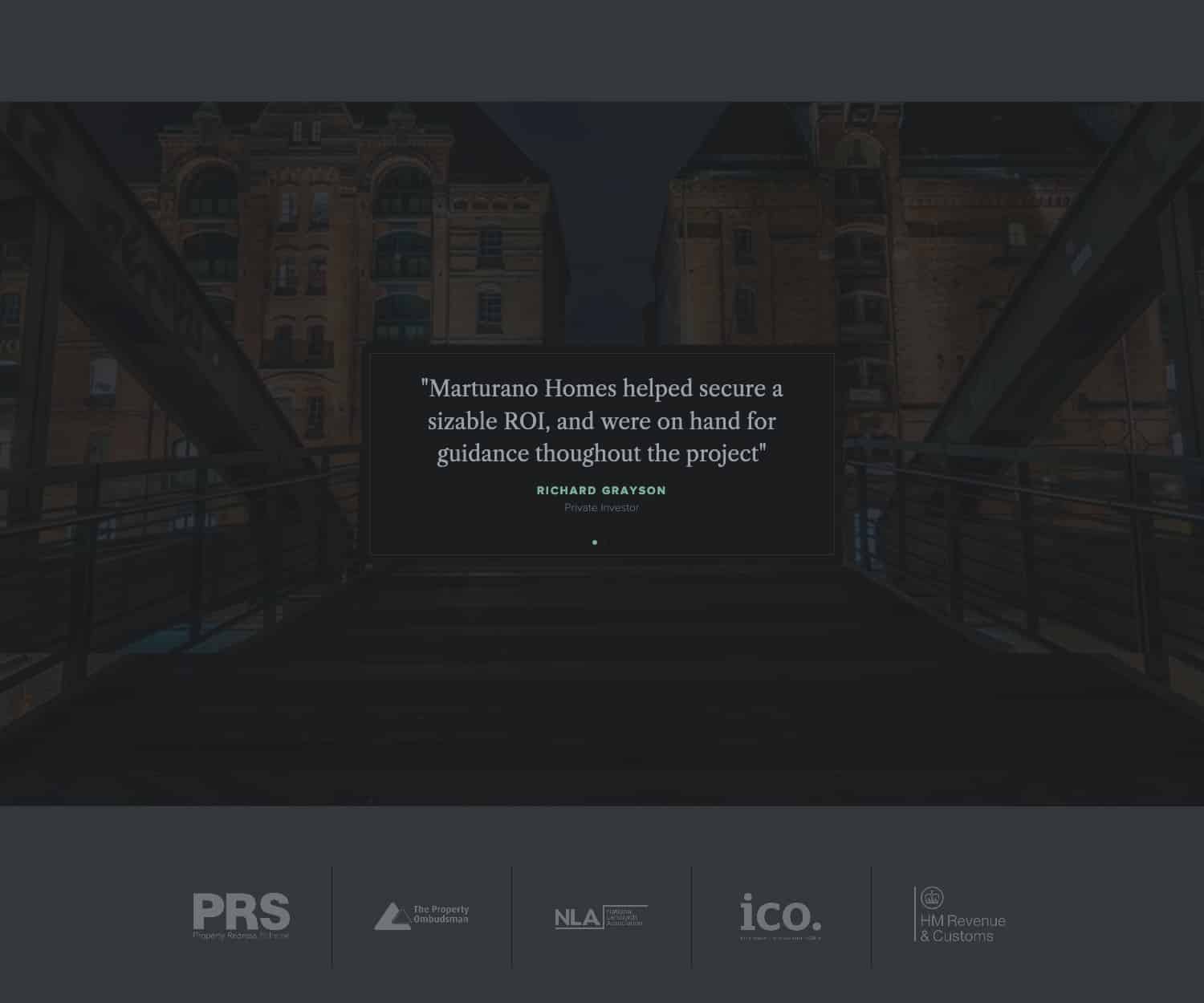
The second part of the trust journey is testimonials, and reviews from previous customers. As with everything else these have been presented on the website with restrained minimalism.
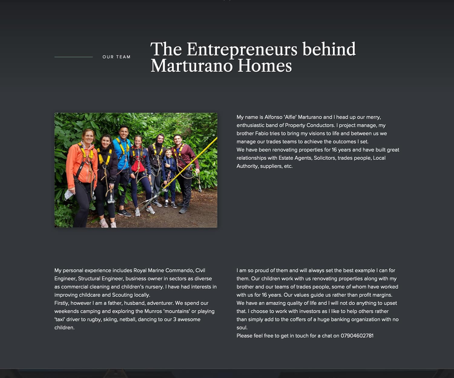
About Page
Of course, an about page is one of the strongest trust signals. Alfie shows his human side on the about page, so his investors can get to know him as a person.
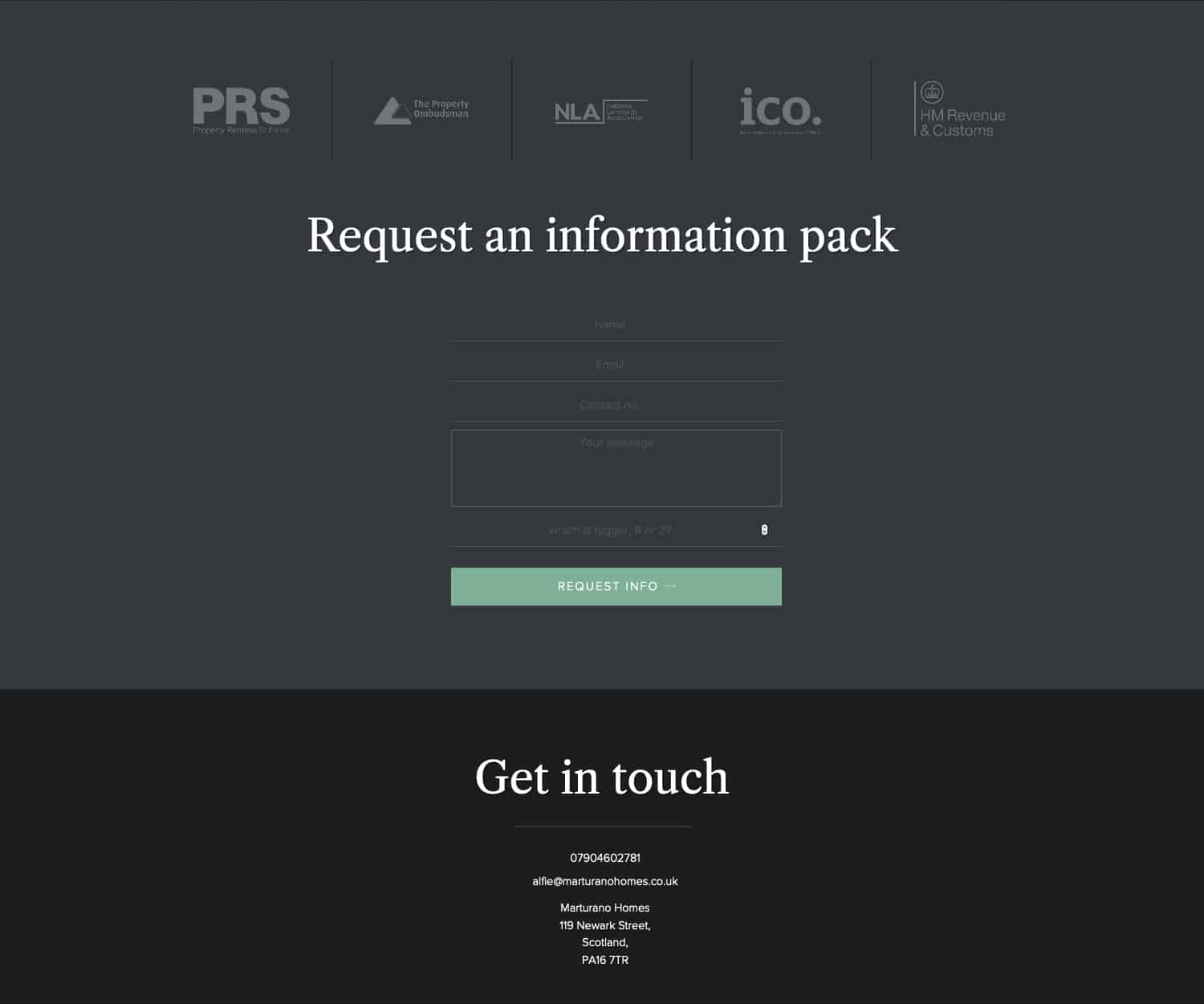
Contact Enquiry Form
I made sure that when clients are ready to invest, it’s as easy as possible to contact Alfie. I provided popup contact forms, aswell as an enquiry form in the footer.
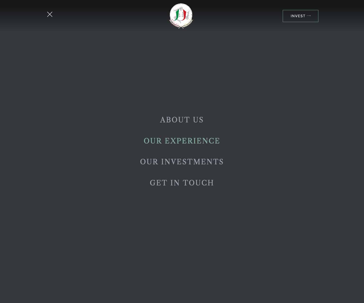
Fullscreen menu
The website was designed to be a simple to navigate as possible. Everything was stripped from the header except the logo, a button to invest, and a menu icon which triggers a full screen minimalist menu.
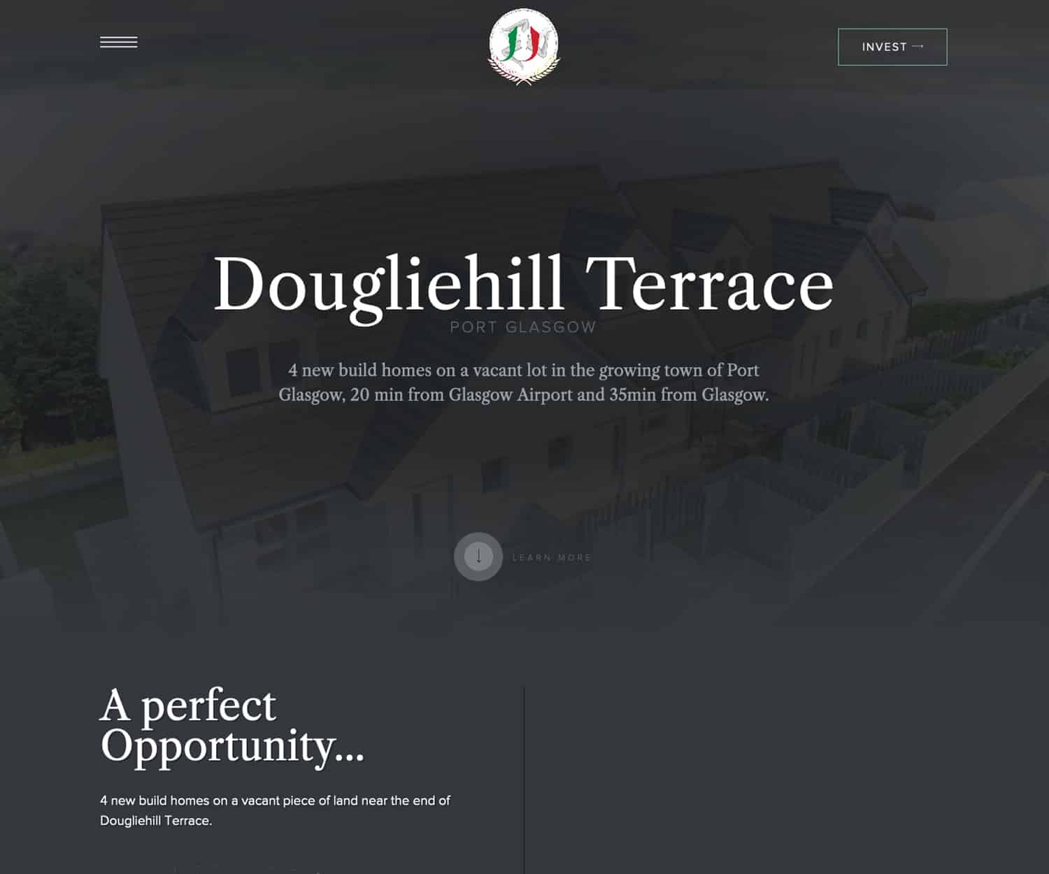
Investment portfolios
Alfie needed website pages for each potential investment, with site plans, before and after image galleries, and key facts about each project to help potential investments reach a decision
investment info
Alfie needed website pages for each potential investment, with site plans, before and after image galleries, and key facts about each project to help potential investments reach a decision

Nick has a great understanding of appealing to the target market on my new website!
