An online booking website for online beauty courses
Angela first approached me to ask me to revamp her existing website for The Beauty Salon, and also to add some additional content, building a WordPress website for another businesses idea she was developing at the same time: the School of Beauty.
Her existing websites were built on Wix and were little more than a single scrolling page of text.
Angela had great ideas for growing the business, I quickly realised that Ang’s Wix website would not take her where she needed to go.
I helped with WordPress consulting service, to identify where Angela could get more leads from her website and introduce online booking through the website.
Her customer were mostly based on mobile, and demanded modern website functionality such as online booking.
I recommended the bold move of starting from scratch with a fully mobile responsive website built on WordPress to futureproof both her businesses and combine the websites into one modern website worthy of her business ideas.
Design of a booking website for the next generation of beauty treatment courses

I helped Angie redesign her existing logo and refresh her brand to match the new value offered from the School of Beauty

Logo Refresh
I tried to stay true to the original principles of the logo, but improve the legibility, and modernize the logo to match the school brand.

Logo Design
The new logo simplifies the school theme, and also brings the logomark into a circular grid. The company name is much more legible at a distance.
Online Beauty Courses web development
Her existing websites were little more than a single scrolling page of text, and were did not show her businesses in a good light:
👇
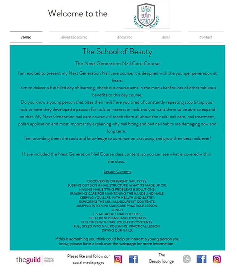
The new website brought together the two separate businesses: the School and the Salon combined into one, user friendly, easy to use website which would allow her existing customers to book online, and also attract new customers for her growing online beauty course business.
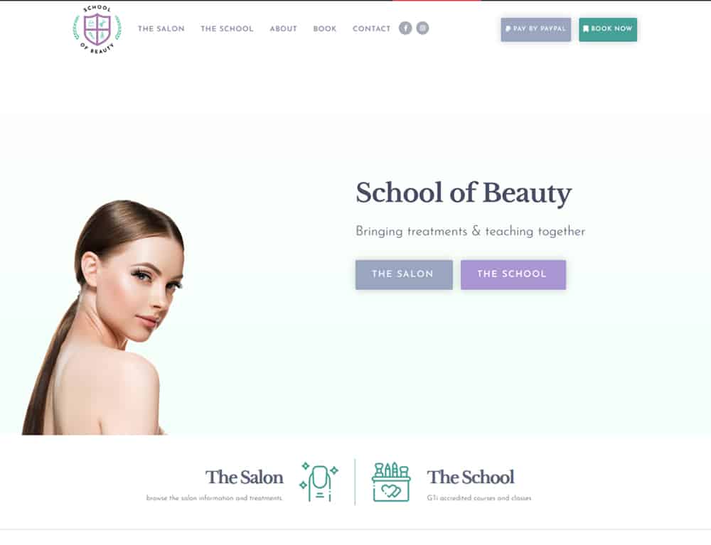
Homepage
The new landing page featured a far more impressive visual offering over the old website, and directs the users into a navigation split to visit either the salon, or the school .
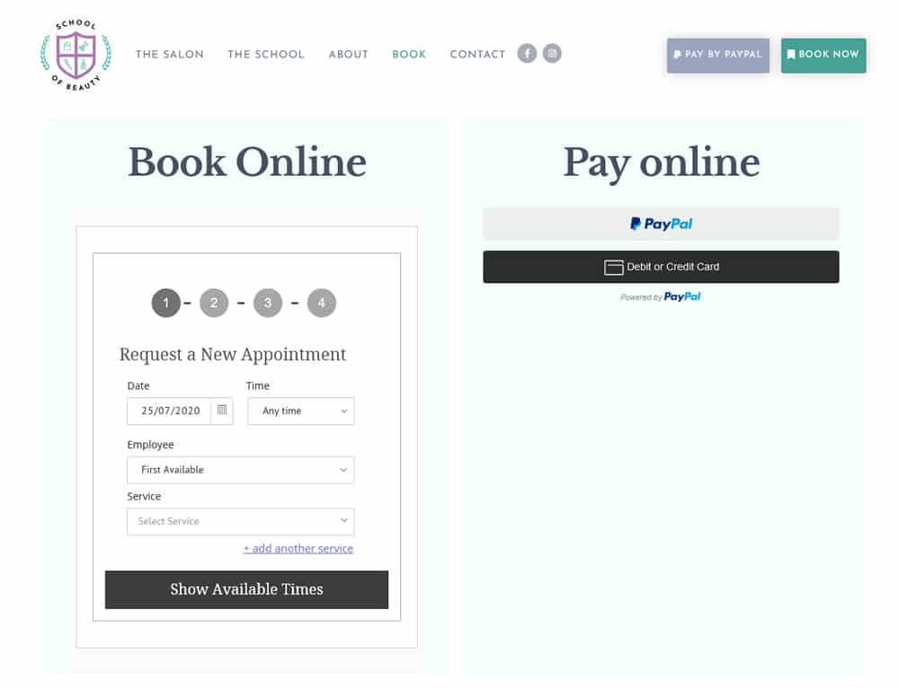
Online Booking
The main feature of the new site was the online booking page which integrates a 3rd-party all-inclusive booking system so Angela can manage all her salon bookings from one place, and take new bookings and payments through the website.
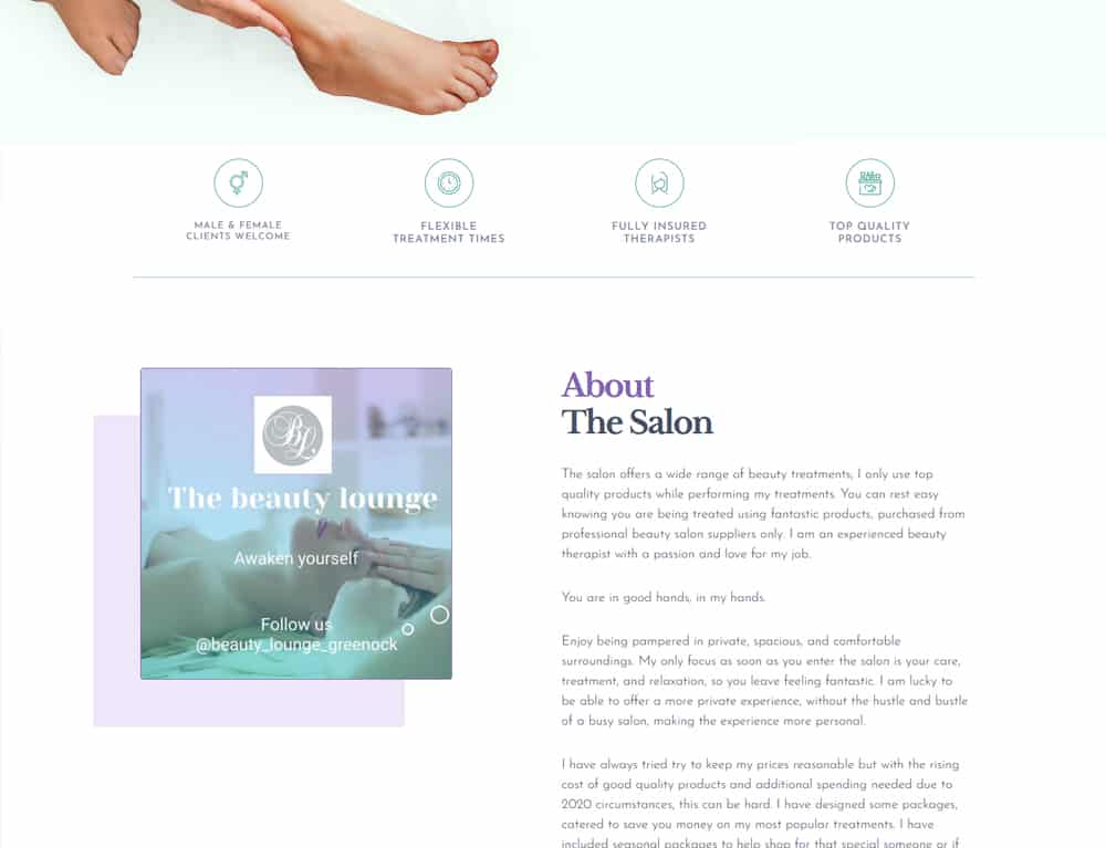
The Beauty Salon
The beauty Salon part of the new website invites users to visit the salon, with plenty of information about how to book, and what to expect at the beauty salon in Greenock
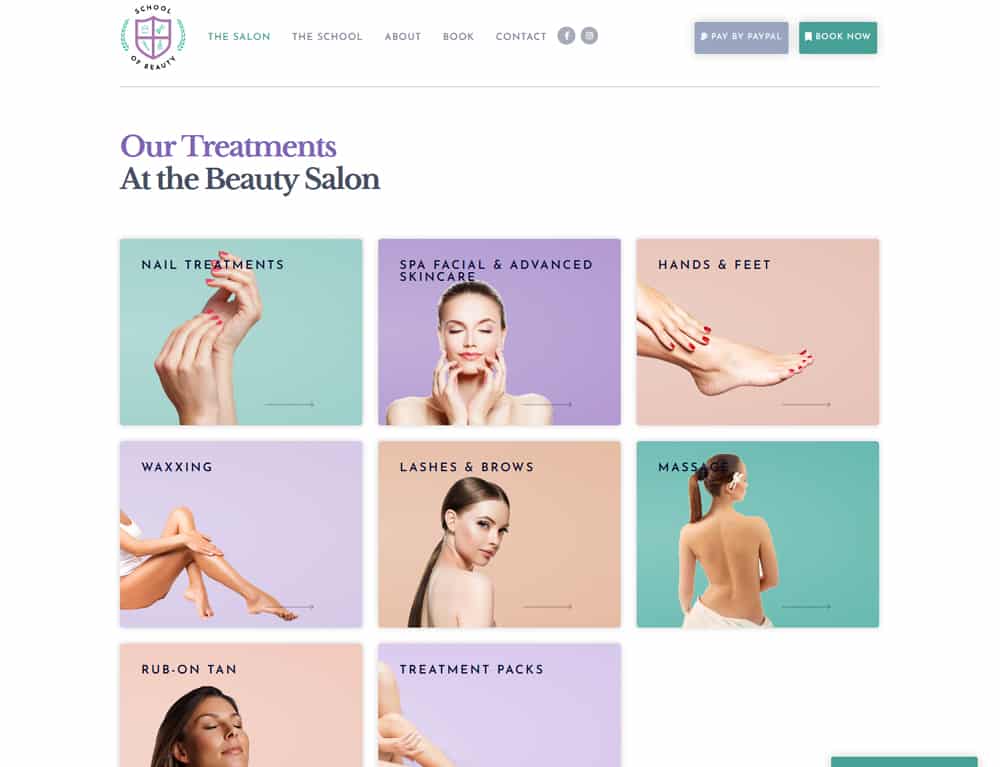
Beauty Salon Treatments
The new treatment thumbnails are highly visual to encourage more bookings;
a huge improvement on the simple text of the old website.
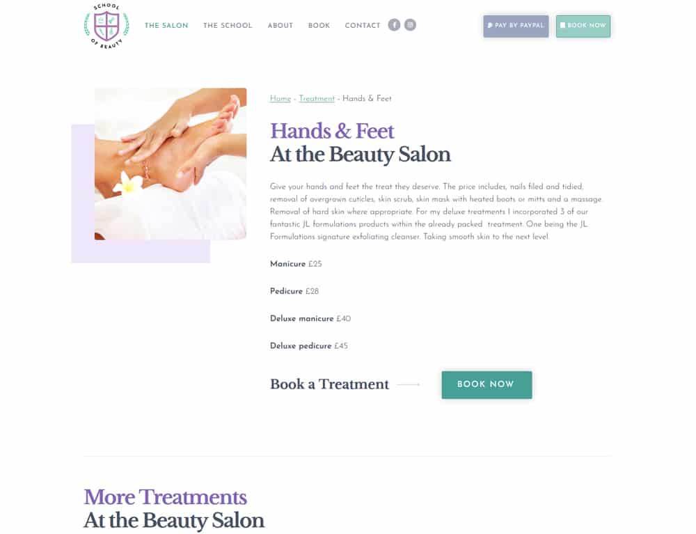
Online Treatments
Each beauty salon treatment is given the luxury of its own page on the website, with details about what’s included in each treatment, as well as links to book and pay online.
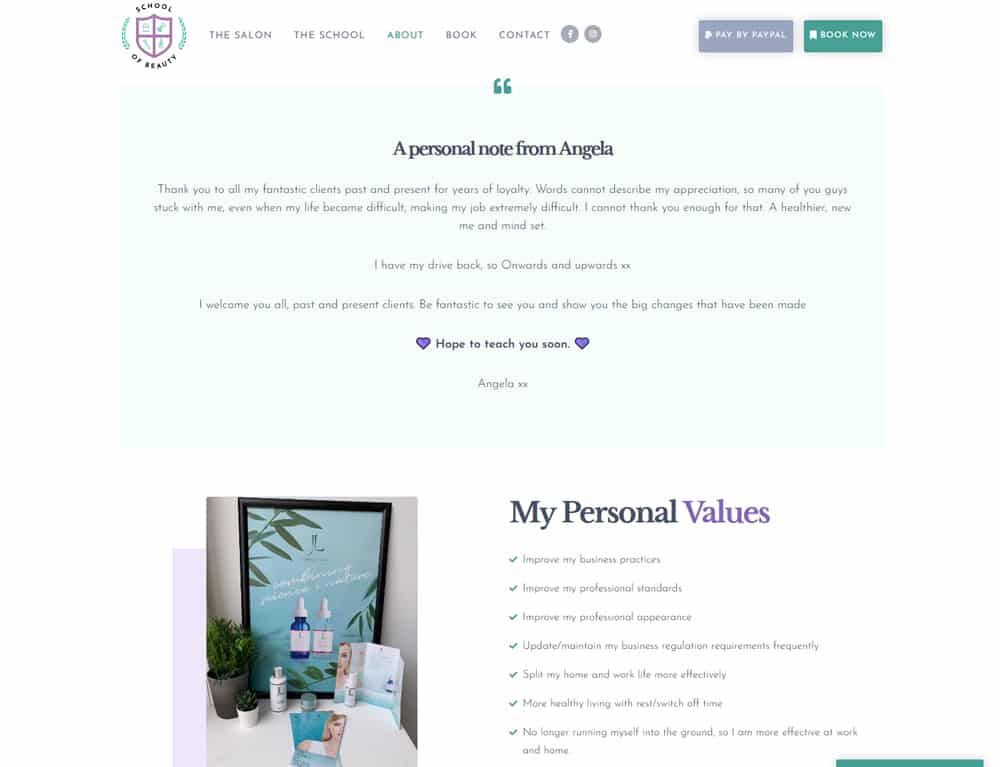
About the School of Beauty
The School section of the new website is just as impressive with Angela’s full range of beauty courses now hosted online.
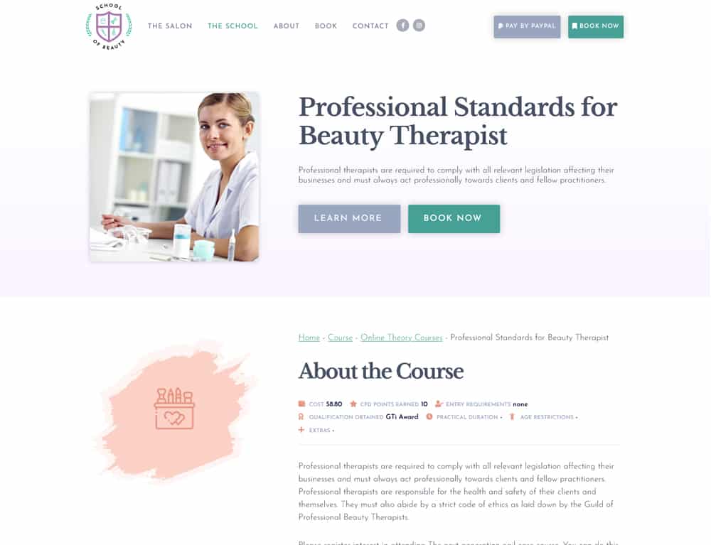
Online Beauty Courses
The process of booking beauty courses online has been streamlined: users can now find all the information they need on the new website including duration, learning outcomes and course requirements.
Online Beauty Courses digital marketing
I’ve designed a range of branded printed promotional marketing to decorate Angela’s salon and school:
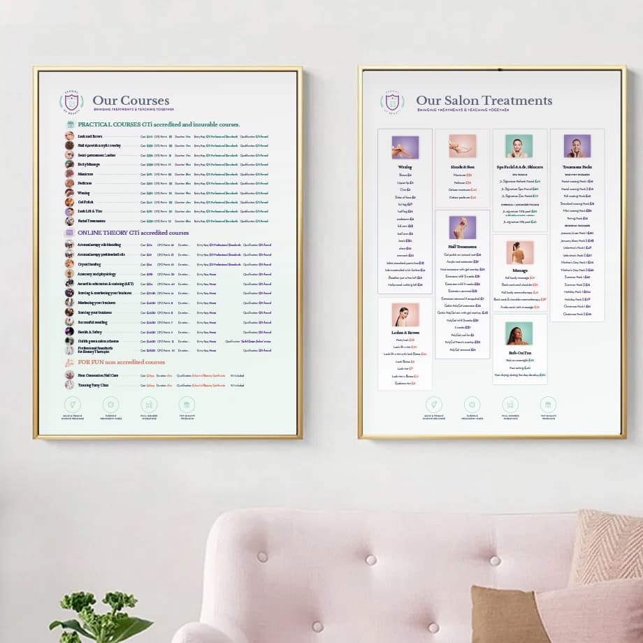
🎴 Posters
I designed two large format posters to decorate the salon walls, with a list of treatments and courses available at School of Beauty.
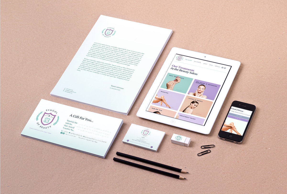
📃 Business Stationery
Angela wanted to show off her new branding across her business. What better way to broadcast her brand than with branded stationery such as business cards, vouchers, stickers and envelopes
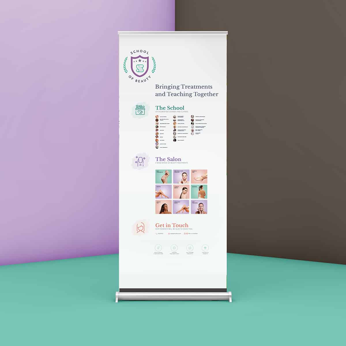
📰 Rollup Banners
These Large format printing rollup banners help to partition the spaces in the salon, as well as presenting all the courses and treatments that Angela offers at her beauty salon.
I can’t recommend Design Hero enough for an excellent website that by far surpassed my expectations. He was very patient: just after I started the project I took unwell for a long time. He was excellent in sending me no pressure updates and waiting on responses while I recovered. He continues to help with a number of different business needs with excellent service all round.
Thank you!
