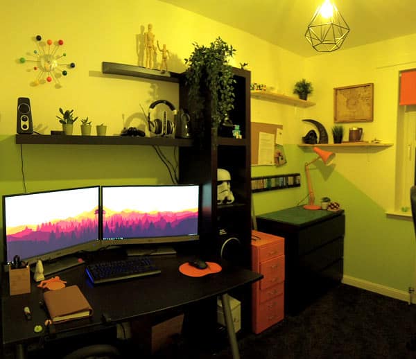
I explore interior spaces and give some tips for making the most of the space you have. We all have our favourite spots in the house, so here’s a few of mine in my own home and what I’ve done to make the most out of the space and light.
This post looks at my study, where I try to achieve a bit of zen and inspire creativity. I’ve used an autumn theme here, so lots of yellows, oranges and reds. We also had a lot of ugly leftover furniture in black such as a desk, shelf units and drawers, so we put it all in this room where they combined to form a cohesive unit along one wall which contrasts against the bright green, rather than dotted sporadically around the house where they may have been unsightly.
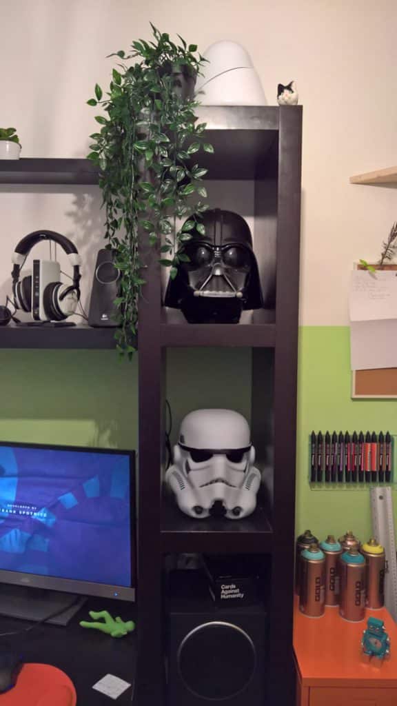
The walls are painted half way up to the ceiling in a pleasant lime green. The paint has been cut off at the height of the shelving with a dramatic angle, giving the effect of dividing the room in half vertically. This helps to enhance the visual height of the small room, and the paint defines the “work” and “play” areas of the room.
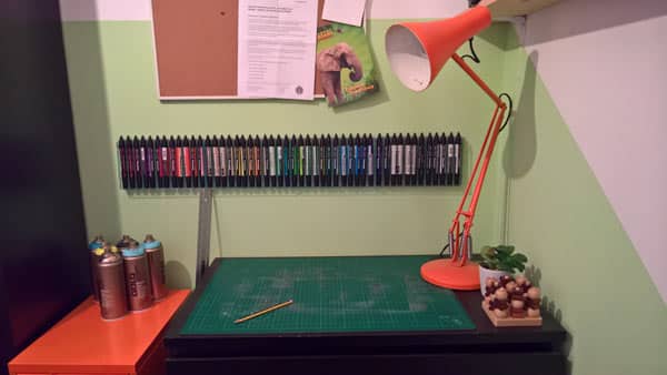
Selecting decorations and trinkets with the right colours helps to really define the colour pallete, even for functional items such as lamps and storage. In this image I have hung an extensive collection of marker pens on the wall as a feature which also serves a practical purpose in the arts and crafts corner.
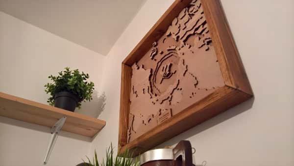
Lots of plants and timber knick knacks litter the room and floating shelf units surround the pc to create a productive cubby with everything I need to work!
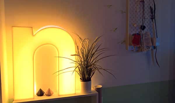
A soft yellow glow light compliments autumn colours, and the room is filled with plenty of plants to create a sense of peace.
About the author

Nicholas Robb, Founder
The original Design Hero founder, solopreneur and marketing expert; Nick will help you supercharge your business success with a broad skill-set spanning a range of digital marketing fields.
If you want help growing your business...

